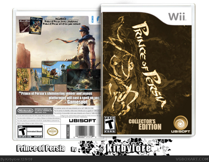
I'm back again with my next box :D (yay!) I made this to celebrate me getting Photoshop CS4! Awsome! but anyways, I went with a more conceptual design, so that's why it's Collector's Edition. Not really much else to say. I hope you like it! Thanks again, and enjoy Prince of Persia : Collector's Edition.
The front is an amazingly sharp design, I love it.
The back is a little mix matched in comparison though. It looks good, but it's very traditional, not like the artsy stylized front.
I love the front. Back is pretty good, but I implore you to never use the Impact font. Try using more better-looking fonts that match with the game. Websites like smashingmagazine.com and dafont.com have plenty of free ones.
 Prince of Persia : Collector's Edition Box Cover Comments
Kewlio :)
[ Reply ]
the front is bangin'!
but the back...not so much.
[ Reply ]
Hey all!
I'm back again with my next box :D (yay!) I made this to celebrate me getting Photoshop CS4! Awsome! but anyways, I went with a more conceptual design, so that's why it's Collector's Edition. Not really much else to say. I hope you like it! Thanks again, and enjoy Prince of Persia : Collector's Edition.
EDIT : ha, #2 and #4, make up your minds!
Edited at 1 decade ago
[ Reply ]
Love the back, the front not so much. I like how the front is presented, just dont like the pic.
[ Reply ]
Not right after I post mine. You could put a description in the empty space. But still very nice.
[ Reply ]
the front and back doesnt match. but its still very good my friend :D
[ Reply ]
I think that the back should match the front's ownage.
[ Reply ]
The front is an amazingly sharp design, I love it.
The back is a little mix matched in comparison though. It looks good, but it's very traditional, not like the artsy stylized front.
[ Reply ]
yup, majority rules. I'll rework the back from scratch. Thanks for the input! I really do appretiate it :)
[ Reply ]
I love the front. Back is pretty good, but I implore you to never use the Impact font. Try using more better-looking fonts that match with the game. Websites like smashingmagazine.com and dafont.com have plenty of free ones.
[ Reply ]
Yeah to be honest Impact does not fit this game at all. Being a massive PoP fan, I really like the front.
Edited at 1 decade ago
[ Reply ]
Very interesting design choice on the front; I really dig it. A bit of text on that empty space on the back would make this better. ;)
[ Reply ]