=D
I'll update with presentation soon =)
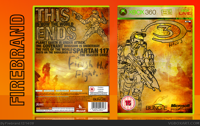
This took a long time, and was my first experiment with my graphics tablet. A lot of work went into building up the texture.
Anyway, hope you like it.
#1, lost the psd for the front. damn corrupt psds ><
I'll see what i can do.
Master chief goes out of the tmeplate and I don't think you should have messed around with the actual template. The halo 3 bit of the logo on the front is rubbish and the back has no real structure to it, this might be better if it was a special edition.
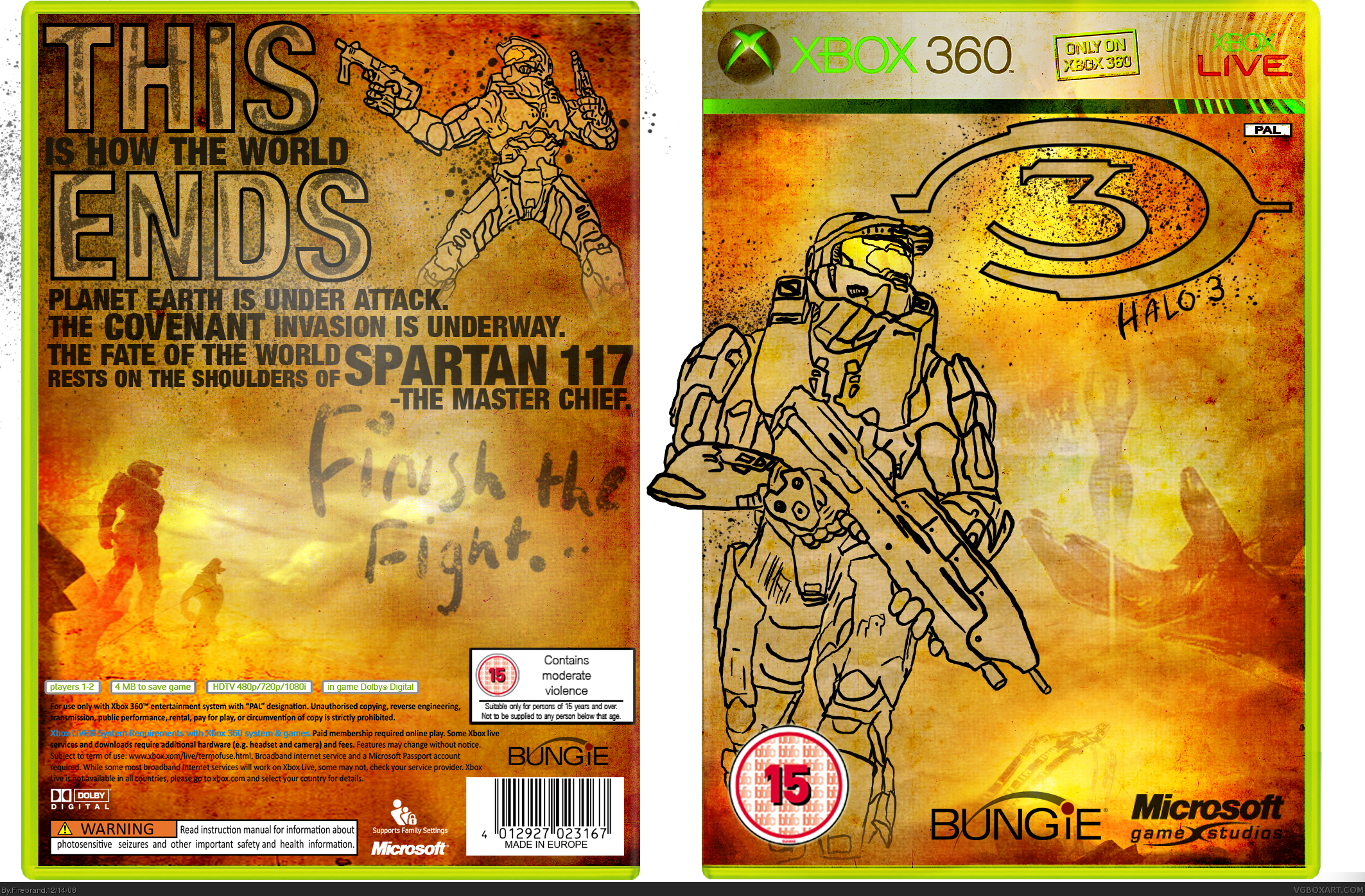
Update!
Sorry for uploading it without presentation and chiefs arm sticking out.
Anyway, delimbed him and cleaned it up, and now I think it looks miles better :)
Edit: If anyone has any better ideas for the logo on the front, please tell me how I should improve it rather than saying it looks rubbish. That isn't exactly helpful tbh.
And why does a box have to be a special edition to deviate from the original art style? I'm not going to write 'special edition' on my box to explain why it is different.
#15 get rid of the halo 3 bit of the logo on the front and just keep the big 3. On the back give it a bit more structure. Maybe this could be a special edition?
#22, I explained why I am not adding special edition in comment ten. I feel it is pointless to add special edition text to explain the way it is different from the original art style.
I'm going to keep the Halo 3 part of the logo as I feel it adds to the original look of this box.
Thanks for the critique anyway :)
 Halo 3 Box Cover Comments
It looks really cool, but you let the Chief bleed out of the template.
[ Reply ]
=D
I'll update with presentation soon =)
This took a long time, and was my first experiment with my graphics tablet. A lot of work went into building up the texture.
Anyway, hope you like it.
#1, lost the psd for the front. damn corrupt psds ><
I'll see what i can do.
Edited at 1 decade ago
[ Reply ]
#1, i agree, you can't let Chief bleed out. Fix that and i'll fav.
[ Reply ]
if only MC wasn't bleeding
[ Reply ]
what OS do you use XP or Vista? If you have Vista, you can just edit the pic in the picture viewer, you would be able to cut off the sticking out arm.
Edited at 1 decade ago
[ Reply ]
Master chief goes out of the tmeplate and I don't think you should have messed around with the actual template. The halo 3 bit of the logo on the front is rubbish and the back has no real structure to it, this might be better if it was a special edition.
[ Reply ]
I'm going to sort out this stuff in V2. I'll put it up when its done.
#5, XP
[ Reply ]
You no what, i love this box even if chief is poping out, so you no what +fav
[ Reply ]
Thankyou all for comments, wil update when I get home. At a friends house right now.
[ Reply ]
Update!
Sorry for uploading it without presentation and chiefs arm sticking out.
Anyway, delimbed him and cleaned it up, and now I think it looks miles better :)
Edit: If anyone has any better ideas for the logo on the front, please tell me how I should improve it rather than saying it looks rubbish. That isn't exactly helpful tbh.
And why does a box have to be a special edition to deviate from the original art style? I'm not going to write 'special edition' on my box to explain why it is different.
#11, thanks.
Template credit to ADFD- almost forgot.
Edited at 1 decade ago
[ Reply ]
Yey, looks even better
[ Reply ]
I love the artistic styling. A different looking halo box...who would have known it was possible?
[ Reply ]
lol, that's all I wanted to do- make it different.
Thanks M_G and Drakxxx
Edited at 1 decade ago
[ Reply ]
:D now that's it!
[ Reply ]
Anything I can improve?
[ Reply ]
this looks so much better, there's really no other way to improve it unless you can find a way to stick screenshots on there. great job, +fav
[ Reply ]
Screens, now that would be interesting
[ Reply ]
i think screens would ruin the effect. I'll have a think..
Edit: can't find a way to include screens that looks good. nvm.
Edited at 1 decade ago
[ Reply ]
printable maybe? i fu****g love this!!!!
[ Reply ]
sorry, I've lost the psd :(
glad you like it anyway =)
[ Reply ]
cool + fav
[ Reply ]
#15 get rid of the halo 3 bit of the logo on the front and just keep the big 3. On the back give it a bit more structure. Maybe this could be a special edition?
Edited at 1 decade ago
[ Reply ]
#22, I explained why I am not adding special edition in comment ten. I feel it is pointless to add special edition text to explain the way it is different from the original art style.
I'm going to keep the Halo 3 part of the logo as I feel it adds to the original look of this box.
Thanks for the critique anyway :)
[ Reply ]
I half expected that to say:
"THIS
is sparta"
[ Reply ]
What's the font on the back called?
Edited at 1 decade ago
[ Reply ]
Basic sans.
To get the hollow letters you select the letters, rasterize, shrink the selection, and delete.
Edited at 1 decade ago
[ Reply ]
Congratz.
[ Reply ]
Nice one.
[ Reply ]
Congrats on the HOF
[ Reply ]
Finally it gets into the hall. :D
[ Reply ]
OMGHOF!
Wasn't expecting that!
Didn't see it on the front page either :/
[ Reply ]
Awesome.. +fav
[ Reply ]
Very original, but does not appeal to me.. Well done on the HOF tho!
[ Reply ]