like the front.
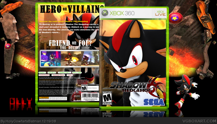
the text on the back gives off a wild west style, which works with the colour scheme of this box well imo.
Just rearrange the back text, and it'l look great.
Pretty good. I would suggest wrapping the text around shadow on the back as well as decreasing the size of the stroke on the screens. Otherwise, good job and keep it up. :)
 Shadow The Hedgehog Box Cover Comments
View in full, I worked really hard on this, it took me a long while!
[ Reply ]
Well, for one, i see that the back text is off, making shadow's face hard to see, also, the text choice is a little bad too.
[ Reply ]
like the front.
the text on the back gives off a wild west style, which works with the colour scheme of this box well imo.
Just rearrange the back text, and it'l look great.
[ Reply ]
#3, Unfortunately, I cannot, it's a shame...
[ Reply ]
nice job man fav. 5/5
[ Reply ]
#5, Thanx man! I'm really glad you like it!
[ Reply ]
#6, lol thats steak.
[ Reply ]
#7, DAMN IT! I forgot... does he still fave everything..?
[ Reply ]
Pretty good. I would suggest wrapping the text around shadow on the back as well as decreasing the size of the stroke on the screens. Otherwise, good job and keep it up. :)
[ Reply ]
#9, HOLY HELL! LADYKILLER LIKES ONE OF MY BOXES!! Okay, I think I'm about to faint... ;)
[ Reply ]
The front is great, but the back's font's sypnosis seems to need outlined or something. So far, good job!
Edited at 1 decade ago
[ Reply ]
Good stuff.
[ Reply ]
#12, Thanks, any particular favourite part?
[ Reply ]
fuckin sucks
[ Reply ]
#1 very, very good boxart
it is good except for the M rating
[ Reply ]
#15, What rating is ShTH in the USA?
[ Reply ]
#16, E10+
[ Reply ]