What the fuck is this supposed to be? It's not even worthy of a critique!
BTW, I don't want to hear that I'm being to harsh. After 78 boxes, you either can not comprehend decency, or you're just a plain troll.
#8, I don't really fucking care if you hate me or not! Why don't you try making a box that doesn't make my eyes shrivel and beg for mercy before you prattle on endlessly again?
Well, I would like to suggest to add some effects to the text. ;)
I mean, it's not bad, but it's not good either. Just look at the back of my Christmas Sonic Rush box, try to use some transparency and maybe add some shadow effects to the letters... Maybe like copy the text and paste it on a new layer, move it a bit down and give it some transparency, it will give it some shadow effect and it will look a bit better! ;)
Hope this helped!
EDIT: Oh, I agree with CruSadEr, but I also think he has to calm down a bit. ;)
#18, LOL Time out and yes I think CruSadEr needs to cool off, but I do think that you need more work with gimp, start to use more like shadows, and effects not that can thing you used, and CruSadEr whats your problem, that was just out of line and totally childish (learn some manners). You are improving but you need to get more experience. I can help you if you want or make tutorials for you with videos, but I will not bitch at you like CruSadEr did. Just relax and concentrate on what your doing, play around with the effects/layers, read tutorials on google or the forum here, and you should be fine. Your a good frined that doesn't need this bitch off between other people. As for the box, get some borders for the main website, and get text ideas for there to. Also you need to get actual screenshots, and if you want a good logo just go too link. Hope this helps, and please dont use that spray shit, use shadows, or strokes. Hope this helped. 2.5/5
 BioShock Box Cover Comments
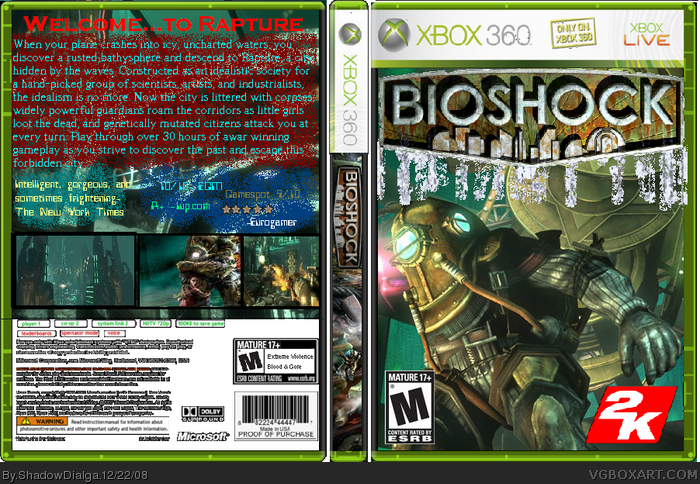
Took maybe 1.5 hours. Pretty much everyone's made a bioshock box, so why not me? Back text from link
Techne's temp, as usual
2-Yipee!
Edited at 1 decade ago
[ Reply ]
I see an improvement.
[ Reply ]
#2, I don't, this is pretty crappy.
[ Reply ]
Well,this was hard to make, so you could at THE VERY LEAST point out what you hate
5- Yep
Edited at 1 decade ago
[ Reply ]
#3, if you take a look at his older boxes, I'm pretty sure you'll see why.
[ Reply ]
hmm
certainly one of your better boxes
don't like all the spray paint crap everywhere though
[ Reply ]
What the fuck is this supposed to be? It's not even worthy of a critique!
BTW, I don't want to hear that I'm being to harsh. After 78 boxes, you either can not comprehend decency, or you're just a plain troll.
Edited at 1 decade ago
[ Reply ]
6- Thanks, thepaint is for better text visibility
7- If I didnt h8 u b4, I do now
9- Like...?
Edited at 1 decade ago
[ Reply ]
I strongly suggest using something different to make the font/logo stand out.
[ Reply ]
#8, I don't really fucking care if you hate me or not! Why don't you try making a box that doesn't make my eyes shrivel and beg for mercy before you prattle on endlessly again?
Edited at 1 decade ago
[ Reply ]
#10, I agree, I do like SD, but he needs to spend more time on his work, and check out some tutorials.
[ Reply ]
#8, "H8 u b4", are you serious?
Leave. Just leave.
[ Reply ]
CruSadEr, you need to lighten up.
ShadowDialga, you need to learn how to spell.
[ Reply ]
11- Alright
12- >=O
13- ookeyi weel XD
[ Reply ]
Well, I would like to suggest to add some effects to the text. ;)
I mean, it's not bad, but it's not good either. Just look at the back of my Christmas Sonic Rush box, try to use some transparency and maybe add some shadow effects to the letters... Maybe like copy the text and paste it on a new layer, move it a bit down and give it some transparency, it will give it some shadow effect and it will look a bit better! ;)
Hope this helped!
EDIT: Oh, I agree with CruSadEr, but I also think he has to calm down a bit. ;)
Edited at 1 decade ago
[ Reply ]
15- Alright!
[ Reply ]
I WILL NOT CALM DOWN! >=O
Edited at 1 decade ago
[ Reply ]
THEN YOU SHALL GO TO TIME OUT, MR CAPS LOCK!!!
[ Reply ]
#18, LOL Time out and yes I think CruSadEr needs to cool off, but I do think that you need more work with gimp, start to use more like shadows, and effects not that can thing you used, and CruSadEr whats your problem, that was just out of line and totally childish (learn some manners). You are improving but you need to get more experience. I can help you if you want or make tutorials for you with videos, but I will not bitch at you like CruSadEr did. Just relax and concentrate on what your doing, play around with the effects/layers, read tutorials on google or the forum here, and you should be fine. Your a good frined that doesn't need this bitch off between other people. As for the box, get some borders for the main website, and get text ideas for there to. Also you need to get actual screenshots, and if you want a good logo just go too link. Hope this helps, and please dont use that spray shit, use shadows, or strokes. Hope this helped. 2.5/5
Edited at 1 decade ago
[ Reply ]
19 Alright
[ Reply ]
I Will Never! Make A BioShock Box!!!
[ Reply ]
21-Good! For You!!!
[ Reply ]
Dialga, Do you feel like doing a combined box and I'll do the front? :)
[ Reply ]
23- Well, aside from the fact htat Ive never heard of you and that im horrible at bax, sure!
EDIT- Also, its called a COLLAB
Edited at 1 decade ago
[ Reply ]
Great. :D Just P.M me about it.
[ Reply ]