You dont need to credit Google for the renders and BG. Google ain't a person, its a search engine! Google aint gonna view this page and be mad that you didnt credit him/her.
#2, I credit google because you found it through google, and if the actual person who did it views the box and sees you didn't credit anything they will think you stole it, not just found it through google.
Box is Decent.
#7, Point is, the person who's work you might be using that you got from google, if they see you didn't credit anything they would be more likely to think you deliberately stole it.
I get what you mean though. It's like crediting Mozilla Firefox for everything.
#6 Wouldn't it make more sense to credit the site that was hosting the image and not Google? Like I said, Google is just a search engine and does not store any materials itself. Google couldn't care less if you credit it or not.
Good box HCFB :)
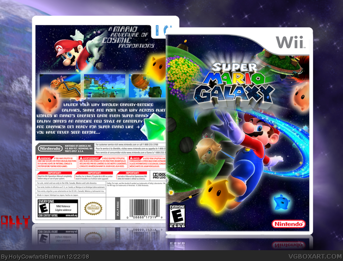
I only suggest that you tone down the glow on the luma's,Its a tad to much.
And also,I think you should add the faded rosalina in the top left corner.
You are over using the blur effect you use on your logos (motion or radial blur, I'm guessing). Also, I don't like what you did with Rosalina on the front. She should be bigger if you're going to do a fade out on her like that.
 Super Mario Galaxy Box Cover Comments
Considering I've never done a Super Mario Galaxy Box before, I thought I'd give it a go. I can't remember where I got the template from but;
~Google for BGs and screenshots.
~Planet Renders for the... renders.
[ Reply ]
You dont need to credit Google for the renders and BG. Google ain't a person, its a search engine! Google aint gonna view this page and be mad that you didnt credit him/her.
[ Reply ]
#2, Lol, yeah... so what do you think of the box?
[ Reply ]
The back Mario render is a little choppy but otherwise, its ok.
[ Reply ]
#4, Choppy? I don't think it's choppy... I just didn't make it smooth...
[ Reply ]
#2, I credit google because you found it through google, and if the actual person who did it views the box and sees you didn't credit anything they will think you stole it, not just found it through google.
Box is Decent.
#7, Point is, the person who's work you might be using that you got from google, if they see you didn't credit anything they would be more likely to think you deliberately stole it.
I get what you mean though. It's like crediting Mozilla Firefox for everything.
#8, I prefer the front aswell :)
Edited at 1 decade ago
[ Reply ]
#6 Wouldn't it make more sense to credit the site that was hosting the image and not Google? Like I said, Google is just a search engine and does not store any materials itself. Google couldn't care less if you credit it or not.
Edited at 1 decade ago
[ Reply ]
#6, Glad to know you think it's decent, this is just a minor box, and I prefer the front to the back...
[ Reply ]
Don't you think you should not add a zoom blur to the logo because it blocks the view. It is good though :D
[ Reply ]
nice one i'm expecting great thing from you (even though i thought you were going to be a mega spammer with that username :p)
[ Reply ]
Holy Cowfarts HolyCowfartsBatman! Thats a pretty cool box, I think I'll fav. ;)
[ Reply ]
#10, I'm HyperShadow2008... didn't you know that...
EDIT: #11, LOL! I'm glad you like it!
Edited at 1 decade ago
[ Reply ]
Aw, you didn't move Mario down :( oh well, pretty decent. 7/10
[ Reply ]
#13, I thank you! I worked really hard on this one... oh, I did move him down... a bit... and I added stuff around him. :)
[ Reply ]
Good box HCFB :)
I only suggest that you tone down the glow on the luma's,Its a tad to much.
And also,I think you should add the faded rosalina in the top left corner.
[ Reply ]
#15, It's been flattened, sorry... I can only add...
[ Reply ]
shit
[ Reply ]
You should keep a source of anything you make and make a separate flat one.
[ Reply ]
You are over using the blur effect you use on your logos (motion or radial blur, I'm guessing). Also, I don't like what you did with Rosalina on the front. She should be bigger if you're going to do a fade out on her like that.
Not bad, but typical design, nothing new.
[ Reply ]
Why!? My finger moved in time to double click...I gotta work on not doing that.
Edited at 1 decade ago
[ Reply ]
#18, Suppose I should... lol... thing is, I'm not that great with Paint.NET (as you can tell by my boxes...)
[ Reply ]
it's ok i suppose but the front looks pretty plain and boring.
[ Reply ]
#22, Uh, dude? Please check the date this was added, and then please could you look at my newer ones, thanks =)
[ Reply ]