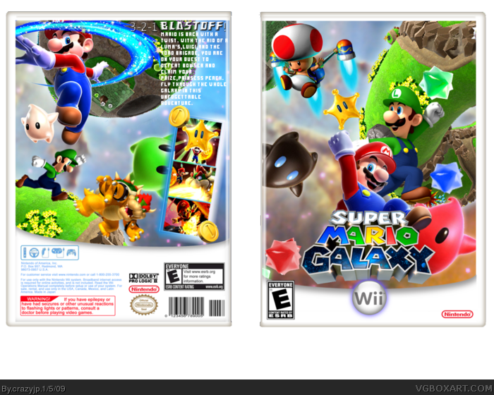
I have poured my heart and soul onto this box. This took me ALOT of effort to make. Thank's for everybody's crtics on my WIP.If it wasnt for you,This box would have had lots of mistakes. I personally like the back more than the front. I had alot of fun making this.
Credit to Koopadasher for the template.
Enjoy =)
The front looks great. The back is a bit disappointing though, the black borders for the snapshots makes everything look boring, and the black text for the words throws everything off. Remember, on back it's ok to cover some things up, as long as it's not the main characters faces.
Still good the way it is, but make an update and I'd rate this a 5/5.
This is alot better! Back needs quite abit of work though. The font should be changed and you just shunted ( is that a word? ) the screens ( which need more exciting borders ) and the text into the bottom right of the box when they should be the main attraction. Junior bowser should be smaller than big bowser :p
On the front I don't like how you made luigi as much of a main character as mario. And the front and back's sky is too similar, you also used the same render for that brown star as on the back.
Overall though it has a nice mario effect, nothing original but solid stuff, your definately improving 6/10 :)
I think its great, and certainly your best.
Theres an empty space on the front that I keep noticed, and I don't like the digital style text on the back, but the composition and design is quite good.
#34, Yeah,Some people keep saying stuff about that little space. I was thinking about adding another luma or star bit,But it would look to crowded imo.
I want say congratulations although I must also say, with that text on the back, I don't think that should have gotten it. It's very small, misplaced, and the font doesn't fit and it isn't easily visible. I mean, it is my opinion, and this comment isn't going to affect it, but I just thought I'd give my two cents.
WHOA! THIS IS IMMENSIVE! Good work! Definiely deserves to be a hall of famer. I have no critism apart from you'll certainly have lots expected from you.
 Super Mario Galaxy Box Cover Comments
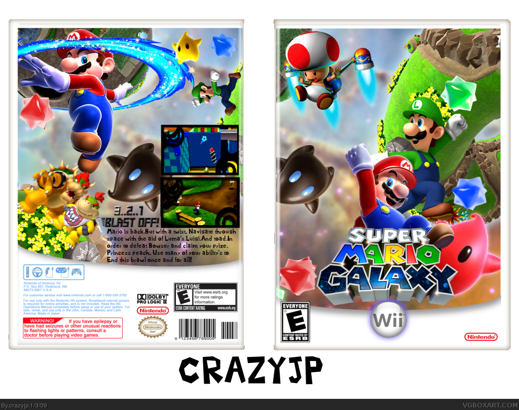
I have poured my heart and soul onto this box. This took me ALOT of effort to make. Thank's for everybody's crtics on my WIP.If it wasnt for you,This box would have had lots of mistakes. I personally like the back more than the front. I had alot of fun making this.
Credit to Koopadasher for the template.
Enjoy =)
[ Reply ]
wow crazy. I must say this is your best box :)
My only suggestions is that, you need to find a better font for the back, and put them a white stroke.
Fav from ClonedX
[ Reply ]
Cool.
[ Reply ]
Thanks!
I had no idea what font to use,So I just stuck with the originaly Mario font.
Thanks for the fav's you three.
Edited at 1 decade ago
[ Reply ]
Damn, that template makes everything look better! It complements your great box. +fav
[ Reply ]
#5, Thank you. And congrats on getting rank 3.
[ Reply ]
The front looks great. The back is a bit disappointing though, the black borders for the snapshots makes everything look boring, and the black text for the words throws everything off. Remember, on back it's ok to cover some things up, as long as it's not the main characters faces.
Still good the way it is, but make an update and I'd rate this a 5/5.
[ Reply ]
You like the front better? Really? I thought the back was better |:
But thanks!
[ Reply ]
*puts hands out*
I want more Mario boxes from you! + Fav & Authour Fav!
[ Reply ]
#9, I might make a New super Mario bro's box one of these days :P
[ Reply ]
This is alot better! Back needs quite abit of work though. The font should be changed and you just shunted ( is that a word? ) the screens ( which need more exciting borders ) and the text into the bottom right of the box when they should be the main attraction. Junior bowser should be smaller than big bowser :p
On the front I don't like how you made luigi as much of a main character as mario. And the front and back's sky is too similar, you also used the same render for that brown star as on the back.
Overall though it has a nice mario effect, nothing original but solid stuff, your definately improving 6/10 :)
[ Reply ]
Shunted? |:
[ Reply ]
wow, me likey :)
[ Reply ]
this is nice, but the tagline ("3-2-1...Blast off!") could be a little bigger IMO.
[ Reply ]
looks very nice. Could have better screenshot borders....but looks very nice nonetheless.
[ Reply ]
#12 squashed, pushed whatever lol
[ Reply ]
It's super creative. You sir, just got 2 more points toward HoF.
[ Reply ]
Wow,Thank you all =)
17,Meh,I doubt it will get HoF,But it will be nice if it does :P
[ Reply ]
My only suggestion is that seeing that black star on the front and back in the same position is kinda annoying -.- But +fav
[ Reply ]
#19, yeah please change that but it is awesome well done
[ Reply ]
#19, Yeah,Im working on that right at this moment. :P
[ Reply ]
Updated!
I put better text,better borders,And I tweaked the back a little.
Enjoy =D
[ Reply ]
Add a dropshadow to the back text.
[ Reply ]
#23, How do I add a dropshadow to the text?
[ Reply ]
damn, this is awsome 5/5 + fav. good job :)
[ Reply ]
#25, Thanks :)
[ Reply ]
Very nice, I just think they need Shadows, good job though.
[ Reply ]
#27, By adding shadow's,What do you mean? Add shadows on the character's to the back? The front?
And how DO I add a shadow?
[ Reply ]
#28, Characters on the back, and check some tutorials to know how to do it, BTW, did you get the Conversation message I sent to you?
[ Reply ]
Omg,Im rank 4!
Thank you all for the support =D
[ Reply ]
It's nice, but I don't like the font of the text on the back
+Fav anyway
[ Reply ]
I liked the back better in the first version :(
[ Reply ]
#32, Make up your mind <_<
[ Reply ]
I think its great, and certainly your best.
Theres an empty space on the front that I keep noticed, and I don't like the digital style text on the back, but the composition and design is quite good.
Good job my friend!
[ Reply ]
#34, Yeah,Some people keep saying stuff about that little space. I was thinking about adding another luma or star bit,But it would look to crowded imo.
[ Reply ]
Wow that template is all over the place now =P. not bad box...3/5
[ Reply ]
#33 Well I didnt' say I didnt like the back the first time, I just didnt like the repeating star...
[ Reply ]
I made a minor update.
I added some coins on the back,and I filled up the little space between Toad and Luigi/Mario
[ Reply ]
The text on the back doesn't seem to fit the theme.
[ Reply ]
this isnt a pic of E_G your link sucks lol :p
although pretty good :D
[ Reply ]
#40, It brings in the suckers every time :P
[ Reply ]
Pretty cool! Like others have said, unique!
[ Reply ]
#42, Thanks Yoshistar,That means alot =)
[ Reply ]
different from others and that's good :)
EDIT: Haha, looks like that my fav got this to HoF, congrats!
Edited at 1 decade ago
[ Reply ]
HoF? Sweet.
Thanks everybody :D
[ Reply ]
Congrats on the HoF Crazyjp, you definately deserved it.
[ Reply ]
Congratz m8.
[ Reply ]
I want say congratulations although I must also say, with that text on the back, I don't think that should have gotten it. It's very small, misplaced, and the font doesn't fit and it isn't easily visible. I mean, it is my opinion, and this comment isn't going to affect it, but I just thought I'd give my two cents.
[ Reply ]
Gratz mate.
[ Reply ]
WHOA! THIS IS IMMENSIVE! Good work! Definiely deserves to be a hall of famer. I have no critism apart from you'll certainly have lots expected from you.
Awesome+Fav
[ Reply ]
The images on back are rotated a little too much but it's a great box.
[ Reply ]
hi everyone im are new here and i have a question: i can download the boxes, print it and put it on my super mario galaxy game box?
[ Reply ]