![]() »
»
[ Box updated on January 5th, 2009 ] [ original ]
 Metal Gear Solid 4: Guns Of The Patriots Box Cover Comments
Comment on jangojoewells's Metal Gear Solid 4: Guns Of The Patriots Box Art / Cover.
I'm torn. some bits I love. other bits I hate. And they're all mixed up, so I can't say I like a particular bit...
Fav for the effort, and the left front cover in particular.
Edited at 1 decade ago
[ Reply ]
Wow, just wow
[ Reply ]
I LOVE this, the middle cover is amazing, great work!
[ Reply ]
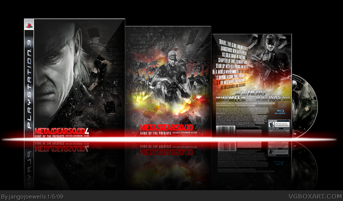
Well here is my mgs4 box, it was hard making this and I still need to redo some parts of the back.
[ Reply ]
Sort of reminds me of Sin City, faved.
[ Reply ]
The middle cover is fantastic. The others aren't quite as good, but it's still pretty all together.
[ Reply ]
I like it, but i dont like that red/white text on the bx on the right.
[ Reply ]
you commented on mine so its only fair i return the favor lol
well i love this love the colour in the middle box and the rest seem to fit round it.
you need to fix the "evil is powerful but courage is solid" the solid part you ned to make better.
but other than that i love it :D
[ Reply ]
#6, Agreed =]
[ Reply ]
Schweet.
[ Reply ]
#8, this
[ Reply ]
How did you do those brick and shattered glass effects?
[ Reply ]
<3
[ Reply ]
Holy crap, this is impressive. The effects on this are top notch, easily your best work.
I seriously hope this gets the attention it deserves, you are far too underrated my friend.
[ Reply ]
This is amazing. +fav
Edit: The "A" in action on the left box is red and hard to see and the ESRB is E on the right box but those are just minor problems. It's still an amazing box and deserves way more attention.
Edited at 1 decade ago
[ Reply ]
you are clearly the most underrated artist here.
[ Reply ]
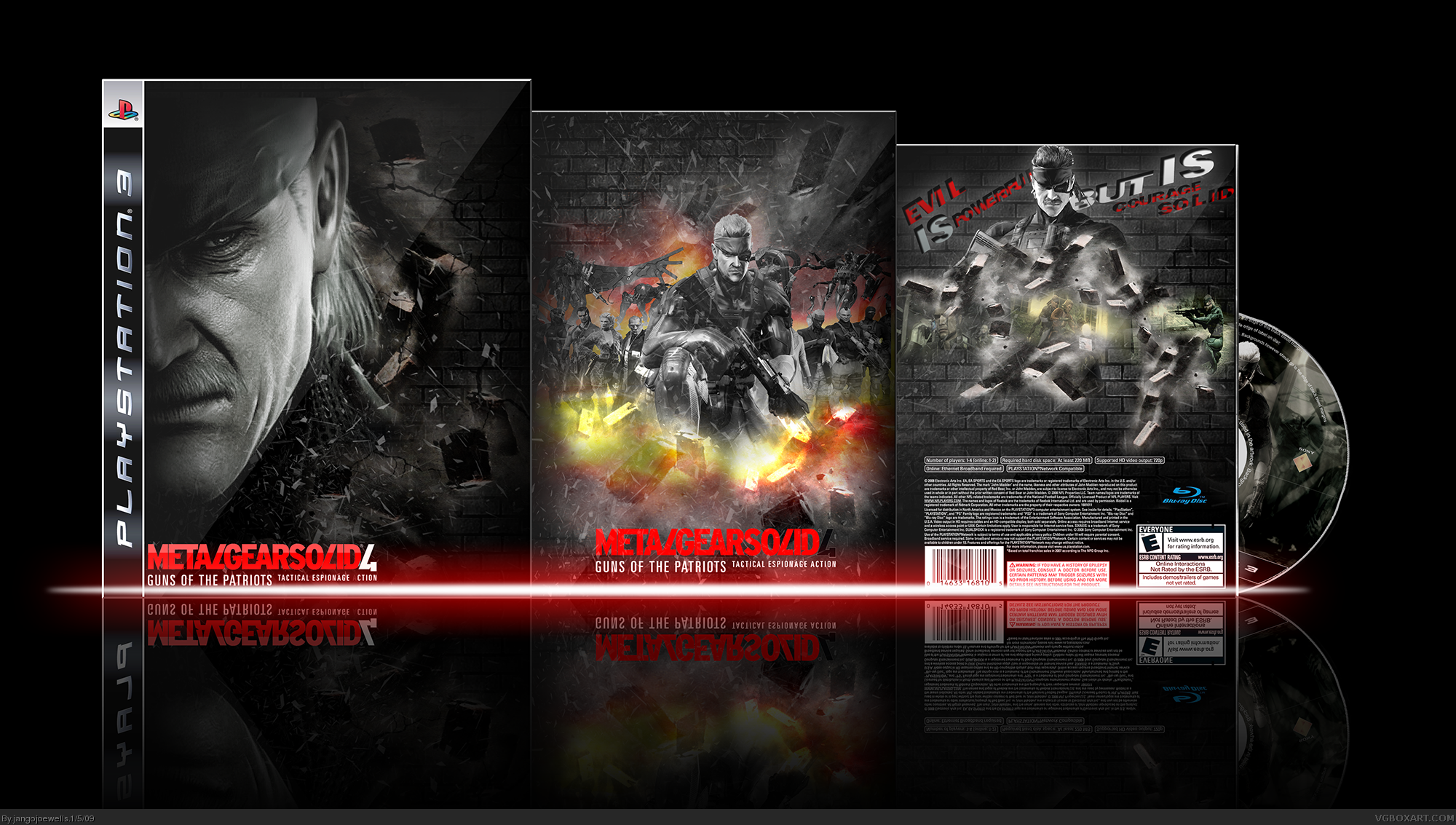
Thanks for all your comments and favs, I have updated the box, fixed and the front and changed the back.
[ Reply ]
Awsome update :)
[ Reply ]
"never will be" and "never was and" need to be switched around so it reads right.
[ Reply ]
What Pan said.
[ Reply ]
Great effort, wonderful design and execution!
Just fix that little typo Pan pointed out.
EDIT: Congrats on the Hall man!
Edited at 1 decade ago
[ Reply ]
Definite congrat! Well done! Long overdue for a second HoF
[ Reply ]
Congrats man :D
[ Reply ]
Awesome work. I love it. My only gripe is the incorrect ESRB.
Edited at 1 decade ago
[ Reply ]
Congrats on the HoF, this box definately deserved it.
[ Reply ]
Why is it rated E?
[ Reply ]
Thanks for comments and favs guys
[ Reply ]
Gold, pure gold.
EDIT: I just noticed though your text on the back is a little, errr 'off' i guess (the blurb i mean). The fav still stands and my comment above of course!
Edited at 1 decade ago
[ Reply ]
awesome work man, but I'd put the "never will be" on the back on the right side and the "never was" on the left.
[ Reply ]
Awesome, great job... But Rated E?
[ Reply ]
the logo on the front cover could probably be at the top, but the whole thing looks great. especially the middle.
[ Reply ]
the whole luks so wicked esp the middle +fav
wicked
one point at the front cover make the logo a bit larger like #31 sed
[ Reply ]
It's really well made, super job!
But, to me, it's just way to action-ish for MGS4.
[ Reply ]