the front is really nice. i'm not a fan of the back though....
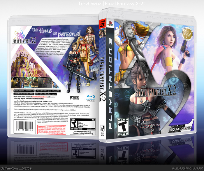
the front needs some work IMO the x-2 is sweet and nice idea but instead of paige being grayed out. make her colour and put her gray in the parts of the x-2 ... also there is colour on her arm that isnt on the 2...
#12, I'm doing this from a official artwork idea. I think all of them in color is boring. The color on her arm is "-" look closer. I mean your idea is good and I might see how I like it but I think its cool this way to =]
#13, I see what's going on on the front, but I see what GrahamZ is saying, and I agree with him, It would look better if the "2" of "X-2" was also black and white, leaving the larger part of Paine in color.
Just my opinion, you don't have to listen to me, but it feels weird that Paine is the only one in grayscale.
great composition and stuff, but the b&w on the front doesn't work for me (it puts a big akward whole in the front--- imo b&w inside only the x2 would suffice), and the logo is akward and seems out of place.
edit: lol ok so i meant i agree with #12 and #15, i didnt see that before haha...
#12, #15, #18, I fixed the box to your liking and I agree it does look better. Thanks for all comments and favorites. I hope you like the box more now =]
 Final Fantasy X-2 Box Cover Comments
A lot of people told me not to update my old one. So a new box for 2009. Enjoy =]
[ Reply ]
Nice.
[ Reply ]
I don't really like the tagline....at all. But the rest is made of pure win. nice job!
[ Reply ]
Holy crap man, this is AMAZING!
Nice to see a new box as well :)
And that's Sens Temp >_>
Edited at 1 decade ago
[ Reply ]
Credit to Sens. Sorry sort of multi tasking, I meant to say that in first post.
Also I will be adding the Printable so you can see things better shortly.
[ Reply ]
very kool.
[ Reply ]
Looks awesome. I especially like what you did with the X2 on the front.
[ Reply ]
Agreed with #7, the X2 is a really nice display of kick ass editing. Awesome design!
[ Reply ]
Very girl power. very innovative back. Agreed with #7. Overall Fantastic really!
[ Reply ]
I only don't like the black and white.
[ Reply ]
Thanks everyone for the comments and favs =]. Glad to see you like it. Let's see if I can finish another one before school next week lol.
[ Reply ]
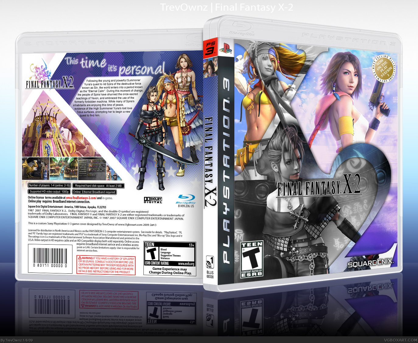
the front is really nice. i'm not a fan of the back though....
the front needs some work IMO the x-2 is sweet and nice idea but instead of paige being grayed out. make her colour and put her gray in the parts of the x-2 ... also there is colour on her arm that isnt on the 2...
+fav
[ Reply ]
#12, I'm doing this from a official artwork idea. I think all of them in color is boring. The color on her arm is "-" look closer. I mean your idea is good and I might see how I like it but I think its cool this way to =]
[ Reply ]
:O looks great dude :)
[ Reply ]
#13, I see what's going on on the front, but I see what GrahamZ is saying, and I agree with him, It would look better if the "2" of "X-2" was also black and white, leaving the larger part of Paine in color.
Just my opinion, you don't have to listen to me, but it feels weird that Paine is the only one in grayscale.
[ Reply ]
Its very girly.
[ Reply ]
#16, duh
[ Reply ]
great composition and stuff, but the b&w on the front doesn't work for me (it puts a big akward whole in the front--- imo b&w inside only the x2 would suffice), and the logo is akward and seems out of place.
edit: lol ok so i meant i agree with #12 and #15, i didnt see that before haha...
Edited at 1 decade ago
[ Reply ]
#12, #15, #18, I fixed the box to your liking and I agree it does look better. Thanks for all comments and favorites. I hope you like the box more now =]
[ Reply ]