Oh where to begin.
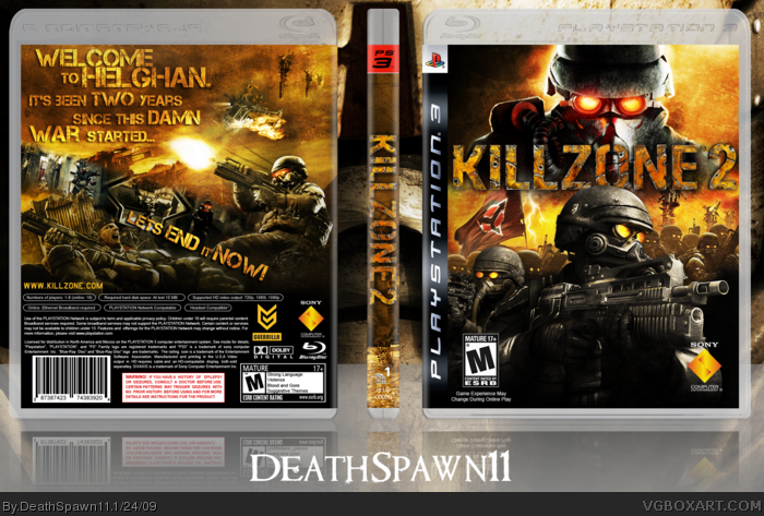
Started this on Tuesday when the front art hit Gamewallpapers. Finished it today. As you should be able to tell. No piece of art went un-blended here x__X I have some kind of texture or brightness/contrast or hue/saturation, or SOMETHING on every piece of art. I put oodles and oodles of effort into this and its one of my personal favorites.
Cred to Techne for the temp, and Shady for helping me get the piece of art used on the back (With the guy behind the sandbags).
Comment/Critique/Fav.
View full!
Kthx
I was just thinking how I wanted to make a Killzone 2 box, and the front was EXACTLY how I wanted it. Doesn't matter to me though as I could've never had pulled it off.
And for people getting Killzone 2, I just got PSN for the demo and the final game. My PSN ID: Digital-Kill3r-7
The front looks kind of typical and expected, it's the back that really is unique and awesome. Don't get me wrong, the box as a whole IS amazing, just it's the back that has the most thought put into it, in my opinion.
#9, I understand why you'd say that lol, the front has the usual Helghast overlooking something layout and I finished the front first day, and then the back was more of a "I'll put this here....and then....crap where's THIS going then..." deal. Which is why it took me a while. =P
#15, Ehhh I can understand that.
I wanted something different than usual for the back and this is how it turned out. thanks though ^_^
#16, did he say the back wasn't good?
No he just said he expected more out of it from the preview I showed him. Also, his backs are way better than yours. Please think your comments over before you go and "diss" someone.
#17 Chill man! I never said his backs sucked. They really nice, but all that I'm saying is that in a way, he dissed you, so I just found that weird considering I like what you got for the back.
The 'B' on "It's been two years" on the back cover is cut off a bit on the left side.
Also, the white text in the back cover, you know all the trademark and copyright garbage? There it says 'Blue-Ray'. You can't copyright an actual word, so it's 'Blu-Ray', without the 'E'.
Oh by the way has anyone seen the first cover art for Killzone 2 made by Guerrilla Games? It was on IGN for a while, and it seems to me the second cover got worse, and now the third and final cover is horrible. Check it out on IGN.
But anyway, the first cover was a very simple concept. There was just a Pyro-trooper Helghast soldier standing there looking cool on a white background, and it just looked awesome! Now it's just an over-sized Helghast head. Weird how Guerrilla actually decided on that lame cover.
Artourg, the B is meant to be that way. It's the style. Are you really so analytic that you must read the legal text and correct a mistake that wasn't his?
And the first cover on IGN was made by them. It was never confirmed to be an official. And to be honest, it did suck.
#24 I'm not saying it was DeathSpawn's fault, I'm just pointing it out. And about the B, there was no way I could have known that the B was supposed to be like that so I just mentioned it.
On the back it says this: Players 1-8 (18 online)??? That's weird... it's not even possible in KZ2 to play with 2 people splitscreen. This is amazing, though.
9/10
 Killzone 2 Box Cover Comments
Oh where to begin.
Started this on Tuesday when the front art hit Gamewallpapers. Finished it today. As you should be able to tell. No piece of art went un-blended here x__X I have some kind of texture or brightness/contrast or hue/saturation, or SOMETHING on every piece of art. I put oodles and oodles of effort into this and its one of my personal favorites.
Cred to Techne for the temp, and Shady for helping me get the piece of art used on the back (With the guy behind the sandbags).
Comment/Critique/Fav.
View full!
Kthx
Edited at 1 decade ago
[ Reply ]
Yay. Its brilliant.
[ Reply ]
Holy Shit no way!
I was just thinking how I wanted to make a Killzone 2 box, and the front was EXACTLY how I wanted it. Doesn't matter to me though as I could've never had pulled it off.
And for people getting Killzone 2, I just got PSN for the demo and the final game. My PSN ID: Digital-Kill3r-7
[ Reply ]
fap fap fap
[ Reply ]
Its dirty and bright. You cant have both in my opinion.
Edited at 1 decade ago
[ Reply ]
*sits, crosses his legs, and awaits the Hall*
[ Reply ]
this is really nice, + fav
[ Reply ]
Amazing!
[ Reply ]
The front looks kind of typical and expected, it's the back that really is unique and awesome. Don't get me wrong, the box as a whole IS amazing, just it's the back that has the most thought put into it, in my opinion.
[ Reply ]
Fantastic, front is epic and i love the typography on the back
[ Reply ]
For The Win.
[ Reply ]
Thanks guys! =D
#9, I understand why you'd say that lol, the front has the usual Helghast overlooking something layout and I finished the front first day, and then the back was more of a "I'll put this here....and then....crap where's THIS going then..." deal. Which is why it took me a while. =P
[ Reply ]
HI-5 Steven :)
[ Reply ]
Steven you asshole.
=P
[ Reply ]
Honestly I'm really disappointed by the back. I was expecting it to be a lot better after what you showed me.
Still, great job.
[ Reply ]
#15 Your backs aren't much better :/
[ Reply ]
#15, Ehhh I can understand that.
I wanted something different than usual for the back and this is how it turned out. thanks though ^_^
#16, did he say the back wasn't good?
No he just said he expected more out of it from the preview I showed him. Also, his backs are way better than yours. Please think your comments over before you go and "diss" someone.
Thank you! And goodnight!
[ Reply ]
Fan-freaking-tastic. Lovin' the back design.
Edited at 1 decade ago
[ Reply ]
#17 Chill man! I never said his backs sucked. They really nice, but all that I'm saying is that in a way, he dissed you, so I just found that weird considering I like what you got for the back.
Got it?
[ Reply ]
Sick nasty.
#17, The kids that can't do better are usual the worst when critiquing lol.
Edited at 1 decade ago
[ Reply ]
The 'B' on "It's been two years" on the back cover is cut off a bit on the left side.
Also, the white text in the back cover, you know all the trademark and copyright garbage? There it says 'Blue-Ray'. You can't copyright an actual word, so it's 'Blu-Ray', without the 'E'.
Edited at 1 decade ago
[ Reply ]
Oh by the way has anyone seen the first cover art for Killzone 2 made by Guerrilla Games? It was on IGN for a while, and it seems to me the second cover got worse, and now the third and final cover is horrible. Check it out on IGN.
But anyway, the first cover was a very simple concept. There was just a Pyro-trooper Helghast soldier standing there looking cool on a white background, and it just looked awesome! Now it's just an over-sized Helghast head. Weird how Guerrilla actually decided on that lame cover.
[ Reply ]
BEAST.
[ Reply ]
Artourg, the B is meant to be that way. It's the style. Are you really so analytic that you must read the legal text and correct a mistake that wasn't his?
And the first cover on IGN was made by them. It was never confirmed to be an official. And to be honest, it did suck.
[ Reply ]
#24 I'm not saying it was DeathSpawn's fault, I'm just pointing it out. And about the B, there was no way I could have known that the B was supposed to be like that so I just mentioned it.
[ Reply ]
awesome man, way cooler than my one
[ Reply ]
On the back it says this: Players 1-8 (18 online)??? That's weird... it's not even possible in KZ2 to play with 2 people splitscreen. This is amazing, though.
9/10
[ Reply ]
#27, Thx dude, I usually don't bother with the specs on the back though. So nevermind that =p
[ Reply ]
I just shit myself.
Edited at 1 decade ago
[ Reply ]