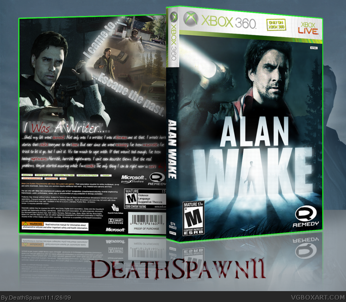
I like what you have going with the front, but the back looks messy. I don't like the text you used on the back either. It shows promise, but it could use some polishing. Pretty good job overall!
I don't like the back because the font is kind of hard to read and weird. The front is great, though. But this isn't your best box ever, it's far from it.
7/10
 Alan Wake Box Cover Comments
That's My Rattata!
b(^_^)d
You know the drill.
[ Reply ]
Front awesome, back not so much :/. Work with your typography.
[ Reply ]
Yeah its good... what do you want?! A God damn cookie?
[ Reply ]
Excellent.
[ Reply ]
Have to agree with Xcore, I really like the front but I don't like the back.
[ Reply ]
I like what you have going with the front, but the back looks messy. I don't like the text you used on the back either. It shows promise, but it could use some polishing. Pretty good job overall!
[ Reply ]
I really like this, great job on the front. I like the design of the back too. +Fav
[ Reply ]
I think the tagline in the shape of the light source is a neat idea, and it looks pretty good here.
The front is awesome!
[ Reply ]
I like the front, and I want to love the back, but that tagline is just throwing me off lol
But I think that this is a very good product in whole, so I'll fav.
[ Reply ]
I don't like the back because the font is kind of hard to read and weird. The front is great, though. But this isn't your best box ever, it's far from it.
7/10
[ Reply ]
Only one prob - Alan Wake is T, not M.
[ Reply ]
lol, They're using your box here. link
[ Reply ]