I like the entire design of this one, the front is different than any other Mirrors Edge box, in a good way. The back really great and goes with the game well. +fav
I agree the game is very crisp and clean and I think that the small blur makes it very smooth which it isn't and the inside light doesn't help either but the back is wonderful but some of the text is very small
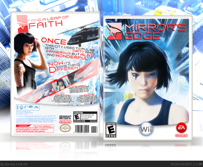
 Mirror's Edge Box Cover Comments
Holy crap dude. I love you so much right now.
[ Reply ]
Love the back, but not a big fan of the front.
[ Reply ]
I like the entire design of this one, the front is different than any other Mirrors Edge box, in a good way. The back really great and goes with the game well. +fav
[ Reply ]
Whoa...I love the front. Back looks cool as well. Keep it up.
[ Reply ]
I agree the game is very crisp and clean and I think that the small blur makes it very smooth which it isn't and the inside light doesn't help either but the back is wonderful but some of the text is very small
[ Reply ]
Niiice . It suits the Wii.
[ Reply ]
Possibly my fav Mirrors Edge box. Keeps the super bright concept of the game and the packaging but manages to make it completely unique.
[ Reply ]
Finally! A Mirror's Edge box that actually looks different from other ones!
I've got to say, it's one of the best Mirror's Edge boxes on the site, tied with Drakxxx and Maximum.
But still, an easy 10/10 in my book!
[ Reply ]
very nice
[ Reply ]
I WISH THIS WAS FOR THE WIIIIIIII!!!!!!!!!!! lol
this is awesome! :D
[ Reply ]
I absolutely love the back but i absolutely hate the front.
[ Reply ]
Love the box, not very different from others and I hate the temp
[ Reply ]
... it's NOT in the HoF..?????????
[ Reply ]
Congrats!
[ Reply ]
I think it would look better with the official temp.
[ Reply ]
backs great but where you going with the front? May be original but that doesn't necesserilly ( tricky word to spell you know :p ) mean good.
[ Reply ]