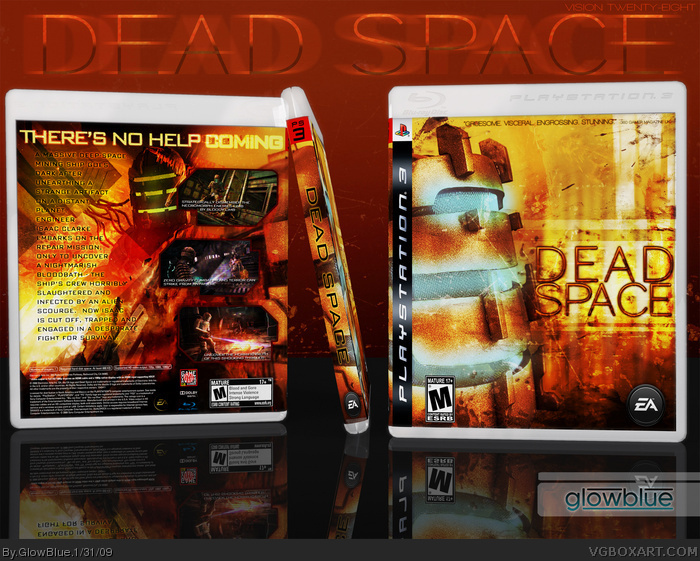
I wanted to create a Dead Space box that obviously does not follow the official "look". I think the official box is rather boring and doesn't stand out on the shelf at all. I went for something more colorful, but keeping to a theme of dark reds and orange to imply the brutal nature of this game. I was influenced heavily by the art style used in the film "Sunshine" and to some degree, "Event Horizon" since they each offer their own take on the sc-fi/horror genre.
The official box suggests the cold, calm and emptiness of space... but that's hardly what this game is about. It's loud, chaotic and living. It's filled with blood, gore and explosions with terrifyingly agile monsters around every corner. I think my peice aptly reflects the mayhem and panic felt in the gameplay and I'm quite happy with how it turned out. Hope you like it!
Favoriting it for the template alone. Brilliant idea. It gives it that casual, realistic look. I'm envious that I hadn't thought of it first. I plan on rethinking my use of presentation soon, and I hope you don't mind if I use something along these lines.
The box itself is well done, but I can't help but get that "The Hills Have Eyes" feel from it. I think it's the use of colors that create the association for me. It really gives the vibe that the game is a generic gore flick, rather than a sci-fi/horror game, but I can't argue with the backup that you gave your design. Explaining the psychological implementations of your design? You might just be my new favorite artist.
#18, By all means try new things with your presentations. I don't mind at all if you mimic my layout. I plan to try and create more natural looking presentations myself. I look forward to seeing what you come up with!
#22, Well the game is available for both platforms, so if a magazine reviews the game why does it matter which console they review it on? The quote applies to the game, not the console.
 Dead Space Box Cover Comments
Holy Shite. Its good You and Runawayred have serious talent as brothers. +fav I will fave +author fave
[ Reply ]
I wanted to create a Dead Space box that obviously does not follow the official "look". I think the official box is rather boring and doesn't stand out on the shelf at all. I went for something more colorful, but keeping to a theme of dark reds and orange to imply the brutal nature of this game. I was influenced heavily by the art style used in the film "Sunshine" and to some degree, "Event Horizon" since they each offer their own take on the sc-fi/horror genre.
The official box suggests the cold, calm and emptiness of space... but that's hardly what this game is about. It's loud, chaotic and living. It's filled with blood, gore and explosions with terrifyingly agile monsters around every corner. I think my peice aptly reflects the mayhem and panic felt in the gameplay and I'm quite happy with how it turned out. Hope you like it!
[ Reply ]
Fav just for the template
[ Reply ]
Ehh, it's alright. But it's just not really the style I'm into, I guess. I like dark/grungy.
[ Reply ]
#4, Fair enough. Perhaps then you'd like my Overlord box? link
[ Reply ]
I've never seen a box leaning against something, very innovative.
[ Reply ]
Great work Josh. I love the alternative take on the game.
[ Reply ]
Really stands out above the crowd, Wow!
[ Reply ]
Very nice! +Fav
[ Reply ]
I love the front. The back is good too, I guess the text placement could be better, but it's still good.
[ Reply ]
...wow. this is amazing! :D
[ Reply ]
I really like the presentation you've got going here. The spine view looks so much cooler when it's leaning like that. Good work :)
[ Reply ]
This should be in the HoF, I like the presentation too.
[ Reply ]
Congrats on the Hall of Fame. This is one fantastic box!
[ Reply ]
This finally got into the Hall. Definitely deserves it! :)
[ Reply ]
Congrats on the HoF Glowblue!
[ Reply ]
Thanks for the favs and feedback everyone!
[ Reply ]
Favoriting it for the template alone. Brilliant idea. It gives it that casual, realistic look. I'm envious that I hadn't thought of it first. I plan on rethinking my use of presentation soon, and I hope you don't mind if I use something along these lines.
The box itself is well done, but I can't help but get that "The Hills Have Eyes" feel from it. I think it's the use of colors that create the association for me. It really gives the vibe that the game is a generic gore flick, rather than a sci-fi/horror game, but I can't argue with the backup that you gave your design. Explaining the psychological implementations of your design? You might just be my new favorite artist.
[ Reply ]
This should have gone in a long time ago. Great work, GB. I love the template.
[ Reply ]
love the dissign its a lot better than the offical box art great work (:
Edited at 1 decade ago
[ Reply ]
#18, By all means try new things with your presentations. I don't mind at all if you mimic my layout. I plan to try and create more natural looking presentations myself. I look forward to seeing what you come up with!
Edited at 1 decade ago
[ Reply ]
Besides the fact that it has a 360 magazine quote on a PS3 box it looks incredible.
[ Reply ]
#22, Well the game is available for both platforms, so if a magazine reviews the game why does it matter which console they review it on? The quote applies to the game, not the console.
[ Reply ]
I've missed this one before
That's sad :/
Well, faved now anyway ^^
[ Reply ]