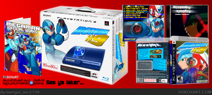
Come one, come all! R_B's last Stand! Forgot who made the 3-D template, and I'm adding a printable so you can read the text on the back. Tried using my tablet to draw the front, but that failed... so I decided to use Photoshop. And seen as how I can't color or shade in in Photoshop, I had to stoop down to using MS Paint and Paint.net and GIMP to color it in (Count 'em, 3) Enjoy, and goodbye, R_B!
Not bad! Definitely your best. I really do like everything, except for the music CD, which seems a little plain. I like the layout on the back cover, and the art book (I'm guessing that's what it is) is pretty cool as well. +fav
Also, I'm not a big fan of the plain red presentation. But that's just me. :)
Eh, its ok, nothing amazing, but it is pretty great. Few things, your back CD case is awfully lackluster, fix it up, make it eye catching. And you have an MGS4 logo at the top of your box
#9, cool your jets buster brown. You can't ever get better if you don't get help from people to MAKE it better! Sorry im not the kinda person thats like "oh wow, this is amazing! HoF!!!!1!!" no... your an ok artist, you can and will get better
EDIT: NVM, you can't get better, cause well, your leaving. Buh-bye!
Oh man, I had no idea you were leaving. -_-' Well, I've got to say you've certainly grown a lot since you've been here. And this box proves that your artistic skills have improved. Too bad we won't get to see more from you.
EDIT: #34 just a joke, calm down. As for the box it might get hof and it might deserve it but its one of those boxes that brings in the gold boxes system. This is better but please stop endlessly bumping!
#36, pasting over it with a new T is quite easy if you own photoshop, then skewing it to fit the 3D box.
And if I had got photoshop three years ago, my rank would be higher, but I never; you want a HoF, don't you?
Then anything will help you right now, no?
#47, I agree, there are many flaws. The PS3 looks poorly made, the Capcom and Megaman renders look low in quality and they don't look like an actual paint job. The PS3 box needs some perspective adjustments. The album cover is very plain and the back needs work. The Box Art is good, but the official works box looks kinda plain too mate.
#56, Does it really yeah it is his best but the box is just ok i don't like the cd and the back of the box is bad and so is the PS3 its self it is his best through
#4, Goodbye :(. You were one of my favs here. Well, it was nice knowing you. As for the box, It's great. Very neat, very artistic, and very evidence showing... 6/5: (5/5 for box + 1/5 for sympathy = fav!) See ya, R_B.
No, Really? I mean, just look how poor the presentation is. Look at the way everything clashes. Look at the lack of actual image editing. The only I see is a colorize, a motion blur, and a flick of the transparency slider. Every thing else is just slapped on.
 Mega Man X9 PS3 Bundle Box Cover Comments
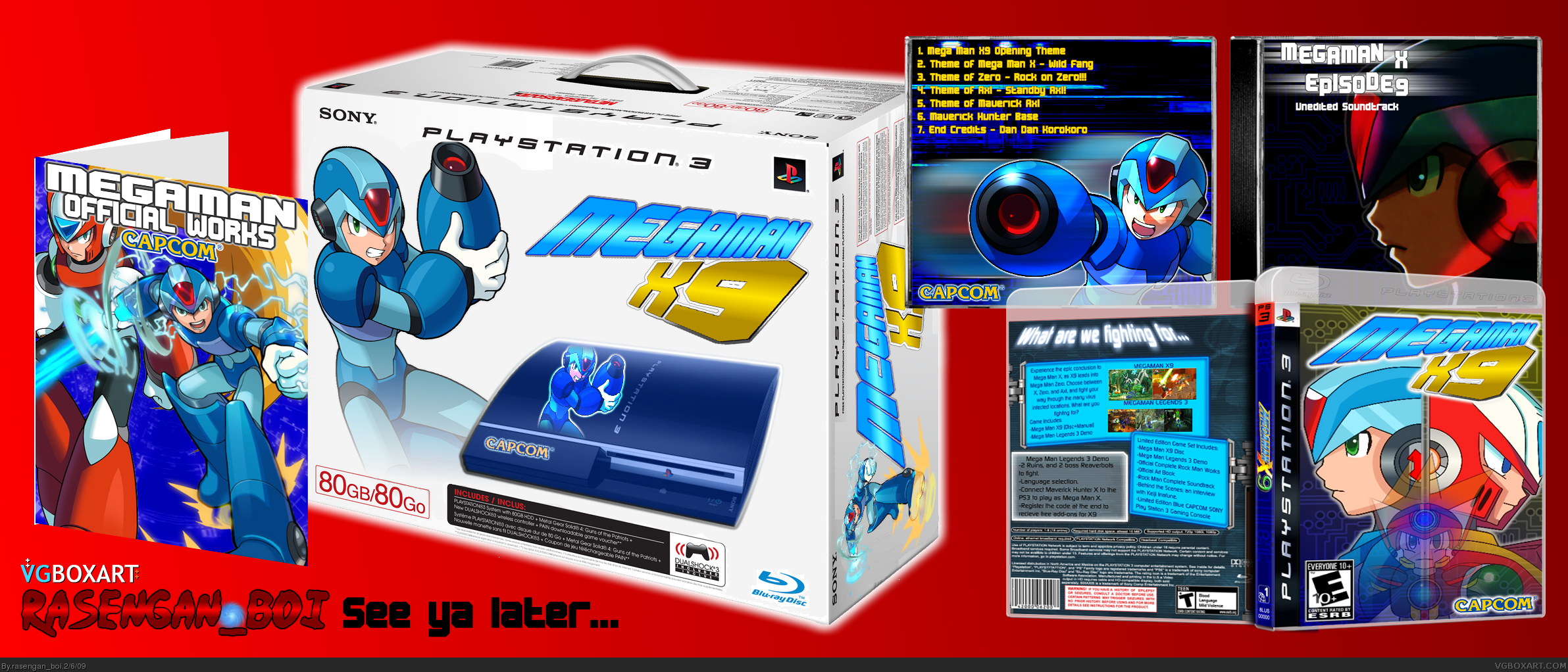
Come one, come all! R_B's last Stand! Forgot who made the 3-D template, and I'm adding a printable so you can read the text on the back. Tried using my tablet to draw the front, but that failed... so I decided to use Photoshop. And seen as how I can't color or shade in in Photoshop, I had to stoop down to using MS Paint and Paint.net and GIMP to color it in (Count 'em, 3) Enjoy, and goodbye, R_B!
Edited at 1 decade ago
[ Reply ]
Not bad! Definitely your best. I really do like everything, except for the music CD, which seems a little plain. I like the layout on the back cover, and the art book (I'm guessing that's what it is) is pretty cool as well. +fav
Also, I'm not a big fan of the plain red presentation. But that's just me. :)
Edited at 1 decade ago
[ Reply ]
I see a lot of effort here, but that red background is really going to kill me. Outside of that, I don't see much else wrong.
[ Reply ]
Not one good bye?
[ Reply ]
#4, If you are leaving, goodbye I guess. This is a good way to exit though, you improved alot with this last box.
Edited at 1 decade ago
[ Reply ]
#5, mm, I can post 'em on Deviant Art, just a lot of people here ignore me...
[ Reply ]
This is so freaking good. Do you have to leave?
[ Reply ]
Eh, its ok, nothing amazing, but it is pretty great. Few things, your back CD case is awfully lackluster, fix it up, make it eye catching. And you have an MGS4 logo at the top of your box
[ Reply ]
#8, Sunuva...
[ Reply ]
The CD case looks slapped in. It needs text work on the back. The back of the actual game case looks decent but the text looks plain and unappealing.
[ Reply ]
#9, cool your jets buster brown. You can't ever get better if you don't get help from people to MAKE it better! Sorry im not the kinda person thats like "oh wow, this is amazing! HoF!!!!1!!" no... your an ok artist, you can and will get better
EDIT: NVM, you can't get better, cause well, your leaving. Buh-bye!
Edited at 1 decade ago
[ Reply ]
#9, That doesn't seem like the mature way to react to criticism. -_-
[ Reply ]
#12, I wasn't saying that to Brettska, I was saying that because I forgot to take it out...
Fix'd
Edited at 1 decade ago
[ Reply ]
First time in a 150 boxes I actually see a good improvement, but then you leave when you finally make something pretty good, makes me sad face.
Good box though, whats your deviantart?
[ Reply ]
#14, ...
link
There will be more boxes, I didn't post much before because I had this site, but now...
Edited at 1 decade ago
[ Reply ]
If you leave, one of my fav. authors will be gone. And you can't do that to little Dante!!
[ Reply ]
#16, check out the link above, my deviant art.
[ Reply ]
OK, made an account so I can check out ya boxes! And, BTW, are you 12? Doesn't this site haves that Coppa thing of 13 age required?
[ Reply ]
#18, I'm 13, turning 14 in March
[ Reply ]
GOOD BYE :(
[ Reply ]
#8, Agreed, its also weird how MGS4 is included in the box too, (in the box details right there on the front)
[ Reply ]
Oh well, I suppose this is a goodbye then. I can clearly see you don't wanna leave from your comments though. So I give you a week! =P
[ Reply ]
#22, Agreed
[ Reply ]
Freaking amazing. Don't go man, look at how much you can achieve.
[ Reply ]
Goodbye. =(
It's been nice knowing you.
At the box, Your best. I can see the effort you put into there. You got a fav from me.
[ Reply ]
I like the game cover, but the rest is not that good.
Well, have a good time with whatever you're going to do, and try to return soon ;)
[ Reply ]
Oh man, I had no idea you were leaving. -_-' Well, I've got to say you've certainly grown a lot since you've been here. And this box proves that your artistic skills have improved. Too bad we won't get to see more from you.
[ Reply ]
I'll still comment, I just won't make any boxes. I'm also leaving because I feel that I'm not mature enough for the site, and leaving until I am.
[ Reply ]
This is definatly your best! ;) hopefully this will be your first HoF
[ Reply ]
#30, first, and possibly last
[ Reply ]
Your front PS3 box has a E10 but the back has a T.
Please fix that, otherwise, this is pretty, erm, brilliant.
[ Reply ]
you'll come crawling back...
EDIT: #34 just a joke, calm down. As for the box it might get hof and it might deserve it but its one of those boxes that brings in the gold boxes system. This is better but please stop endlessly bumping!
Edited at 1 decade ago
[ Reply ]
#33, who are you to say? you haven't been here long enough or know me enough to say that.
[ Reply ]
Hmmm, when I tilt my laptop screen, I see how horribly cut out the PS3 box icons are.
However, fix your PS3 boxart and I will treat you with a fav.
[ Reply ]
#35, A fav from you wouldn't be much of a prize, and the thing is, I can't fix it.
[ Reply ]
#36, pasting over it with a new T is quite easy if you own photoshop, then skewing it to fit the 3D box.
And if I had got photoshop three years ago, my rank would be higher, but I never; you want a HoF, don't you?
Then anything will help you right now, no?
Edited at 1 decade ago
[ Reply ]
Lets get this in HoF,its good enough.
[ Reply ]
Fixed the Teen logo
[ Reply ]
I love mega man!! VIRTUAL HI FIVE!!!
but srsly, nice box man! Please don't leave :(
[ Reply ]
Amazing, just simply amazing
too bad you are leaving though
[ Reply ]
This is definately your best box so far, deserves the HoF. +fav
Edited at 1 decade ago
[ Reply ]
Your Best Box By Far! +fav
[ Reply ]
This is awesome! Fav.
[ Reply ]
#44, I agree :D
[ Reply ]
cool dude , definitely your best ! the only thing i dont like is the transparent drawing of axel in the box
[ Reply ]
This is overrated, it simply is. I don't wanna sound like I'm bitching, but I think people are faving just for the content.
Various flaws though, bundle has MGS4 description on the bottom, not too fond of the PS3.
[ Reply ]
good, HOF soon 5/5 +fav
[ Reply ]
#47, I agree, there are many flaws. The PS3 looks poorly made, the Capcom and Megaman renders look low in quality and they don't look like an actual paint job. The PS3 box needs some perspective adjustments. The album cover is very plain and the back needs work. The Box Art is good, but the official works box looks kinda plain too mate.
You guys shouldn't fav just because he's leaving.
Edited at 1 decade ago
[ Reply ]
nice ^_^
[ Reply ]
No HoF?
[ Reply ]
#51, no HoF.
:(
[ Reply ]
Congrats on rank 7!
[ Reply ]
even though I don't particularly think this deserves the hall I feel sorry for r_b that after 37 favs it didn't get in so...bump
[ Reply ]
#21 you guys must have laser vision or something...
[ Reply ]
This is bloody stupid! It deserves the HoF!
[ Reply ]
#56, Does it really yeah it is his best but the box is just ok i don't like the cd and the back of the box is bad and so is the PS3 its self it is his best through
[ Reply ]
Dang it,Let the box be. If it doesn't get HoF,It's for a reason. No need for bumps like "DIS DESERVES HOF!!!"
[ Reply ]
#58, agreed.
[ Reply ]
#59, Agreed? Your loving every second of it.
[ Reply ]
#60, I have new boxes, I want to leave this to die, and look forward.
[ Reply ]
#4, Goodbye :(. You were one of my favs here. Well, it was nice knowing you. As for the box, It's great. Very neat, very artistic, and very evidence showing... 6/5: (5/5 for box + 1/5 for sympathy = fav!) See ya, R_B.
[ Reply ]
#62, little late...
[ Reply ]
#63, I know. Sorry
Edited at 1 decade ago
[ Reply ]
#63 How late is he if you haven't left?
[ Reply ]
#65, I stated that several weeks ago
[ Reply ]
#66, I just seen the box. :)
Congrats on HoF!
Edited at 1 decade ago
[ Reply ]
SLAP ME SIDEWAYS WITH EXTRA YAOI SAUCE! MY 150TH BOX IS MY FIRST HOF!
[ Reply ]
#68, Yaoi sauce? lol, that's new. Anyway, congrats again.
[ Reply ]
I have 2 Hall of Fames... bumped out of my own competition...
[ Reply ]
#70, 2/152 HOFs Congrats.
[ Reply ]
#71, thank you. lol
[ Reply ]
Congrats!
[ Reply ]
Really?...Really?...
Edited at 1 decade ago
[ Reply ]
#74, Really?... (Just thought 3 was the magic number here)
#68, I'm still lost with the yaoi sauce comment... lol
[ Reply ]
Congrats!
[ Reply ]
No, Really? I mean, just look how poor the presentation is. Look at the way everything clashes. Look at the lack of actual image editing. The only I see is a colorize, a motion blur, and a flick of the transparency slider. Every thing else is just slapped on.
Edited at 1 decade ago
[ Reply ]
Awesome, but i found a mistake :D! At the bottom, it says: "Including Metal Gear Solid 4"
But beside that, really awesome, 8.8 +fav
[ Reply ]
yo that's tight!
[ Reply ]
Not all that good, but considering the effort which looks like you put into it... fav+
[ Reply ]
You know... looking at his work, I doubt he was stupid enough to make an alt...
[ Reply ]