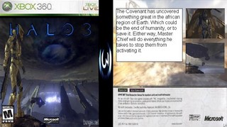
right then, lets start with the the right side of the pic. There is bad grammar in the white box and its white which is always bad.
The middle of the box does not have the 360 logo at the top and the logo that is there is pixlated. The final part is also pixelated with the h3 logo covering his face and the two logos at the bottom being boxed.
To finish things off it the wrong way around.
I am not in any way saying stop trying....I am saying get better. Trust me, inn my first week at the site I was arguably worst than you. Yet thankfully back then you could delete your work.
 Halo 3 Box Cover Comments
The blurb on the back is hilariously awesome.
[ Reply ]
I'm sorry but its terrible
[ Reply ]
Its so bad, its good.
[ Reply ]
1. Its a paint job
2. the back and spine arent 360
3. the cover is backwards.
(Back is suppose to be on the left)
4. Its just plain bad.
[ Reply ]
that desription on the back doesn't make alot of sense :S
[ Reply ]
right then, lets start with the the right side of the pic. There is bad grammar in the white box and its white which is always bad.
The middle of the box does not have the 360 logo at the top and the logo that is there is pixlated. The final part is also pixelated with the h3 logo covering his face and the two logos at the bottom being boxed.
To finish things off it the wrong way around.
I am not in any way saying stop trying....I am saying get better. Trust me, inn my first week at the site I was arguably worst than you. Yet thankfully back then you could delete your work.
-Lodovicok
[ Reply ]
AHAHAHAHAHAHAHAHAHAHAHAHAHAHAHAH enough said...........
[ Reply ]
this has got to be the greatest box ever made.
ever.
[ Reply ]
Wow... a square box for an Xbox game... is this something new? [/sarcasm]
[ Reply ]
its the wrong way around isnt it? shouldnt the front cover be on the right? or is that me?
[ Reply ]
the so called "front" picture is too smushed up and the temp is too blurry ood try though
[ Reply ]