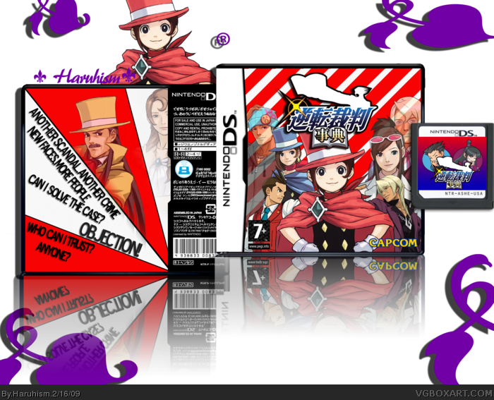
My latest box My best yet It has taken me 5 days to make I'm really proud of it I'm hoping that this could be my first Hof :) View in full for best quality!
#1, HoF? I doubt it. On the front, the background is really repetitive and has colors that are really annoying. The back isn't amazing; the background is also annoying, and the gradient separating the white scalene triangle from the man with the mustache looks unnecessary. Also, the text on the back should each be on on side of a triangle and "Objection!" should at least have some sort of blur; something that will make it look like it's being shouted.
The back is too plain but overall, this box is pretty great! I love the presentation and everything looks stylish! Compare this to your earlier boxes (like link and its clear to see you have improved alot. Well done.
You really are improving quite a bit! I agree with #8 about the back design, but I still think it's an interesting composition. Keep at it, for you to improve this much it must mean you have a real passion for this kind of thing, and a good knack for it as well.
#13, It could have been because he hasn't or didn't credit anything because Cerium asked for the logo credits in sonic twilight edition (don't know if Cerium made it) so that might be the answer for that one!
 Pheonix Wright Next Generation Box Cover Comments
My latest box My best yet It has taken me 5 days to make I'm really proud of it I'm hoping that this could be my first Hof :) View in full for best quality!
Edited at 1 decade ago
[ Reply ]
its not lastest its latest...
[ Reply ]
#2 Oh sorry anything else about the box not my spelling .
[ Reply ]
#1, HoF? I doubt it. On the front, the background is really repetitive and has colors that are really annoying. The back isn't amazing; the background is also annoying, and the gradient separating the white scalene triangle from the man with the mustache looks unnecessary. Also, the text on the back should each be on on side of a triangle and "Objection!" should at least have some sort of blur; something that will make it look like it's being shouted.
[ Reply ]
#4 Oh I understand and good things about it?
[ Reply ]
This is great! Really well done, massive improvement!
[ Reply ]
The back isn't great, but I can see how much work you've put in this, and how much you've improved, so I'll fave. Keep up the good work :)
[ Reply ]
The back is too plain but overall, this box is pretty great! I love the presentation and everything looks stylish! Compare this to your earlier boxes (like link and its clear to see you have improved alot. Well done.
[ Reply ]
You really are improving quite a bit! I agree with #8 about the back design, but I still think it's an interesting composition. Keep at it, for you to improve this much it must mean you have a real passion for this kind of thing, and a good knack for it as well.
[ Reply ]
This would look way better with Japanese text on the back and the right rating logo
[ Reply ]
For the back, one 'segment' should be full of screenshots, one with a tagline in, and one with text about the game. Give it a try.
[ Reply ]
Thanks guys!
[ Reply ]
Why was haruhiism banned?
[ Reply ]
Yeah I don't know either...
[ Reply ]
#13, It could have been because he hasn't or didn't credit anything because Cerium asked for the logo credits in sonic twilight edition (don't know if Cerium made it) so that might be the answer for that one!
[ Reply ]
#2, he said latest
[ Reply ]
japanese logo, japanese template, english synopsis?
[ Reply ]