[ Buy Halo 3 at Amazon ] By Radioactive Bob 38 on June 7th, 2006 No Printable Available [ Box updated on June 9th, 2006 ] [ original ] Halo 3 Box Cover Comments Comment on Radioactive Bob's Halo 3 Box Art / Cover. Cancel Reply Radioactive Bob 38 [ 1 decade ago ] Just made this one. Took a while actually. Any comments would be appreciated. [ Reply ] shakensparco 1 [ 1 decade ago ] if that is cortana there in the background, it kinda obscures everything I think... Oh wait that's the covenent city High Charity... [ Reply ] shakensparco 1 [ 1 decade ago ] I think too much is going on [ Reply ] shakensparco 1 [ 1 decade ago ] But it is still pretty sweet. good work [ Reply ] Radioactive Bob 38 [ 1 decade ago ] #4 thanks! With all the Halo 3 box art, i didn't think anybody would like it. But i will still try and make it look a little less crowded. [ Reply ] Lodovicok 27 [ 1 decade ago ] lol....same pic i used.....nice job except there is way to much going on [ Reply ] Radioactive Bob 38 [ 1 decade ago ] Everbody wanted this to look a litle less crowded, so i scaled down High Charity and made it more faint. Hope you like it. [ Reply ] Lodovicok 27 [ 1 decade ago ] please just take it away [ Reply ] shakensparco 1 [ 1 decade ago ] make the chief brighter so he is the most noticable by far [ Reply ] Ahazi 1 [ 1 decade ago ] I think it looks okay with High Charity there, But as #9 stated, you need to make the chief lighter. Is that a Real city background there? [ Reply ] Ahazi 1 [ 1 decade ago ] Infact, if you got rid of high charity, and made the chief lighter, then it would almost be an exact copy of lodovicok's [ Reply ] Radioactive Bob 38 [ 1 decade ago ] #11 which is what i DON'T want. (a copy of lodo's) [ Reply ] Radioactive Bob 38 [ 1 decade ago ] You all wanted the Chief brighter. I think it's too bright. Opinions? [ Reply ] [Deleted] [ 1 decade ago ] The Big "3" Logo Is Too Bright [ Reply ]

 Halo 3 Box Cover Comments
Just made this one. Took a while actually. Any comments would be appreciated.
[ Reply ]
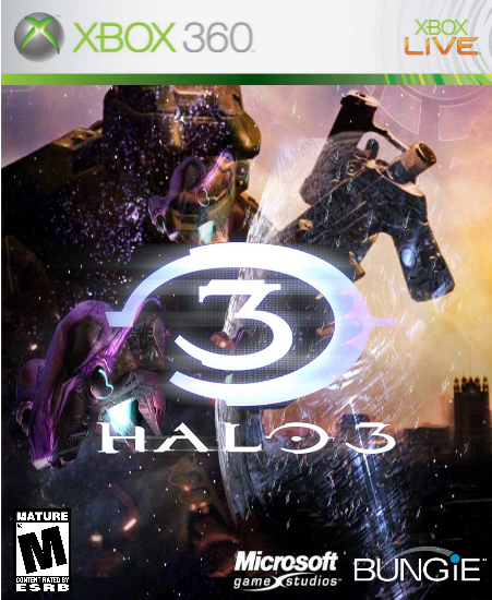
if that is cortana there in the background, it kinda obscures everything I think... Oh wait that's the covenent city High Charity...
[ Reply ]
I think too much is going on
[ Reply ]
But it is still pretty sweet. good work
[ Reply ]
#4 thanks! With all the Halo 3 box art, i didn't think anybody would like it. But i will still try and make it look a little less crowded.
[ Reply ]
lol....same pic i used.....nice job except there is way to much going on
[ Reply ]
Everbody wanted this to look a litle less crowded, so i scaled down High Charity and made it more faint. Hope you like it.
[ Reply ]
please just take it away
[ Reply ]
make the chief brighter so he is the most noticable by far
[ Reply ]
I think it looks okay with High Charity there, But as #9 stated, you need to make the chief lighter. Is that a Real city background there?
[ Reply ]
Infact, if you got rid of high charity, and made the chief lighter, then it would almost be an exact copy of lodovicok's
[ Reply ]
#11 which is what i DON'T want. (a copy of lodo's)
[ Reply ]
You all wanted the Chief brighter. I think it's too bright. Opinions?
[ Reply ]
The Big "3" Logo Is Too Bright
[ Reply ]