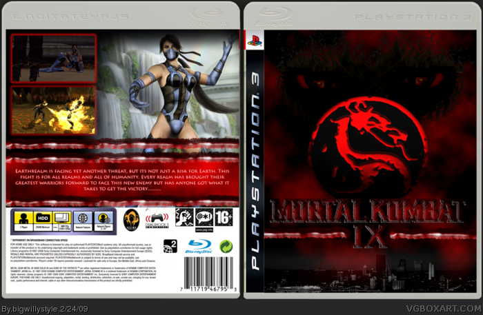
#2, i dont like the pic of the woman (i dont know mortal kombat so i dont know her name), it doesnt look like it would appear on the back of a box, and i dont like the border of the screenshots.
And stop loling i HATE this!! ;)
Well, it looks like a big screenshot, i dont know, i dont like the 3d-look at the back, you should try a mighty wallpaper, i think. And i think every game should have a kind of motto on the back. For example, "Unleash the best" (Sonic unleashed), "Explore the ocean stars..." (Star ocean: the last hope). You know what i mean? Do you have any games at home? Look at the back of the boxes you will find a motto at the top of every back.
#6, Stop giving out shitty advice. Just because it's common to have a slogan for a game on the back doesn't mean one is necessary in any way.
The screenshot borders are somewhat typical, but there's nothing wrong with that. They look fine for the style you're going for. I like the summary on the back, I think you did well with the red tears. You should know, though, that it's grammatically improper to use more than three periods for ellipses.
You should try to take it easy on the filters for the front of the box. It's easy to get carried away, and it's hard to learn when to use what. It's obvious you put a lot of effort into it, and it shows. It's a lot better than a lot of boxes I've seen submitted by newer users.
 Mortal Kombat 9 Box Cover Comments
I dont like the back, the front is awesome, all in all it is 7.5/10
[ Reply ]
why don't you like the back??? give me feed back lol
anyone else wish to comment?
[ Reply ]
the rating on the front is missing, other than that, this box looks pretty good :)
[ Reply ]
#2, i dont like the pic of the woman (i dont know mortal kombat so i dont know her name), it doesnt look like it would appear on the back of a box, and i dont like the border of the screenshots.
And stop loling i HATE this!! ;)
[ Reply ]
4 that is Kitana and i put her on the back because she is one of my favorite MK characters. Whats wrong with the borders they look fine.
[ Reply ]
Well, it looks like a big screenshot, i dont know, i dont like the 3d-look at the back, you should try a mighty wallpaper, i think. And i think every game should have a kind of motto on the back. For example, "Unleash the best" (Sonic unleashed), "Explore the ocean stars..." (Star ocean: the last hope). You know what i mean? Do you have any games at home? Look at the back of the boxes you will find a motto at the top of every back.
[ Reply ]
#6, Stop giving out shitty advice. Just because it's common to have a slogan for a game on the back doesn't mean one is necessary in any way.
The screenshot borders are somewhat typical, but there's nothing wrong with that. They look fine for the style you're going for. I like the summary on the back, I think you did well with the red tears. You should know, though, that it's grammatically improper to use more than three periods for ellipses.
You should try to take it easy on the filters for the front of the box. It's easy to get carried away, and it's hard to learn when to use what. It's obvious you put a lot of effort into it, and it shows. It's a lot better than a lot of boxes I've seen submitted by newer users.
[ Reply ]
7 would you mind commenting on my updated version of this box. I have improved with a couple of bits ..........see what you think
[ Reply ]
KOJIMA PRODUCTIONS?
[ Reply ]