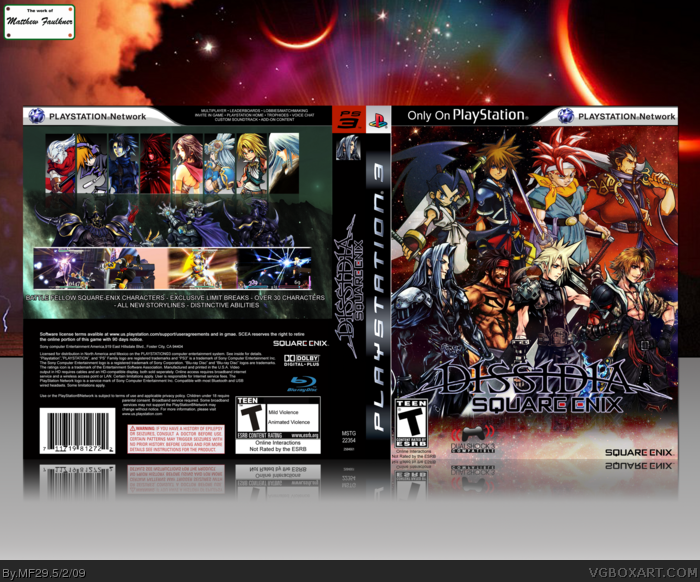
A couple of spotty art choices, the Riku art and the pixelated version of the Vincent art. Could have used some Enix characters (Dragon Quest, Star Ocean, and so on.)
Big thumbs up for Brave Fencer Musashi and Neku. I could see this on a Super Smash Bros. level with the fan service.
Turned out really well. Not too sure why the characters on the front are facing the same direction...would have achieved a better effect if you faced them against each other. Otherwise, great job!
It's fairy easy to do, you just copy-pasted alot of SquareSoft characters in 2 rows, and some of them are streched out abit, so I don't like the front much, but the back's pretty good.
#14, at first that was my direction, but some of the character's weapons/stances conflicted with that placement. It had their swords and arms sticking out in the middle, I couldn't find a proper way to cover it up, I understand what you are saying though. Good stuff.
#16, right, but I thought the back was actually one of my better backs. I felt that adding a description would've probably made the box look worse, because of my poor sense of font choice.
I appreciate the people who provided the resources and inspiration, and the people who commented and favorited, hopefully I will continue to upload HoF material. Much appreciated mates.
 Dissidia: Square-Enix Box Cover Comments
Credit:
vividamage123 for general direction
Sens for 3D plastic
master_general for 300dpi template
[ Reply ]
Niiiice. This should be your first HoF.
[ Reply ]
All I can say is that I have fell in love.
Definite favourite.
[ Reply ]
Oh wow, this is beautiful
[ Reply ]
Lions, Tigers, and Dissidia.
Oh my.
[ Reply ]
This HAS to get into the HoF! Definately your best box so far. +fav
[ Reply ]
That's awesome and something I would definitely want to happen :S
[ Reply ]
Nice one.. front looks great. Could have done more in terms of description/story for back, but nice work ;)
[ Reply ]
I love it!
[ Reply ]
Very cool. Would have loved to see Ash from Vagrant Story on the roster. ;)
[ Reply ]
Nice!
[ Reply ]
A couple of spotty art choices, the Riku art and the pixelated version of the Vincent art. Could have used some Enix characters (Dragon Quest, Star Ocean, and so on.)
Big thumbs up for Brave Fencer Musashi and Neku. I could see this on a Super Smash Bros. level with the fan service.
Nice.
[ Reply ]
Incredible man. This must go into the HOF.
[ Reply ]
Turned out really well. Not too sure why the characters on the front are facing the same direction...would have achieved a better effect if you faced them against each other. Otherwise, great job!
[ Reply ]
Same what LK said :)
[ Reply ]
It's fairy easy to do, you just copy-pasted alot of SquareSoft characters in 2 rows, and some of them are streched out abit, so I don't like the front much, but the back's pretty good.
[ Reply ]
This was destined to be HoF since you posted it on the forum.
Very well done, sir.
[ Reply ]
#8, indeed mate.
#14, at first that was my direction, but some of the character's weapons/stances conflicted with that placement. It had their swords and arms sticking out in the middle, I couldn't find a proper way to cover it up, I understand what you are saying though. Good stuff.
#16, right, but I thought the back was actually one of my better backs. I felt that adding a description would've probably made the box look worse, because of my poor sense of font choice.
I appreciate the people who provided the resources and inspiration, and the people who commented and favorited, hopefully I will continue to upload HoF material. Much appreciated mates.
Edited at 1 decade ago
[ Reply ]
#18, Congrats on first hall, i thought this would have happened a while ago, Great job man!
[ Reply ]
Sh!t. How'd I miss this?! This is more than amazing! Plus it has Crono on it!
[ Reply ]
awesome!
[ Reply ]
I just looooooove crossovers, and this is awesome!
[ Reply ]