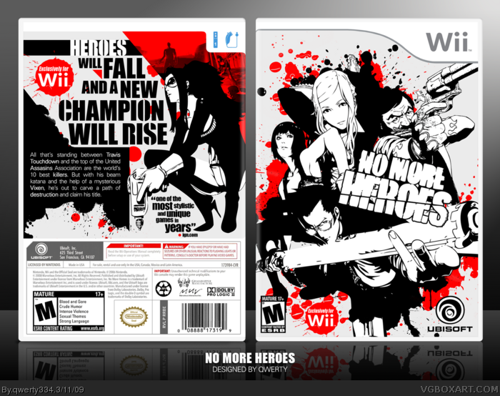
In an effort to learn all of the varied styles of boxart design, I have once again changed my style completely. This time, it's the slash-em-up action/adventure game No More Heroes.
It was all about a bold (almost pseudo-MadWorld) color scheme, clean vectors, and a wild yet still navigatible composition, and I definitely got what I was going for in the end. Please view in full, or better yet, the printable for better quality/detail. Enjoy!
i like this very much. i think you should make this a limited edition or something like that. as the back gives that feeling with no screenshots. but other than that i find this very refreshing and has a great layout.
p.s i know my fav wont count to much but it does deserve it .
Thanks guys. :)
#3, Nah, I wanted to keep it official-looking. Besides, it gives much needed color contrast.
#9, It does have screenshots hidden in the design. Try and find them. ;)
 No More Heroes Box Cover Comments
In an effort to learn all of the varied styles of boxart design, I have once again changed my style completely. This time, it's the slash-em-up action/adventure game No More Heroes.
It was all about a bold (almost pseudo-MadWorld) color scheme, clean vectors, and a wild yet still navigatible composition, and I definitely got what I was going for in the end. Please view in full, or better yet, the printable for better quality/detail. Enjoy!
P.S. Credit Techne for the great template. :)
[ Reply ]
Wonderful job. Love the style, simplistic colors and composition and can't see anything wrong with it. =)
Edited at 1 decade ago
[ Reply ]
I like the way the back turned out.
Lol, make the Wii controllers red! :p
Edited at 1 decade ago
[ Reply ]
Absolutely gorgeous in every way.
[ Reply ]
Excellent job converting the colour renders to black and white.
[ Reply ]
You, my friend, get super-duper-mega-ultra-bonus points for you and this box being awesome. +Fav +Author Fav
[ Reply ]
This box is bush league.
[ Reply ]
Amazing, great job my friend
[ Reply ]
i like this very much. i think you should make this a limited edition or something like that. as the back gives that feeling with no screenshots. but other than that i find this very refreshing and has a great layout.
p.s i know my fav wont count to much but it does deserve it .
[ Reply ]
Thanks guys. :)
#3, Nah, I wanted to keep it official-looking. Besides, it gives much needed color contrast.
#9, It does have screenshots hidden in the design. Try and find them. ;)
[ Reply ]
*tear rolls down face* Truly a masterpiece *claps*
[ Reply ]
Congrats! This f***ing rules!
[ Reply ]
Congrats on Hall of FAme!
[ Reply ]
Holy....
[ Reply ]
Epic...thats all can think of beacuse it's too awesome.
Edited at 1 decade ago
[ Reply ]