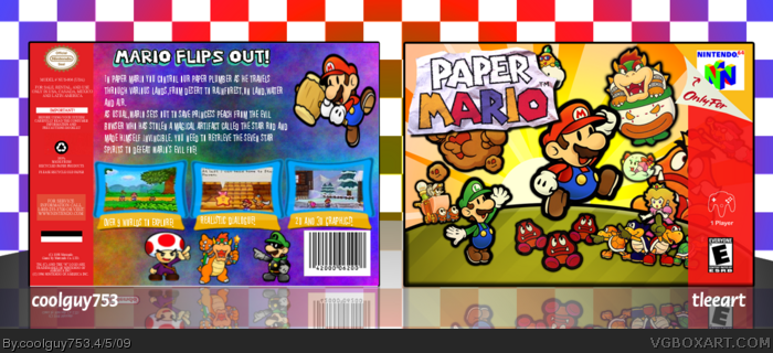
Ok so latest box. This is a collab with tleeart so huge credits to him. He uploaded his own version with that front but with his own back, I sent an idea to him and said what about n64? So he sent a couple of games and I chose paper mario and it started there. The template is from vgba simple needs but had no name on so noone to credit as far as I know. My 1st n64 box and I'd just like to say it was an honour and great fun working with tleeart,I personally loved this game so great to post a box for it. Open to criticism.
So yeah,enjoy!
EDIT: #1, I understand that but could you at least critique it?
i mean on the back, the screens, and renders are kinda blurry. the rest is okay and the front's not blurry at all. as for the font choice...idk. something better i guess. :P oh and not cursive. lol
Massive update:
I changed the screenborders,tagline and text. Also changed the colour of the background abit. Sorry but don't know what to do about blurryness as I didn't see any.
Credit to Ninty for the screenborders.
EDIT: #10, Yeah the tagline is a little choppy but seriously it would take ages to render off that top bit. Anyway I'm sorry but I still don't see any blurryness on the renders, so can't really fix, sorry lol.
much better but still a little flawed like the tagline is a bit choppy at the top, and as for the blurryness, i still say the bottom renders on the back are a bit. if you compare them to the ones on the front then you can definitely tell that they're a bit blurry. lol
While it looks better I still don't like font of the description itself, I suggest that you use something normal like arial or georgia instead. I'm also not really fond of the background on the back, doesn't feel quite "Mario" if you know what I am talking about. I think it would have looked better with a faded mario-world or something like that.
#12, I disagree. I really like the background I made, maybe it differs too much from the front I don't know but I think it fits in with the style. If others also say what you said I will change it. I think that the cartoony style text fits in where as a plain font wouldn't really work. But on the actual screenborders I'll change the font there as I don't think it works as well as the summary but thanks for your critique :)
#11, Thanks!
The font for the description looks absolutely terrible, how about trying Whimsy? (if you have it)And the Mario on the back is squished. Nice choice of screen-borders though. Also, the back doesn't resemble the front in any way, you want to keep the color scheme and the theme of the box constant. tleeart's front has characters running around in a Meadow. Your back has characters placed on a colorful background, they don't really match.
Your getting there. A few more tweaks here and there, and you'll have a good box on your hands.
Sorry for late replies guys,this box is on the laptop so I won't be able to update for abit but:
#14, Thanks,I have downloaded whimsy and I will take into consideration what you and whoomp said about the background.
#15, Thanks!
#16, What do you suggest to replace/improve it?
 Paper Mario Box Cover Comments
The back is horrid.
[ Reply ]
Ok so latest box. This is a collab with tleeart so huge credits to him. He uploaded his own version with that front but with his own back, I sent an idea to him and said what about n64? So he sent a couple of games and I chose paper mario and it started there. The template is from vgba simple needs but had no name on so noone to credit as far as I know. My 1st n64 box and I'd just like to say it was an honour and great fun working with tleeart,I personally loved this game so great to post a box for it. Open to criticism.
So yeah,enjoy!
EDIT: #1, I understand that but could you at least critique it?
Edited at 1 decade ago
[ Reply ]
#1, agreed. the screenborders are strange, the tagline is terrible looking, use a different text, overall pretty blurry.
as for the front, well that's amazing but you didn't make it. :/
[ Reply ]
#3, I'll change borders and tagline. What font do you reccomend? And it doesn't look blurry at all to me, even in full view.
[ Reply ]
#3, what? He didn't make it? o.ô
Nice, but Mari and that Toad is scretched.
4/5 Awesome front.
[ Reply ]
i mean on the back, the screens, and renders are kinda blurry. the rest is okay and the front's not blurry at all. as for the font choice...idk. something better i guess. :P oh and not cursive. lol
[ Reply ]
#5, No, he didn't. I did, and I gave him permission to submit it. It's allowed.
[ Reply ]
Very nice box, so +fav :)
[ Reply ]
Massive update:
I changed the screenborders,tagline and text. Also changed the colour of the background abit. Sorry but don't know what to do about blurryness as I didn't see any.
Credit to Ninty for the screenborders.
EDIT: #10, Yeah the tagline is a little choppy but seriously it would take ages to render off that top bit. Anyway I'm sorry but I still don't see any blurryness on the renders, so can't really fix, sorry lol.
Edited at 1 decade ago
[ Reply ]
much better but still a little flawed like the tagline is a bit choppy at the top, and as for the blurryness, i still say the bottom renders on the back are a bit. if you compare them to the ones on the front then you can definitely tell that they're a bit blurry. lol
[ Reply ]
looks great!
[ Reply ]
While it looks better I still don't like font of the description itself, I suggest that you use something normal like arial or georgia instead. I'm also not really fond of the background on the back, doesn't feel quite "Mario" if you know what I am talking about. I think it would have looked better with a faded mario-world or something like that.
[ Reply ]
#12, I disagree. I really like the background I made, maybe it differs too much from the front I don't know but I think it fits in with the style. If others also say what you said I will change it. I think that the cartoony style text fits in where as a plain font wouldn't really work. But on the actual screenborders I'll change the font there as I don't think it works as well as the summary but thanks for your critique :)
#11, Thanks!
Edited at 1 decade ago
[ Reply ]
The font for the description looks absolutely terrible, how about trying Whimsy? (if you have it)And the Mario on the back is squished. Nice choice of screen-borders though. Also, the back doesn't resemble the front in any way, you want to keep the color scheme and the theme of the box constant. tleeart's front has characters running around in a Meadow. Your back has characters placed on a colorful background, they don't really match.
Your getting there. A few more tweaks here and there, and you'll have a good box on your hands.
[ Reply ]
Awesome, it's a nice collab, and I don't really have any gripes over it.
[ Reply ]
Too much space left on the back.
[ Reply ]
Sorry for late replies guys,this box is on the laptop so I won't be able to update for abit but:
#14, Thanks,I have downloaded whimsy and I will take into consideration what you and whoomp said about the background.
#15, Thanks!
#16, What do you suggest to replace/improve it?
[ Reply ]
The front - AMAZING!
The back - not so much
I think this would be in the hall if the back wasn't so streched! 4/5 for a spectacular front!
[ Reply ]