
[ Box updated on March 24th, 2009 ] [ original ]
 Star Wars: The Force Unleashed Box Cover Comments
Comment on sacredgabz's Star Wars: The Force Unleashed Box Art / Cover.
[ Box updated on March 24th, 2009 ] [ original ]
Comment on sacredgabz's Star Wars: The Force Unleashed Box Art / Cover.
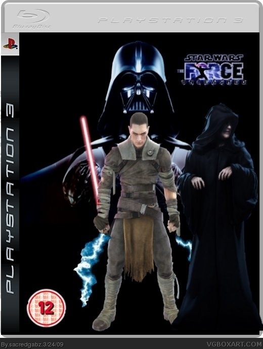
Not bad but the guy in front just dont fit in there 7/10
[ Reply ]
Background is bland guy is too light there are no devs.Also they are all floating the logo needs to be centered and bigger 12 is too small hooded guy is out the temp Darth Vader is streched and lightning is choppy.1/5.
Edited at 1 decade ago
[ Reply ]
kinda boring and all the black looks cool but then suddleny the guy infront ruins it. You could do much better :) would be cool if the logo was behind darth vader and maybee a death star in the background :)?
[ Reply ]
do you mean the emperor
[ Reply ]
#4, yeah
[ Reply ]
Right its updated
[ Reply ]
Both very awful.
[ Reply ]
#7, thanks thats relly nice!
[ Reply ]
Guy is still floating
Tie Fighter is choppy
Vader is still strechedand spacey bacground dosn't cover entire temp
sorry dude.Keep trying!
[ Reply ]
By the way Vader hasn't been stretched
[ Reply ]
#8, dont cry.
I have the reputatation of the most heartless user on this side.
#10, thats funny. he is so streched i have to bleed out of my eyes.
[ Reply ]
11 - Bleeding out of the eyes is painful :P
And I'm already positive that sacredgabz is under-age. Why can't people follow rules?
[ Reply ]
#12- xDD yes, very painful :p thats why i close my eyes if i open this site
[ Reply ]
#12, what? I'm 19, so bugger off
[ Reply ]
#14, sorry but you dont have talent for designing. it isnt meant as an offend, but please stop making this boxes.
[ Reply ]
U know what, I should stop
[ Reply ]
#16, thanks :)
[ Reply ]