Booo. Why do I booo? Because you link to your box art in all of your comments, which makes you a self-advertising douche.
Now I can understand being a self-advertising douche if you have awesome talent that for some reason never gets recognized but this box really blows.
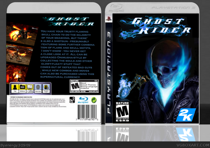
- Your cutouts are terrible--ever heard of feathering?
- The resolution of the template doesn't match the rest.
- Your 'description' on the back is horrible in both composition and looks: the font is generic and unfitting and you couldn't even get it to line up properly.
- The 'Rated M' logo is way too big
- The flames are blue everywhere except in the screenshots
- You typed "1 Player, Memory Stick 1MB, Vibration func." in fucking Comic Sans.
You either did this in Paint, in which case you should never make box art again, or you suck balls in Photoshop/Gimp.
Don't advertise. Simple. See any other new members doing that? No. So don't do it.
The box definatly needs improving, the temp is horrible, you just used the front of the PS3 temp twice, and typed '1player, mem stick' etc
You also need a background, and use better fonts.
#2, harsh man, dont attack him like that
If you attack the author, your comment will be deleted and you will be banned if continued.
Anyway, it's a good start but
DO NOT ADVRTISE ON OTHER BOXARTS
That is what the forums are for.
I give it a 2/5 because all the front is is a picture with a logo slapped on it link
well, i guess u did edit the hell cycle
you know what, it is now a 3.5/5, make the flames orange and get rid of the back, i will fav it! If you take my advice, it will score a 4.5/5 too from me!
 Ghost Rider Box Cover Comments
This is my first box art hope you like it ! Comment :)
[ Reply ]
Booo. Why do I booo? Because you link to your box art in all of your comments, which makes you a self-advertising douche.
Now I can understand being a self-advertising douche if you have awesome talent that for some reason never gets recognized but this box really blows.
- Your cutouts are terrible--ever heard of feathering?
- The resolution of the template doesn't match the rest.
- Your 'description' on the back is horrible in both composition and looks: the font is generic and unfitting and you couldn't even get it to line up properly.
- The 'Rated M' logo is way too big
- The flames are blue everywhere except in the screenshots
- You typed "1 Player, Memory Stick 1MB, Vibration func." in fucking Comic Sans.
You either did this in Paint, in which case you should never make box art again, or you suck balls in Photoshop/Gimp.
[ Reply ]
Im not selfish im just new here and i want everyone to comment me thatsall ! :)
[ Reply ]
Don't advertise. Simple. See any other new members doing that? No. So don't do it.
The box definatly needs improving, the temp is horrible, you just used the front of the PS3 temp twice, and typed '1player, mem stick' etc
You also need a background, and use better fonts.
[ Reply ]
#2, harsh man, dont attack him like that
If you attack the author, your comment will be deleted and you will be banned if continued.
Anyway, it's a good start but
DO NOT ADVRTISE ON OTHER BOXARTS
That is what the forums are for.
I give it a 2/5 because all the front is is a picture with a logo slapped on it
link
well, i guess u did edit the hell cycle
you know what, it is now a 3.5/5, make the flames orange and get rid of the back, i will fav it! If you take my advice, it will score a 4.5/5 too from me!
[ Reply ]