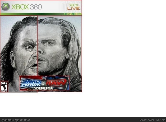
... not good... Remove the white space, ESRB to hard near the corner...( actually it is the corner in your box) faces aren't symetrical in shape ( now you can strectch, you guys don't -_-')
Logo is badly cut and last but not least, try at least to pay attention to the size of real boxes, if the xbox wouldn't be there it'd be a ds box!
 Smackdown vs Raw 2010 Box Cover Comments
awsome
[ Reply ]
good (it would be better if the right guy's face was a bit... as straight as the other one) but good
[ Reply ]
... not good... Remove the white space, ESRB to hard near the corner...( actually it is the corner in your box) faces aren't symetrical in shape ( now you can strectch, you guys don't -_-')
Logo is badly cut and last but not least, try at least to pay attention to the size of real boxes, if the xbox wouldn't be there it'd be a ds box!
[ Reply ]
The drawing: Awesome.
The box: Awful.
[ Reply ]
I make that face, when looking at this.
[ Reply ]
#5
xDDD Funniest sentence i ever heard on Vgboxart LOL xDD ROFL!!!
[ Reply ]
you know i think it would be more interesting if it was matt hardy andjeff since they r kindve going through a rivalry right now
Edited at 1 decade ago
[ Reply ]
#7, Please don't tell me your gonna comment on every SVR box.
[ Reply ]