Ok so long time since if posted a box, this is for the interchanging game competition i'm against Joeythehedgehog(best of luck)
Also the logos are ment to be in odd places because I think it looks more cool! :D
Over 30 layers and major editing had to be done and I thought this would be a bit advansed for me but it has turned out pretty good.
Credit
Template: Drakxx
A new thread will be posted soon by Stevencho for the round of Me v.s Joey so take a look and have a vote!
#7, I'm sorry to tell you this, but no, it's not. Infact, I don't like it very much at all. The sonic part of the logo is blurry and the placements of the pegi, dev logos really don't look good at all where they are. The way that you have it in 3-D makes it look like it is as thin as paper, and the back is way too plain.
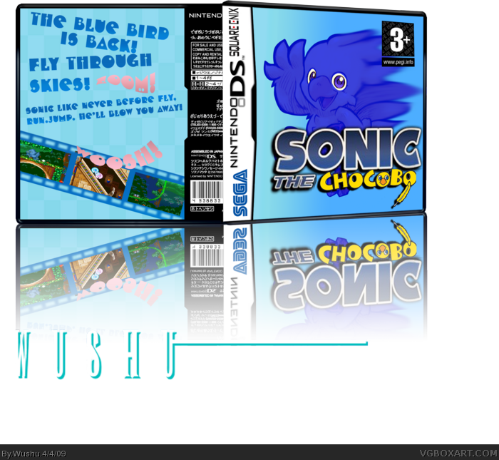
 Sonic the Chocobo Box Cover Comments
Ok so long time since if posted a box, this is for the interchanging game competition i'm against Joeythehedgehog(best of luck)
Also the logos are ment to be in odd places because I think it looks more cool! :D
Over 30 layers and major editing had to be done and I thought this would be a bit advansed for me but it has turned out pretty good.
Credit
Template: Drakxx
A new thread will be posted soon by Stevencho for the round of Me v.s Joey so take a look and have a vote!
Edited at 1 decade ago
[ Reply ]
Dont really like the back, but the front is very nice
Edited at 1 decade ago
[ Reply ]
#2, Thanks !
[ Reply ]
Awkward 3d, but still cool. favorite
[ Reply ]
Dragon ryder many thanks!
Edited at 1 decade ago
[ Reply ]
Wow, thats awesome.
[ Reply ]
You think so? Thanks, I really appreciate the positve feedback.+ Is this HoF worthy?
Edited at 1 decade ago
[ Reply ]
#7, I'm sorry to tell you this, but no, it's not. Infact, I don't like it very much at all. The sonic part of the logo is blurry and the placements of the pegi, dev logos really don't look good at all where they are. The way that you have it in 3-D makes it look like it is as thin as paper, and the back is way too plain.
Sorry if I sound too harsh
Edited at 1 decade ago
[ Reply ]
no its fine.! :D
[ Reply ]
Okay, here's your bloody comment.
Seriously, stop advertising on my page.
[ Reply ]
I don't get it...
[ Reply ]
#11, Its for a comp to put 2 characters and merge them together!
[ Reply ]
#12, Oh! the inter changing chars comp? Yeah, I'm in that, I'll fave.
[ Reply ]
Ok good you remembered that I was in the competition too!
+ RANK3 wooo
[ Reply ]
Every time I see some asshole put Japanese text on a box it makes me want to stab them in the dick more and more. I swear to God.
[ Reply ]
#15, Um anything else thats not abusive?
[ Reply ]
um, i dont like the background very much and the back is very plain. i like the sonic on the front
[ Reply ]
#17, Thanks!
[ Reply ]
#16, Nope. that's pretty much it.
Also, you forgot the spine. It looks stupid as-is.
[ Reply ]
#19, Thats fine everyone has their own opinion. :)
[ Reply ]
The front's pretty good :)
[ Reply ]
#21, Many thanks!
Is this good enough for HoF?
[ Reply ]
Not trying to be harsh, but NO.
[ Reply ]
#23, Oh ok :)
[ Reply ]