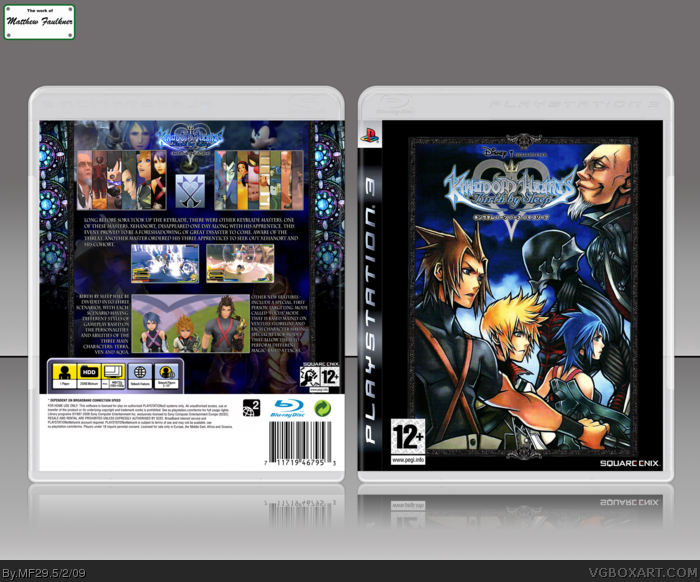
- I went with what was available, I thought Birth By Sleep was another box that I could knock out decently. No other art could have been used more appropriately than the only piece of decent art by Nomura for the front.
- The back looks a tad bit better in full view, the screenshots are a bit scattered, otherwise they would have been in a generic line.
- Put on PS3 because people don't like to disclose their precious PSP templates, and I wasn't patient enough to wait for someone to offer me one. The back pictures are low in quality, that's something I can't help.
But the back is lacking organization. I think adding a border to the screens and making the font pop out more would help. Try making the back image blend more with the rest of the back.
The preview looks great, but in full view, the box is very blurry and low quality. There isn't alot of artwork, so I can't complain much about that.
The back, as AT said, is kinda disorganized. The background image, imo, really doesn't fit this game. I don't think the organization XIII plays a big role in this game, and that blond haired guy is Roxas, not Ven. That background might have been better for Kingdom hearts 358/2 days.
:P
AS others have said the bacl ruins it for you. Get a better artwork for the back, something that fights the game, not something that fits another game, The back also needs orginization, fix that and you get a fav, the front looks really nice by the way
A little disappointing, really. I love the style of the back you got going, yet the BG is for 358/2 days, and the front is just an image with a logo slapped on ;\
 Kingdom Hearts: Birth By Sleep Box Cover Comments
- I went with what was available, I thought Birth By Sleep was another box that I could knock out decently. No other art could have been used more appropriately than the only piece of decent art by Nomura for the front.
- The back looks a tad bit better in full view, the screenshots are a bit scattered, otherwise they would have been in a generic line.
- Put on PS3 because people don't like to disclose their precious PSP templates, and I wasn't patient enough to wait for someone to offer me one. The back pictures are low in quality, that's something I can't help.
[ Reply ]
I really love your front
But the back is lacking organization. I think adding a border to the screens and making the font pop out more would help. Try making the back image blend more with the rest of the back.
[ Reply ]
I agree with AT.
Loving the front, but those screens really need borders on the back.
[ Reply ]
The preview looks great, but in full view, the box is very blurry and low quality. There isn't alot of artwork, so I can't complain much about that.
The back, as AT said, is kinda disorganized. The background image, imo, really doesn't fit this game. I don't think the organization XIII plays a big role in this game, and that blond haired guy is Roxas, not Ven. That background might have been better for Kingdom hearts 358/2 days.
:P
If you fix the back, you will get a fav from me.
[ Reply ]
AS others have said the bacl ruins it for you. Get a better artwork for the back, something that fights the game, not something that fits another game, The back also needs orginization, fix that and you get a fav, the front looks really nice by the way
[ Reply ]
The back ruined the awesome front.
[ Reply ]
#2, #3, #4, #5, Thank you.
I'm going in for a complete re-haul of the back.
[ Reply ]
A little disappointing, really. I love the style of the back you got going, yet the BG is for 358/2 days, and the front is just an image with a logo slapped on ;\
I'll check back on this for updates.
[ Reply ]
Version 2 & 3 Added.
- Added some BBS like pictures, and other things. It looks more organized now.
- Comments?
Edited at 1 decade ago
[ Reply ]
Very nice! 5/5 +fav +author fav!
[ Reply ]
Thanks mate.
[ Reply ]
Awesome box man, the front is like... perfect! BTW i could make you a PSP temp if you want, let me know if you want one it's no prob. +fav+author fav!
Edited at 1 decade ago
[ Reply ]
Thanks
[ Reply ]