The back design is really sleek, but the front, as well as the overall feel, is too dark. Even though the movie itself was a very "dark" movie, it was a fairly colorful movie. The blending on the front, while well-done, seems out of place and doesn't fit. Overall, I would say the back has a great design, really well done, but the box in general is far too dark to feel right.
 The Incredible Hulk Box Cover Comments
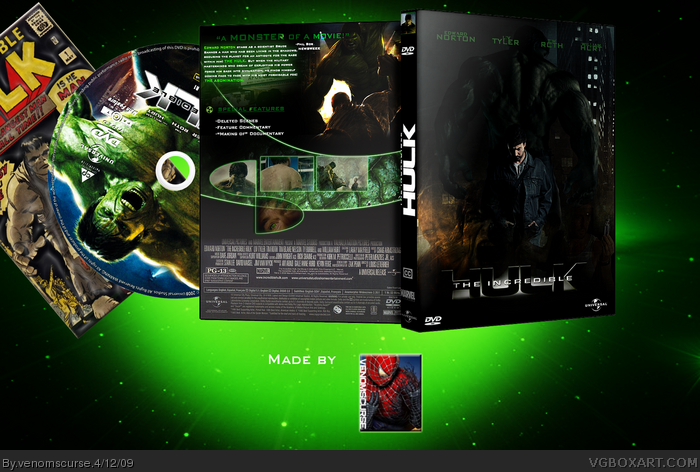
Okay guys
another one that I was making straight after my Iron Man one and it took me a LOT of effort.
Don't say that the front is just a poster...because it's not...look closely around Edward Norton.
Credits:
The disc is the official...I just added some effects to it to look a little different.
[ Reply ]
Wow, that's pretty cool, I especially love the back, faved.
And author faved.
Edited at 1 decade ago
[ Reply ]
#2, thanks!
[ Reply ]
The back design is really sleek, but the front, as well as the overall feel, is too dark. Even though the movie itself was a very "dark" movie, it was a fairly colorful movie. The blending on the front, while well-done, seems out of place and doesn't fit. Overall, I would say the back has a great design, really well done, but the box in general is far too dark to feel right.
I commented on your Iron Man box as well.
Edited at 1 decade ago
[ Reply ]
#4 wow awesome, ad to favs link
[ Reply ]
Awesome!!! +fav :)
[ Reply ]
#6, thanks
#4, thanks for the constructive criticism, i appreciate it.
[ Reply ]
Wow, very stylish.
[ Reply ]