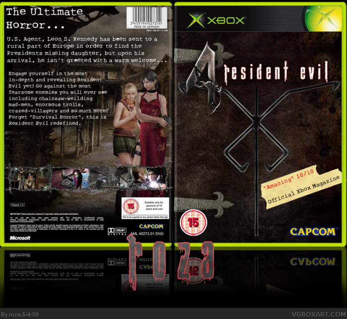
Here we go! My newest box! took about 10 hours, made for the Developer Competition ^^ and before anyone says, 'It has no live and is not xbox exclusive' I know, it was the only template i could find.
Credit:
ADFD: Template-BBFC's
SO: Screen Borders, 'roza'
LK: Logo, Background Image
Deviant Art(Dont know who sadly): Los Illuminados Logo
So tell me what you think and enjoy!
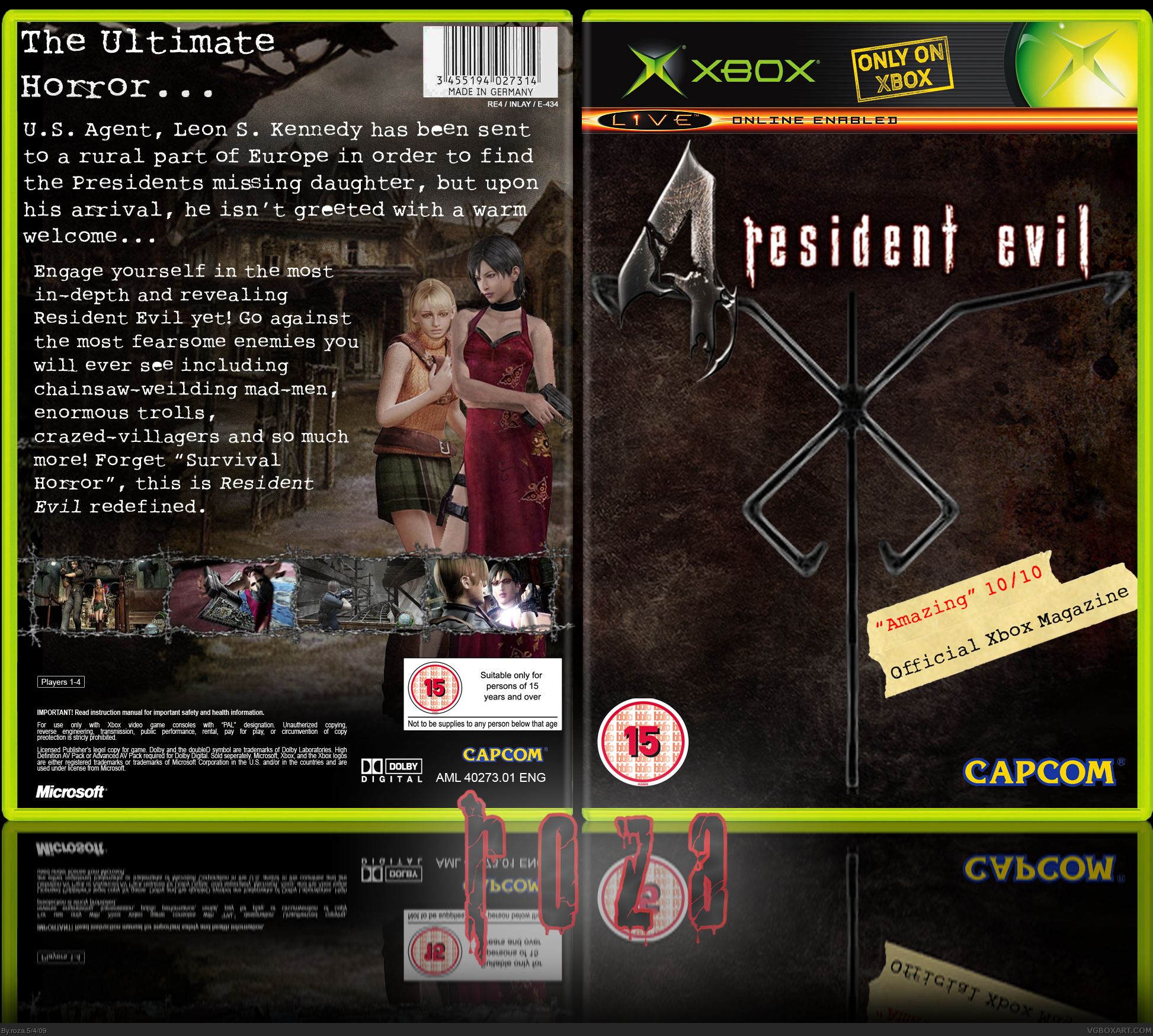
#2 yeah, but im new on PhotoShop, i normally use Fireworks, but i could only get the PS trial so im not really sure on what effects to use or how to use them lol
cover is fine but some details are not ok to me, as:
- on the front title a bit blurry, in this forum you have specialist on render, ask them to make one for you (especially when you look the quality of the template)
- the round for restricted is not perfect
- the back as said before, the renders are not well cut and the colors should be reworken a bit.. also adding a bit dark fade can make it look better,
- the screenshots is fine but the barbwire looks blurry
- not sure about the font of the legals, it looks a bit weird
I think the blurb from XBox Magazine should be on the back, it obstructs what you were going for on your front. I think Leon should be next to Ashley on the back, well just my opinion on that one.
I also am not liking how your logo is covering the hinge on the front. My suggestion would be to size down the cult's emblem and size down the logo (just a bit!) so it's not overlapping the hinge or anything else.
It's good, but I think my suggestions would improve it.
#10, ah cool, thanks, ill see what i can do about the front, but i decided not to put Leon on because he is on every custom case i have seen, and i wanted to try somthing original. Thanks again ^^
Thanks for listening to me! :)
First of all, I would suggest to add extra effect to the 10/10 sign on the front. Maybe something grunchy. The back is really nice, but the text is a bit plain imho :)
 Resident Evil 4 Box Cover Comments
Here we go! My newest box! took about 10 hours, made for the Developer Competition ^^ and before anyone says, 'It has no live and is not xbox exclusive' I know, it was the only template i could find.
Credit:
ADFD: Template-BBFC's
SO: Screen Borders, 'roza'
LK: Logo, Background Image
Deviant Art(Dont know who sadly): Los Illuminados Logo
So tell me what you think and enjoy!
#2 yeah, but im new on PhotoShop, i normally use Fireworks, but i could only get the PS trial so im not really sure on what effects to use or how to use them lol
Edited at 1 decade ago
[ Reply ]
bit too much of an emphasis on text on the back.
the front could do with a few more effects.
[ Reply ]
I dont like the renders on the back, it could be more mysterious; but the front is very good :)
+fav :D
Edited at 1 decade ago
[ Reply ]
Looks cool Roza! 5/5.
[ Reply ]
cover is fine but some details are not ok to me, as:
- on the front title a bit blurry, in this forum you have specialist on render, ask them to make one for you (especially when you look the quality of the template)
- the round for restricted is not perfect
- the back as said before, the renders are not well cut and the colors should be reworken a bit.. also adding a bit dark fade can make it look better,
- the screenshots is fine but the barbwire looks blurry
- not sure about the font of the legals, it looks a bit weird
otherwise the general looking is fine
[ Reply ]
I don't like the front, its too plain, the back, however, I like.
If you shorten the text, and make the front more interesting, then I'll fav =)
[ Reply ]
UPDATE: Added soem hinges on the front and shortened the text, aslo changed the Template! (ADFD). Any thought on the update!
#8 thanks man! ^^
#9, thanks man, thats what i was aiming for :D
Edited at 1 decade ago
[ Reply ]
Well, that is, beautiful. xD <3
[ Reply ]
Beautiful. Not like any of the other RE4 boxes :P Fav.
[ Reply ]
I think the blurb from XBox Magazine should be on the back, it obstructs what you were going for on your front. I think Leon should be next to Ashley on the back, well just my opinion on that one.
I also am not liking how your logo is covering the hinge on the front. My suggestion would be to size down the cult's emblem and size down the logo (just a bit!) so it's not overlapping the hinge or anything else.
It's good, but I think my suggestions would improve it.
[ Reply ]
#10, ah cool, thanks, ill see what i can do about the front, but i decided not to put Leon on because he is on every custom case i have seen, and i wanted to try somthing original. Thanks again ^^
[ Reply ]
#11, Like I said, Leon was only a suggestion, I figured that's why Ada was on instead :)
[ Reply ]
The renders on the back seem a tad out of place, but besides that I like this a lot. Good job roza. 3.75/5
[ Reply ]
I really like the different take on this. It is a little blurry and the renders look a little out of place but it still looks great. Fav
[ Reply ]
#13+14 thanks guys, i really appreciate the comments ^^ i might try and get an update soon ^^ with HQ if possible!
[ Reply ]
Thanks for listening to me! :)
First of all, I would suggest to add extra effect to the 10/10 sign on the front. Maybe something grunchy. The back is really nice, but the text is a bit plain imho :)
[ Reply ]