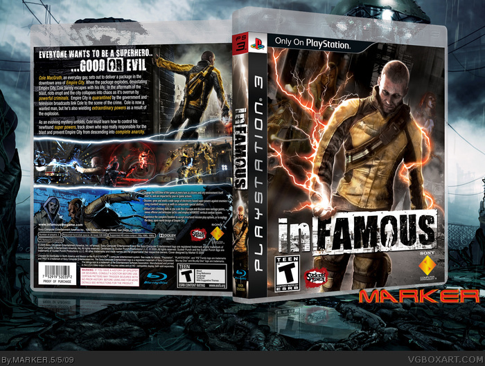
Since I haven't done a 300dpi PS3 Cover since Metal Gear Solid 4 (all other PS3 boxart are 200dpi), I thought I'll have a go at inFamous (so have everyone else I see - lol), so here's my custom cover/boxart. Front is based on the movie poster of "Matrix" with the 3 characters at a slight slant -- obviously doesn't look identical because of the available artwork available. Back looks... well... seeing other inFamous boxes, pretty typical I guess now - ;)
Anyway, best (?) in full and printable later if required.
The overall look is nice, but isn't too original. The front art's becoming really overused, and the lightning around the screenshots isn't anything new either.
Love the highlighting of key words on the blurb on the back and the overall look of the back, spine is really catching for me for some reason, i like it. Good comp all round. But after seeing ShadySaiyan's, i have to say that it's not as grabbing as one would expect. Top box though mate. Good to see the Grand Master of VGBA back out making boxes too, hurrah for the new system!!
Can't say I like it. The whole thing looks pieced together. It doesn't really flow, and there isn't any form of color scheme. Looking at your past work it is far from your best, sorry :/
EDIT: There is one thing on this that is pretty cool though. I like how you took the logo and adapted it into "good or evil. "
@11 --- Lighting is made using "Alien Skin Xenoflex 2" plug-in. Back top image is off official website! link
I screen grabbed it (pieced together).. and just added a wall to the left of it. :) You could "decompile the flash" -- I know you know how to do that ;)
Actually, I made the front image from a few images without knowing Sucker Punch released a Massive Webkit AFTER I did the box! Typical. Cole on the front is the Evil one (as I didn't have a hi-res "Good" one), so recoloured him and added an eyeball! lol
Sorry if you peeps don't like it, can't please everyone :)
Compared to 95% of the covers uploaded on this site it's great. Compared to your other work though I would say it's on the lower end. It's still pretty good.
#12, Darn, it's like i've known about Photoshop plugins since i got it so many years ago, but i forgot about it and every time i stumble across i again, i forget again., i need to check some out.
Also yeah i ripped it from there, doesn't fit my screen Res, but its close enough.
#12, Hmmm that plugin is a lot of money. Do you know of any lightning filter add-ons for photoshop that are free?
About the box,it may not be too original but that does not take away from the fact it is very well made. One thing I love is the way you did the reflection. +fav
 inFAMOUS Box Cover Comments
Since I haven't done a 300dpi PS3 Cover since Metal Gear Solid 4 (all other PS3 boxart are 200dpi), I thought I'll have a go at inFamous (so have everyone else I see - lol), so here's my custom cover/boxart. Front is based on the movie poster of "Matrix" with the 3 characters at a slight slant -- obviously doesn't look identical because of the available artwork available. Back looks... well... seeing other inFamous boxes, pretty typical I guess now - ;)
Anyway, best (?) in full and printable later if required.
[ Reply ]
It's cool, but I'm tired of that art, and I'm really tired of the electric screenshots.
[ Reply ]
Awesomeness.
[ Reply ]
WOOOOOOOOOOOOOOOOOOOOOOOOOOOOOOOOOOOOOOOOOOOOOWWWWWWWWWWWWWWWWWWWWWWWWWWWWWWWWWWWWWWWWWWWWWWWW
Man That is AWESOME
Edited at 1 decade ago
[ Reply ]
The overall look is nice, but isn't too original. The front art's becoming really overused, and the lightning around the screenshots isn't anything new either.
[ Reply ]
-_-
[ Reply ]
It's not exactly the most original box you've made, but I really like the composition of the back and the perspective of the front.
[ Reply ]
Love the highlighting of key words on the blurb on the back and the overall look of the back, spine is really catching for me for some reason, i like it. Good comp all round. But after seeing ShadySaiyan's, i have to say that it's not as grabbing as one would expect. Top box though mate. Good to see the Grand Master of VGBA back out making boxes too, hurrah for the new system!!
Edited at 1 decade ago
[ Reply ]
:|
[ Reply ]
Can't say I like it. The whole thing looks pieced together. It doesn't really flow, and there isn't any form of color scheme. Looking at your past work it is far from your best, sorry :/
EDIT: There is one thing on this that is pretty cool though. I like how you took the logo and adapted it into "good or evil. "
Edited at 1 decade ago
[ Reply ]
Looks great, like i'd expect from Marker, idk how you or other infamous box creators make such clean looking lightening, but its impressive!
Also, that art on the top back, where do you get it, i'd like to make it my wallpaper.
Like the presentation as well, something i always enjoy the most from you and Mad Spike.
[ Reply ]
@11 --- Lighting is made using "Alien Skin Xenoflex 2" plug-in. Back top image is off official website! link
I screen grabbed it (pieced together).. and just added a wall to the left of it. :) You could "decompile the flash" -- I know you know how to do that ;)
Actually, I made the front image from a few images without knowing Sucker Punch released a Massive Webkit AFTER I did the box! Typical. Cole on the front is the Evil one (as I didn't have a hi-res "Good" one), so recoloured him and added an eyeball! lol
Sorry if you peeps don't like it, can't please everyone :)
[ Reply ]
Compared to 95% of the covers uploaded on this site it's great. Compared to your other work though I would say it's on the lower end. It's still pretty good.
Can I ask you a few questions?
[ Reply ]
again, an insta-hof!
[ Reply ]
#12, Darn, it's like i've known about Photoshop plugins since i got it so many years ago, but i forgot about it and every time i stumble across i again, i forget again., i need to check some out.
Also yeah i ripped it from there, doesn't fit my screen Res, but its close enough.
[ Reply ]
The front is pretty rad, but the back is so clustered, it comes off like the front of a magazine. The presentation is sick though!
[ Reply ]
Woah woah woah, very nice
[ Reply ]
Awesome as always sir.
[ Reply ]
#1, available art is available :P
Nice job marker.
[ Reply ]
#12, Hmmm that plugin is a lot of money. Do you know of any lightning filter add-ons for photoshop that are free?
About the box,it may not be too original but that does not take away from the fact it is very well made. One thing I love is the way you did the reflection. +fav
[ Reply ]
Stylish.
8/10
[ Reply ]
Awesome.
[ Reply ]
Good but generic. I expect more from you Marker! lol
[ Reply ]
Epic!
[ Reply ]
amazing
[ Reply ]