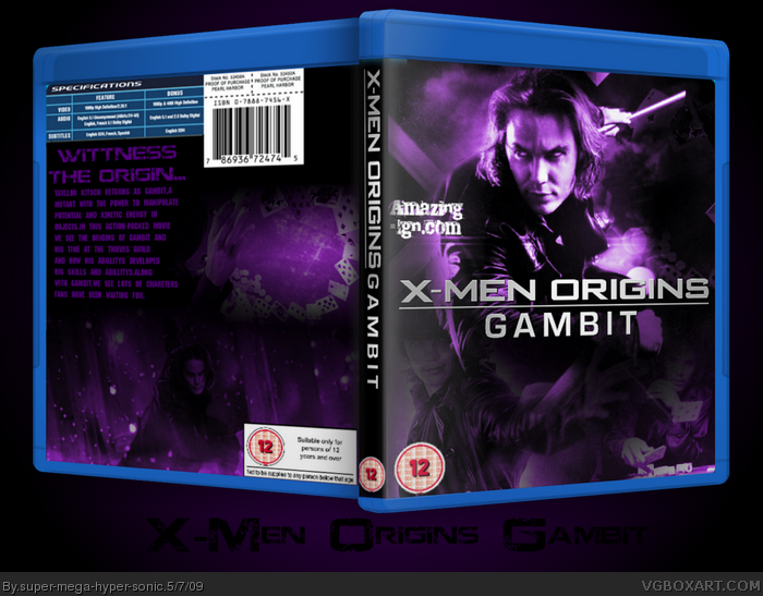
Idea is good, though the back is very plain, and you really over did the purple on the front. Idea=good Final Product=Could've been way better, no offence, but keep improving dude, you got potential, just need to bring your ideas better to justice if you know what i mean.
Yey!I Love the character! Haven't seen the movie yet but I might go see it at the weekend.
Cred to ADFD Scorpion Soldier.
#1,sorry you don't like it :(.Purple was sorta my theme though.
You have to work on the back layout, your fronts looks very good. +fav for the awesome front, but work on your backs. If you can improve your back, you get an author fav.
#2, I didn't say i didn't like it, you misunderstood, just saying you maybe might want to take a look at retail boxes, to also give it more realism, instead of the plain back, and the purple would work with gambit, though with a purple tone, like the blue tone of wolverine, and not a 100% purple Gambit, but rather some purple tones on him instead. I see the idea you we're going with this one, i'm just giving constructive criticism on your work to help you improve, so no hard feelings dude.
As bad as the movie is, Batman Forever had amazing artwork and the character posters showed a nice way of how to use a colour scheme for different characters as a "series" of related posters (e.g. Gambit-Purple poster, Cyclops-Blue poster, Storm-Silver poster etc.) It shouldn't be all-purple.
As bad as the movie is, Batman Forever had amazing artwork and the character posters showed a nice way of how to use a colour scheme for different characters as a "series" of related posters (e.g. Gambit-Purple poster, Cyclops-Blue poster, Storm-Silver poster etc.) It shouldn't be all-purple.
 X-Men Origins: Gambit Box Cover Comments
Idea is good, though the back is very plain, and you really over did the purple on the front. Idea=good Final Product=Could've been way better, no offence, but keep improving dude, you got potential, just need to bring your ideas better to justice if you know what i mean.
[ Reply ]
Yey!I Love the character! Haven't seen the movie yet but I might go see it at the weekend.
Cred to ADFD Scorpion Soldier.
#1,sorry you don't like it :(.Purple was sorta my theme though.
Edited at 1 decade ago
[ Reply ]
You have to work on the back layout, your fronts looks very good. +fav for the awesome front, but work on your backs. If you can improve your back, you get an author fav.
[ Reply ]
#2, I didn't say i didn't like it, you misunderstood, just saying you maybe might want to take a look at retail boxes, to also give it more realism, instead of the plain back, and the purple would work with gambit, though with a purple tone, like the blue tone of wolverine, and not a 100% purple Gambit, but rather some purple tones on him instead. I see the idea you we're going with this one, i'm just giving constructive criticism on your work to help you improve, so no hard feelings dude.
[ Reply ]
So many people are making X-men Orgins So and so box, what next X-men origins Powerpuff Girls?
[ Reply ]
#5,*Idea Light bulb appears above head*
#4,None taken :)lets be friends.
[ Reply ]
#6, Don't even think about it >.>
[ Reply ]
jevans is waaaaay better.
[ Reply ]
#8, I know,I know!
I'm not god's gift at paint.net you know!
[ Reply ]
It's WIP I guess.
As bad as the movie is, Batman Forever had amazing artwork and the character posters showed a nice way of how to use a colour scheme for different characters as a "series" of related posters (e.g. Gambit-Purple poster, Cyclops-Blue poster, Storm-Silver poster etc.) It shouldn't be all-purple.
[ Reply ]
everythin, but the back, is perfect
[ Reply ]