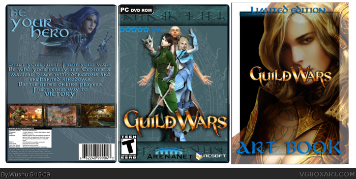
- Front is plain and placement is bad.
- Art Book is average, the logo is too high.
- The back is OK, but nothing special. The screens don't match the overall color scheme.
Wushu your not against me.
As for the box,it needs something else added to it. Not sure what but I'm not very fond of the colour schemes contrasts with the screens.
 Guild Wars Box Cover Comments
Ok this is for the summer comp!
Theme: RPG
Opponent: Coolguy
Credit: S_O For screenborders
View in full for best quality!
Hoping for HoF!
[ Reply ]
Not bad, just a little empty
[ Reply ]
Not bad..but like #2 said, add a little more something to the front and back.
[ Reply ]
Anymore comments?
[ Reply ]
- Front is plain and placement is bad.
- Art Book is average, the logo is too high.
- The back is OK, but nothing special. The screens don't match the overall color scheme.
[ Reply ]
Wushu your not against me.
As for the box,it needs something else added to it. Not sure what but I'm not very fond of the colour schemes contrasts with the screens.
[ Reply ]