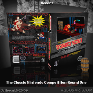
Okay, so it's been awhile since I made any boxes. Partially because of work, partially because I'm in comps that require more than my usual flair to make them look good.
So this is for the Classic Nintendo Competition that Mailtoad put on. The box required the image of DK carrying Pauline on the box. The quality of the image was horrendous, so I took it on myself to recreate it on Illustrator. So then I had the problem of not having a matching res/quality Mario, so I found an older Mario image from one of the older Mario games (I just googled for that one) and remade it also.
I tried to follow the example of the original Mario Bros. official box I found on link and give it some additional flair.
I created and rendered the first stage of Donkey Kong in 3D and then when I was finished I created the box in 3D and did the final render.
I know I just wrote a novel, but I had to in order to tell you all what went into this.
The creative effort that went into this is astounding. The character renders on the back look fantastic, and your model of the Donkey Kong level with the original sprite graphics looks so insanely awesome, I haven't the words for it.
#7 and #10, this is what happened because I DIDN'T get the Fire Emblem pic, I was so jealous! I mean, c'mon! I get this washed out crappy Donkey Kong pic to work with? So I had to make it better :)
I will definitely set out and do a few more of these classic boxes.
While this is impressive, I think it's by no means a HoF kind of impressive. Conceptually it's wonderful, and even your execution was well-done, but there are just a couple things here and there that really hinder its potential.
I think the grungy textures on the scenery is way overboard. A textured stage for the cover would be fine, but hyper-realistic textures doesn't fit with 8-bit sprites.
In addition, I think your description on the back is really lacking in character and overall zeal.
#24, Thanks for the critiques. I can definitely see why you have gripes about the design.
This is the first experiment of it's kind for me since my Sonic CD box (trying to mix old school with high-resolution graphics) so I'm still getting a feel for it.
Thank you for your comments, it will definitely help in the future.
#25, I've had faster HoF's, actually, but yes, I definitely gotta thank everybody for their support!
I actually think the 2D sprites give it a very Paper Mario feel, and I think it's really nicely done. I don't mind the design one bit. It's fantastically clever!
The only difficult thing for me to see is if the box dimensions are correct, but it could just be my eyes. /shrug
#28, I based my aspect ratio on an official box. I just guessed on other dimensions, so I could be wrong there. The angle of the 3D could affect that as well.
 Donkey Kong Box Cover Comments
Okay, so it's been awhile since I made any boxes. Partially because of work, partially because I'm in comps that require more than my usual flair to make them look good.
So this is for the Classic Nintendo Competition that Mailtoad put on. The box required the image of DK carrying Pauline on the box. The quality of the image was horrendous, so I took it on myself to recreate it on Illustrator. So then I had the problem of not having a matching res/quality Mario, so I found an older Mario image from one of the older Mario games (I just googled for that one) and remade it also.
I tried to follow the example of the original Mario Bros. official box I found on link and give it some additional flair.
I created and rendered the first stage of Donkey Kong in 3D and then when I was finished I created the box in 3D and did the final render.
I know I just wrote a novel, but I had to in order to tell you all what went into this.
I hope you enjoy this!
[ Reply ]
Fantastic!
[ Reply ]
#2, QFT!
Really good man !
[ Reply ]
*has heart attack*
Edited at 1 decade ago
[ Reply ]
Maybe I need to make more of these...Thanks for the comments/favs so far!
[ Reply ]
Great work!
Love the whole back, especially!
[ Reply ]
#6, You have got this all wrong group one (me) needs to user that pic your using the other one.. >.< Sorry men. Go back and check.
[ Reply ]
This box just breathes awesomeness.
[ Reply ]
#5, Maybe? Dude there's no maybe about it! This is brilliant work,I'm really loving it.
[ Reply ]
You need to do Fire Emblem because you are in my group =P.
[ Reply ]
#9 yeah, if he keeps this up, he'll be the NES boxart king!!!
[ Reply ]
Yeah, this box is simply fantastic :)
[ Reply ]
#5, some, just not too many ;)
[ Reply ]
The creative effort that went into this is astounding. The character renders on the back look fantastic, and your model of the Donkey Kong level with the original sprite graphics looks so insanely awesome, I haven't the words for it.
I'm beyond impressed with this one sir.
[ Reply ]
The 3D/2D on the front is sweet, the overall, box definitely looks official!
Nice!
[ Reply ]
#7 and #10, this is what happened because I DIDN'T get the Fire Emblem pic, I was so jealous! I mean, c'mon! I get this washed out crappy Donkey Kong pic to work with? So I had to make it better :)
I will definitely set out and do a few more of these classic boxes.
Thank you guys so much for the positive feedback!
Edited at 1 decade ago
[ Reply ]
Screw you! xD +fav
[ Reply ]
Amazing box. :D
[ Reply ]
Oh CRAP!!!! I just realized I was using the wrong image!!! Well, back to the drawing board...
[ Reply ]
#19, I say just make mailtoad let you use this one. :)
[ Reply ]
#20, Well, I'll ask. If not, I'll make a Fire Emblem box. I always wanted to anyway.
[ Reply ]
Everything on this is great, I love the 2D and 3D effects. Fav
[ Reply ]
congrats on the hall of fame :D
[ Reply ]
While this is impressive, I think it's by no means a HoF kind of impressive. Conceptually it's wonderful, and even your execution was well-done, but there are just a couple things here and there that really hinder its potential.
I think the grungy textures on the scenery is way overboard. A textured stage for the cover would be fine, but hyper-realistic textures doesn't fit with 8-bit sprites.
In addition, I think your description on the back is really lacking in character and overall zeal.
[ Reply ]
One of the fastest HoF's...
[ Reply ]
#24, Thanks for the critiques. I can definitely see why you have gripes about the design.
This is the first experiment of it's kind for me since my Sonic CD box (trying to mix old school with high-resolution graphics) so I'm still getting a feel for it.
Thank you for your comments, it will definitely help in the future.
#25, I've had faster HoF's, actually, but yes, I definitely gotta thank everybody for their support!
[ Reply ]
Amazing dude.
[ Reply ]
I actually think the 2D sprites give it a very Paper Mario feel, and I think it's really nicely done. I don't mind the design one bit. It's fantastically clever!
The only difficult thing for me to see is if the box dimensions are correct, but it could just be my eyes. /shrug
Long live retro gaming!
[ Reply ]
#28, I based my aspect ratio on an official box. I just guessed on other dimensions, so I could be wrong there. The angle of the 3D could affect that as well.
[ Reply ]
Everything about this is great, but Mario was called 'Jump Man" back then, lol
[ Reply ]
#30, I know, but I didn't want to call him Jumpman.
Actually I'm surprised nobody noticed that before now.
Edited at 1 decade ago
[ Reply ]
this is GRRRRREAT!
[ Reply ]