O.K.
I've run my patience out.
Please try not to use the logo/hard to read from a distance.
Simple and sweet is best (In my opinion)
Dear JoeyTheHedgehog, The box design is nice, but spare the use of the Halo font. Lots of areas with it just looks bad.
Make the main body of the text on the back in a clear to read font, but matching the style font, like this: link
 Halo 3: Wii Edition Box Cover Comments
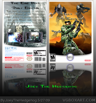
This took me 2 days to make. My friend gave me the idea. Hope you like it.
~credit~
Koopadasher-template
planet renders
screenborders thread.
[ Reply ]
umm...some of the renders are floating on the front...and the back, text is too big...
[ Reply ]
Looks too... Cluttered.
[ Reply ]
O.K.
I've run my patience out.
Please try not to use the logo/hard to read from a distance.
Simple and sweet is best (In my opinion)
Dear JoeyTheHedgehog, The box design is nice, but spare the use of the Halo font. Lots of areas with it just looks bad.
Make the main body of the text on the back in a clear to read font, but matching the style font, like this:
link
I'll fav if you change it.
[ Reply ]
its ok 3/5
[ Reply ]