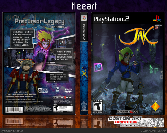
Don't have much time to talk about this now, since I go to work in like 10 minutes, but this is my Final Round entry for Drakxxx's Custom Art Comp. I did the characters in Illustrator, and shaded them in Photoshop. I did the background stuff in Photoshop and heavily edited screenshots (on the back.)
I hope you all like this, and if you think mine is the best of the three, vote for me in the comp.
Thanks in advance for any comments/critiques/favs!
#7, I didn't want to do the numeral two, sorry you didn't like that.
#7 and #8, I'll work on rounding them out soon. I'll leave this version as is for the comp, but I'll do some work on my art, I kinda rushed the ones on back. Don't know if I can make them less flat, but I'll give it a try.
Thanks everybody so far for their comments, their ideas for improvement, and of course their fav's!
I think it's great!! I wish Jak and Daxter would stand out a little bit more, though. They're the focal images, yet they blend in with the background too well. When we glance at the boxart, our eyes immediately turn to the logo first. Then the Sony logo on the bottom right. Awesome job, though.
Hey Man, i am Brazilian fan and i like this cover , so great ... But i no have say download, please help me brother, give me this cover ... I Need cover for my collection , help me
 Jak II Box Cover Comments
Don't have much time to talk about this now, since I go to work in like 10 minutes, but this is my Final Round entry for Drakxxx's Custom Art Comp. I did the characters in Illustrator, and shaded them in Photoshop. I did the background stuff in Photoshop and heavily edited screenshots (on the back.)
I hope you all like this, and if you think mine is the best of the three, vote for me in the comp.
Thanks in advance for any comments/critiques/favs!
[ Reply ]
Your title says Jak II.
But your logo says Jak.
Lolwut?
[ Reply ]
#2, There's a numeric "2" on the corner of the logo. This is Jak II, I just changed up the logo.
[ Reply ]
Hummina hummina hummina
[ Reply ]
#3, Missed that.
>__>
Gud box. b(^_^)d
[ Reply ]
Very nice job, I really like how the characters turned out.
[ Reply ]
I like this game.
The two should have been the numeral two, but it's still good.
The pictures on the back look a little flat? If that makes any sense.
[ Reply ]
Very nice dude. Love the art, love the shading technique. I agree that the back images are a bit flat, but still cool.
[ Reply ]
#7, I didn't want to do the numeral two, sorry you didn't like that.
#7 and #8, I'll work on rounding them out soon. I'll leave this version as is for the comp, but I'll do some work on my art, I kinda rushed the ones on back. Don't know if I can make them less flat, but I'll give it a try.
Thanks everybody so far for their comments, their ideas for improvement, and of course their fav's!
[ Reply ]
I love it!
[ Reply ]
Looks good, the racing guy on the backs (forgot his name) head seemed a little squished though.
[ Reply ]
#11, He's got a funky head to begin with, lol. When I set out to fix the character art and make it look a little better, I'll unsquish his head.
[ Reply ]
#12, Hahahaha
[ Reply ]
This is what I'm talking about :)
[ Reply ]
I think it's great!! I wish Jak and Daxter would stand out a little bit more, though. They're the focal images, yet they blend in with the background too well. When we glance at the boxart, our eyes immediately turn to the logo first. Then the Sony logo on the bottom right. Awesome job, though.
For example, something like this would be cool :
link
Of course, it's all based upon your opinion! It's good the way it is too.
As for the back, I think it's perfect. Everything's placed perfectly, ... and looks cool.
Keep it up. :D
Edited at 1 decade ago
[ Reply ]
#15, I have a list of things to work on with this box, so I'll add focus issue on the front to the list and I'll get to work on it soon.
Thanks for the critique! I'm not gonna beg, but is it worthy of your fav?
[ Reply ]
This is awesome. Just like you Tleeart. Fav, and Author fav. It deserves it.
[ Reply ]
#17, Thanks! I really do need to try fixing some of the things people complained about on this, just had so many ideas on my mind for boxes lately.
[ Reply ]
This box is practically perfect, Great choice of artwork. Only downfall is that the 2 is almost not noticeable.
[ Reply ]
The guy on the back looks a little weird (like bent or something) but other than that I am really liking your custom artwork. Great job!
(I am looking forward to that update :P)
[ Reply ]
nice box but the 2 next to jak is extermly hard to notice, make it bigger please
[ Reply ]
#21, I don't even think I have the files anymore, so I don't think I'll be doing that, unfortunately. I appreciate the input, though!
[ Reply ]
Hey Man, i am Brazilian fan and i like this cover , so great ... But i no have say download, please help me brother, give me this cover ... I Need cover for my collection , help me
[ Reply ]