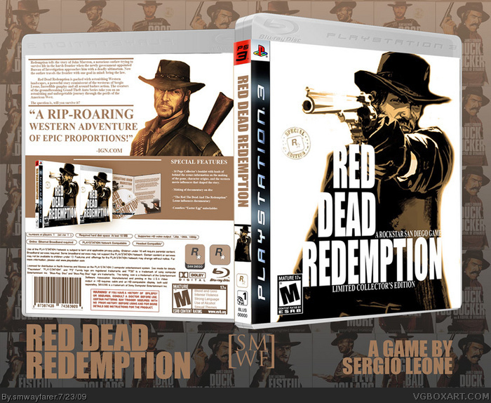
The front has waaay too much white space, and the back seems cluttered, not well organized. Also, the scribbles look homemade, in a bad way. Mostly because they are blurry.
I would look at Clint Eastwood Westerns' DVD covers and try approaching it that way.
It's not horrible, but given the awesome source material, it can be improved upon so much.
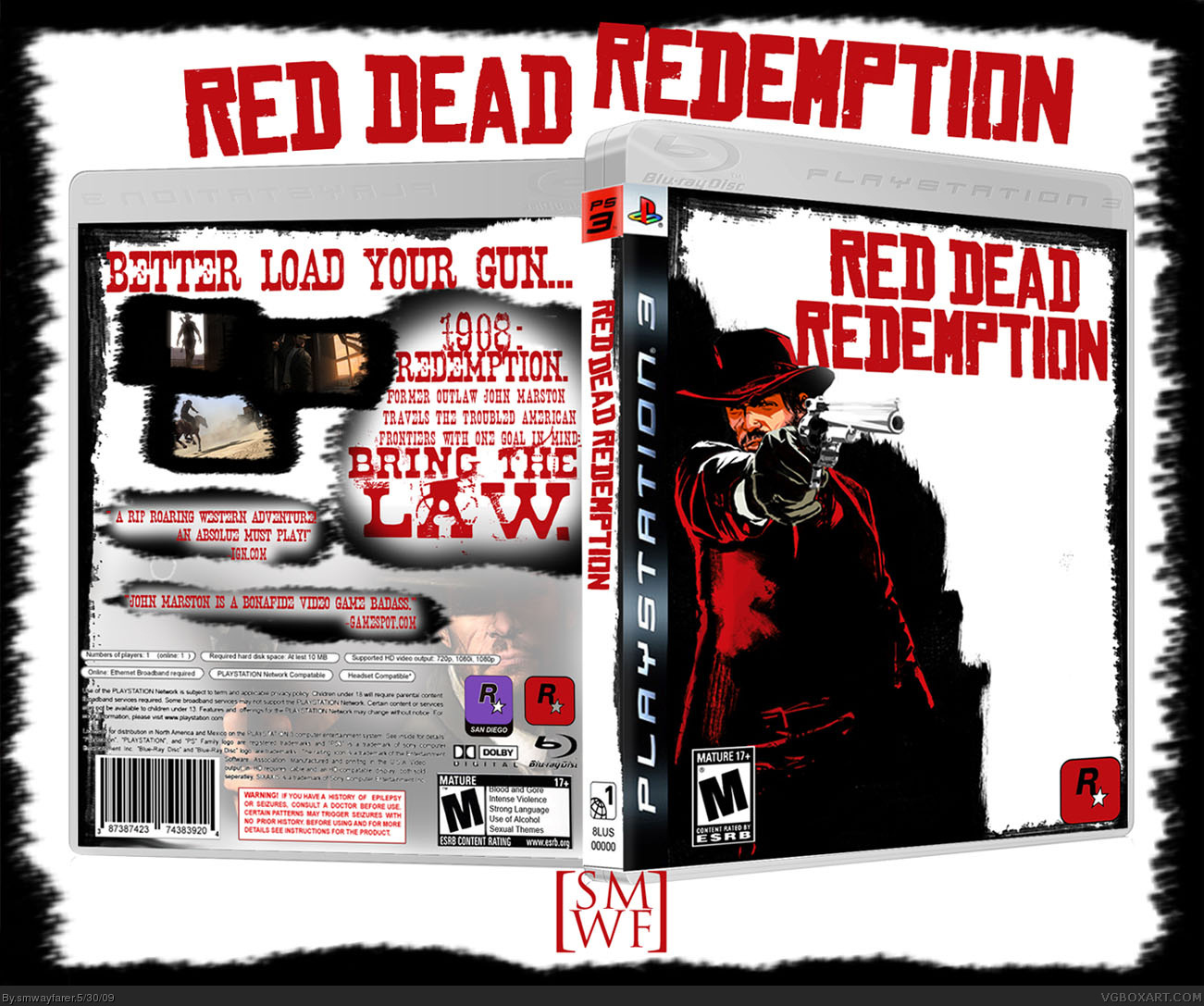
Updated, totally reworked to match the style of the Sergio Leone DVD's in an anthology i have, Example:http://www.dvdempire.com/Exec/v4_item.asp?item_id=1320243&tab=5&anchor=1#topoftabs
I'm not impressed with this box. First of all, everything looks like it was just slapped on a white background with no attention to a nice flow from back to front and vice versa. Second of all, there are no screenshots. Third, you used the same front render as everyone else but didn't manage to make it unique, plus it's of a very poor quality. As someone above said, for the awesome source material available, you could've done a lot better.
 Red Dead Redemption Box Cover Comments
Game looks s'damn cool.
[ Reply ]
It is good but i'm not a fan of the back.
[ Reply ]
The front has waaay too much white space, and the back seems cluttered, not well organized. Also, the scribbles look homemade, in a bad way. Mostly because they are blurry.
I would look at Clint Eastwood Westerns' DVD covers and try approaching it that way.
It's not horrible, but given the awesome source material, it can be improved upon so much.
[ Reply ]
Updated, totally reworked to match the style of the Sergio Leone DVD's in an anthology i have, Example:http://www.dvdempire.com/Exec/v4_item.asp?item_id=1320243&tab=5&anchor=1#topoftabs
[ Reply ]
The front is spot on to those Man With No Name collector's boxes. If you can get a back together to match, now that would be super awesome.
Edited at 1 decade ago
[ Reply ]
#5, I will start on a back
[ Reply ]
Done!
[ Reply ]
#7, Looks so much better now. Excelllent job, +fav.
[ Reply ]
Really nice job man. This is an awesome idea, and you executed it great.
[ Reply ]
Love it.
[ Reply ]
I'm not impressed with this box. First of all, everything looks like it was just slapped on a white background with no attention to a nice flow from back to front and vice versa. Second of all, there are no screenshots. Third, you used the same front render as everyone else but didn't manage to make it unique, plus it's of a very poor quality. As someone above said, for the awesome source material available, you could've done a lot better.
[ Reply ]