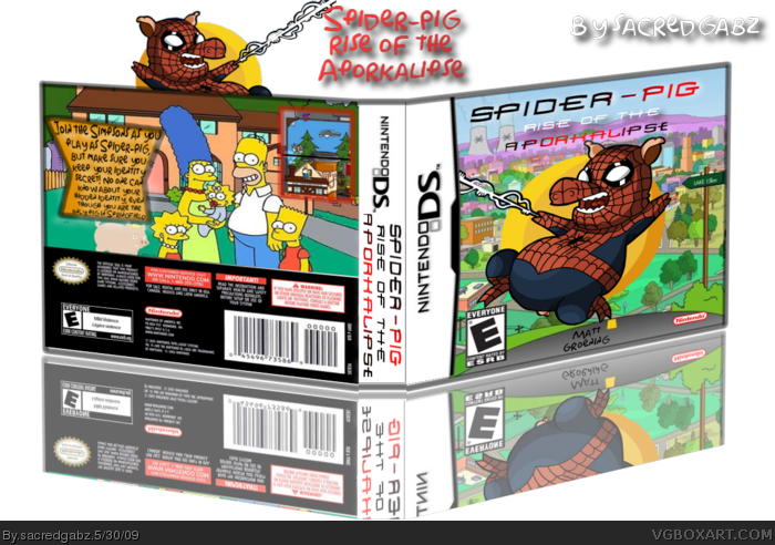
#1, Oh wow. Homorakhn with a black and red graient. Great logo.
EDIT: Oh noes! It has different sizes and colours!
Really, try next time to get an offical logo or mimic it.
Hey, Sarashi. What is up with you? Do you hate me or something? Sure, I may not be great as you, but at least I am improving and people appreciate that, but obviously you don't. And look, I don't see anyone else criticising me. I bet you just look at my boxes to find something that's wrong and exaggerate it. And the comment you just did wasn't even about the box. It was about my comment in #1. So if you don't like the box, don't comment on it.
#6, In fact, I'm sorry. I don't hate you, but just want to critique you work. I have done it in a bad way. Im really sorry; because as I read back through my work, it seems really horrible what i've put you through (Even worse than the trillion hate mail messages in my old MSN). I owe you a big apology.
I do realise that you've been improving, and heck, I remember your first comment on my boxes.
Again. I'm sorry. I'll try to mark the good points, and not exaggerate the bad points.
The box is nice apart from the logo, but I doubt I could have done any better, so I don't think I can critique it.
I like the front, and back, But I think the side could do with some colour.
#9, You know what, that's awesome. A BIG THANNKS!!!! And also, you probably could do better than me, heck your a rank 4 and I'm a rank 3. Nough said. Oh and you didn't fav. Just sayin
#12, no, i rendered it and put it on a pic of springfield. Made the logo and matt groening logo mahself. i also made a back if you are blind. And also, you are rank 0, with no favs so don't critisize me.
Maybe a metallic look for "Spider-Pig" mimicking Spider-Man's logo and a smaller font for the "Rise of Aporkalipse". Or get rid of the subtitle altogether and name it just "Spider-Pig". Since the box looks really good, it's a pity to lose some points because of the logo.
 Spider-Pig: Rise of the Aporkalipse Box Cover Comments
My new Spider-Pig box. I think I did quite well on this and i created the logo mahself. C&C welcome.
[ Reply ]
This is hilarious!
Fav!
Shouldn't this be humour?
Edited at 1 decade ago
[ Reply ]
#2, not really. Coz it should be a game even though the simpsons are funny. It's like saying the simpsons game is humor
[ Reply ]
#1, Oh wow. Homorakhn with a black and red graient. Great logo.
EDIT: Oh noes! It has different sizes and colours!
Really, try next time to get an offical logo or mimic it.
[ Reply ]
Oh, goodie. A game based on the lamest, most annoying meme ever.
Box is decent.
[ Reply ]
Hey, Sarashi. What is up with you? Do you hate me or something? Sure, I may not be great as you, but at least I am improving and people appreciate that, but obviously you don't. And look, I don't see anyone else criticising me. I bet you just look at my boxes to find something that's wrong and exaggerate it. And the comment you just did wasn't even about the box. It was about my comment in #1. So if you don't like the box, don't comment on it.
[ Reply ]
AWESOME!!!!!!!!!!!!!!!!!!!!!!!!!!!!!!!!!!!!!!!!!!!!!!!!!!!!!!!!!!!!!!!!!!!!!!!!!!!!!!!!!!!!!!!!!!!!!!!!!!!!!!!!!!!!!!!!!!!!!!!!!!!!!!!!!!!!!!!!!!!!!!!!!!!!!!!!!!!!!!!!!!!!!!!!!!!!!!!!!!!!!!!!!!!!!!!!!!!!!!!!!!!!!!!!!!!!!!!!!!!!!!!!!!!!!!!!!!!!!!!!!!!!!!!!!!!!!!!!!!!!!!!!!!!!!!!!!!!!!!!!!!!!!!!!!!!!!!!!!!!!!!!!!!!!!!!!!!!!!!!!!!!!!!!!!!!!!!!!!!!!!!!!!!!!!!!!!!!!!!!!!!!!!!!!!!!!!!!!!!!!!!!!!!!!!!!!!!!!!!!!!!!!!!!!!!!!!!!!!!!!!!!!!!!!!!!!!!!!!!!!!!!!!!!!!!!!!!!!!!!!!!!!!!!!!!!!!!!!!!!!!!!!!!!!!!!!!!!!!!!!!!!!!!!!!!!!!!!!!!!!!!!!!!!!!!!!!!!!!!!!!!!!!!!!!!!!!!!!!!!!!!!!!!!!!!!!!!!!!!!!!!!!!!!!!!!!!!!!!!!!!!!!!!!!!!!!!!!!!!!!!!!!!!!!!!!!!!!!!!!!!!!!!!!!!!!!!!!!!!!!!!!!!!!!!!!!!!!!!!!!!!!!!!!!!!!!!!!!!!!!!!!!!!!!!!!!!!!!!!!!!!!!!!!!!!!!!!!!!!!!!!!!!!!!!!!!!!!!!!!!!!!!!!!!!!!!!!!!!!!!!!!!!!!!!!!!!!!!!!!!!!!!!!!!!!!!!!!!!!!!!!!!!!!!!!!!!!!!!!!!!!!!!!!!!!!!!!!!!!!!!!!!!!!!!!!!!!!!!!!!!!!!!!!!!!!!!!!!!!!!!!!!!!!!!!!!!!!!!!!!!!!!!!!!!!!!!!!!!!!!!!!!!!!!!!!!!!!!!!!!!v
[ Reply ]
I love it! FAV!
[ Reply ]
#6, In fact, I'm sorry. I don't hate you, but just want to critique you work. I have done it in a bad way. Im really sorry; because as I read back through my work, it seems really horrible what i've put you through (Even worse than the trillion hate mail messages in my old MSN). I owe you a big apology.
I do realise that you've been improving, and heck, I remember your first comment on my boxes.
Again. I'm sorry. I'll try to mark the good points, and not exaggerate the bad points.
The box is nice apart from the logo, but I doubt I could have done any better, so I don't think I can critique it.
I like the front, and back, But I think the side could do with some colour.
4/5, FAV.
Edited at 1 decade ago
[ Reply ]
#9, You know what, that's awesome. A BIG THANNKS!!!! And also, you probably could do better than me, heck your a rank 4 and I'm a rank 3. Nough said. Oh and you didn't fav. Just sayin
[ Reply ]
Dude, i already checked it out...
[ Reply ]
saw this at google images 5 minutes ago and the pic is still not funny on a ds boxart
[ Reply ]
#12, no, i rendered it and put it on a pic of springfield. Made the logo and matt groening logo mahself. i also made a back if you are blind. And also, you are rank 0, with no favs so don't critisize me.
[ Reply ]
I saw this and I was like, FAV.
[ Reply ]
Maybe a metallic look for "Spider-Pig" mimicking Spider-Man's logo and a smaller font for the "Rise of Aporkalipse". Or get rid of the subtitle altogether and name it just "Spider-Pig". Since the box looks really good, it's a pity to lose some points because of the logo.
Edited at 1 decade ago
[ Reply ]
Its pretty good! 4.5/5 + fav.
[ Reply ]
good i love spider pig! fav 4.5/5
[ Reply ]
Thanks for the C&C and favs so far,I really appreciate it
[ Reply ]