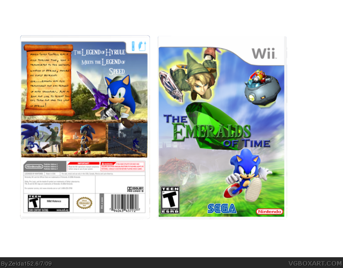
My First 3D cover!
Cred to:
Cerium for idea and Synopsis
Eggboy13: for Logo and Link Sonic
and me for BG...
Tell me what you think!
How can i make it better?
I don't know what to do about it, but the upper right of the front is very empty. I think maybe Eggman could be up there in some sort of flying machine, or other enemies of some sort.
The Spine is extremely boring. I'd like to see the spine logo at least match the style of the front logo.
Just out of curiosity, what happened where the barcode was on the back? It's all warped. Also, the size of the words in the tagline could be changed up depending on emphasis placed on them, like Legend (both times), Hyrule, and Speed.
#4, I don't know if you're taking it harshly or not. It's good, but since most of it looks good, the issues I've found, if they were fixed, could make this great.
The box isn't bad, but here's thing's you may want to do to make the box a lot better :)
1. Try and make your own custom logo. Not only will it be fun, but it will help you become a better artist as a whole, being able to make your own logo.
2. The front is good, but you've got a lot of empty space. I don't know what else to say except to fill it, maybe make your renders a bit bigger.
3. The back is actually very nice, but you never want a tagline over the face of a character, it's really unprofessional and doesn't look that good either. On your box, you have your tagline over Eggman.
4. Some nitpicks you may want to fix are the ESRB and barcode on the back, both are kind of messed up.
Hmm, I personally liked your other setup better, the one were Link was flying. This new front you have now is ok, but nothing is really unified in the image. It just looks like the characters are doing whatever in a game they all happen to be in...I hope that makes sense to you. Your version 2 had more unity with the image simply becasue it looked like both Sonic and Link were racing together as a team.
So, my opinion would be to maybe try working with what you had before, and put this new logo #17 gave you on that one. Stretch the logo out some though, as it's looking kind of small on version 3, and maybe put a glow or stroke on it if your using photoshop. I'd have to take a look at it with your new logo in place to give you an opinion on what else might make it better, but I'll certainly come take a look at it again for you.
Not too shabby my friend, although i feel you're emerald is a bit too big, and don't be afraid to get creative with the tag (headline) on the back, you really gotta make it eye catching
OK the background was really good and you covered it up :) oh move the logo down a bit, ad ersb and def logo. On the tag put a drop shadow and color it gold But apart from that very nice box!
Oh my gosh I've made 6 different versions!!! If i make one more thats my last...so if anyone has any advice give it to me NOW!!!
and Ganonforf is faded, you can see his head perfectly if you look good enough...
Thanks!
It looks a lot better now. One thing though, that I would like to see, like what tleeart said, is have Ganondorf a bit more visible. It looks looks to me like his opacity is like, 60-70 or something...lol.
#32, No, I can see him clearly, but everybody else has normal coloration, and yet he's so faded. He's not that far away.
I personally liked the old logo better, but whatever. I know a lot of people are giving you their idea of what is best for the design. All I have to say is to compare it to the best official boxes and designs on this site and determine if this design compares well enough to them.
Personally, I think there's a lot of space that is not well used. Also, the text is very plain. It needs some artistic effects applied to it for a more stylistic approach.
 The Emeralds of Time Box Cover Comments
My First 3D cover!
Cred to:
Cerium for idea and Synopsis
Eggboy13: for Logo and Link Sonic
and me for BG...
Tell me what you think!
How can i make it better?
[ Reply ]
Not bad. Im loving what you did with the background. But you might want to touch up Sonic's head (make his spikes go behind his hand?) 3.5/5 Overall
[ Reply ]
I don't know what to do about it, but the upper right of the front is very empty. I think maybe Eggman could be up there in some sort of flying machine, or other enemies of some sort.
The Spine is extremely boring. I'd like to see the spine logo at least match the style of the front logo.
Just out of curiosity, what happened where the barcode was on the back? It's all warped. Also, the size of the words in the tagline could be changed up depending on emphasis placed on them, like Legend (both times), Hyrule, and Speed.
Not bad, it just needs some improvements.
[ Reply ]
ok...
[ Reply ]
#4, I don't know if you're taking it harshly or not. It's good, but since most of it looks good, the issues I've found, if they were fixed, could make this great.
[ Reply ]
ok...so i just fill in some empty space and fix the spine?
[ Reply ]
I would definitely try to get Eggman up in the corner or something.
I like the look of it, and your certainly on to something otherwise though.
[ Reply ]
link
The text on the back is a huge no-no. Please read the link above.
Edited at 1 decade ago
[ Reply ]
Ok, since my 3D box wasnt so good...i fixed it...is it any better?
Edited at 1 decade ago
[ Reply ]
I'm sorry but I notice that Link seems to be flying.
How very odd.
[ Reply ]
Cool Box.
BUT: the esrb on the front T for Teen, but on the back its M for teen xD
And that Code-thingy is weird.
[ Reply ]
#8, Boy. I thought almost no-one read my thread.
Anyways, I actually like the design, but it's not that well attempted.
[ Reply ]
Edited at 1 decade ago
[ Reply ]
The box isn't bad, but here's thing's you may want to do to make the box a lot better :)
1. Try and make your own custom logo. Not only will it be fun, but it will help you become a better artist as a whole, being able to make your own logo.
2. The front is good, but you've got a lot of empty space. I don't know what else to say except to fill it, maybe make your renders a bit bigger.
3. The back is actually very nice, but you never want a tagline over the face of a character, it's really unprofessional and doesn't look that good either. On your box, you have your tagline over Eggman.
4. Some nitpicks you may want to fix are the ESRB and barcode on the back, both are kind of messed up.
Hope that helps my friend!
[ Reply ]
Cool! fav, big time!
[ Reply ]
UPDATE!!!
Cred SM22 for logo...
Edited at 1 decade ago
[ Reply ]
Thanks Zelda152!
Your the first Person ever who used one of my Logos! =D You fixed all things... Well, I see no flaws.
5/5 +fav!
[ Reply ]
Hmm, I personally liked your other setup better, the one were Link was flying. This new front you have now is ok, but nothing is really unified in the image. It just looks like the characters are doing whatever in a game they all happen to be in...I hope that makes sense to you. Your version 2 had more unity with the image simply becasue it looked like both Sonic and Link were racing together as a team.
So, my opinion would be to maybe try working with what you had before, and put this new logo #17 gave you on that one. Stretch the logo out some though, as it's looking kind of small on version 3, and maybe put a glow or stroke on it if your using photoshop. I'd have to take a look at it with your new logo in place to give you an opinion on what else might make it better, but I'll certainly come take a look at it again for you.
[ Reply ]
#18, Agreed 1000%.
[ Reply ]
good box
[ Reply ]
good box
[ Reply ]
good box
[ Reply ]
thanks!
[ Reply ]
#23, agreed. looks great now =]
[ Reply ]
Not too shabby my friend, although i feel you're emerald is a bit too big, and don't be afraid to get creative with the tag (headline) on the back, you really gotta make it eye catching
[ Reply ]
How could i do that?
[ Reply ]
OK the background was really good and you covered it up :) oh move the logo down a bit, ad ersb and def logo. On the tag put a drop shadow and color it gold But apart from that very nice box!
Edited at 1 decade ago
[ Reply ]
DAMNIT!!! I ALWAYS FORGET THE ESRB AND DEV LOGOS!!
[ Reply ]
Fix the dev logos and ESRB, you get a fav.
It looks more polished and clean, good work.
[ Reply ]
I would like to see Ganondorf to be a little more visible. Right now he's hard to see.
[ Reply ]
Oh my gosh I've made 6 different versions!!! If i make one more thats my last...so if anyone has any advice give it to me NOW!!!
and Ganonforf is faded, you can see his head perfectly if you look good enough...
Thanks!
Edited at 1 decade ago
[ Reply ]
Better! :)The Emerald on the logo is pretty big though. You may want to shrink it a bit. I'll fave though ;)
[ Reply ]
It looks a lot better now. One thing though, that I would like to see, like what tleeart said, is have Ganondorf a bit more visible. It looks looks to me like his opacity is like, 60-70 or something...lol.
[ Reply ]
#32, No, I can see him clearly, but everybody else has normal coloration, and yet he's so faded. He's not that far away.
I personally liked the old logo better, but whatever. I know a lot of people are giving you their idea of what is best for the design. All I have to say is to compare it to the best official boxes and designs on this site and determine if this design compares well enough to them.
Personally, I think there's a lot of space that is not well used. Also, the text is very plain. It needs some artistic effects applied to it for a more stylistic approach.
[ Reply ]
I like the back, but the front seems unbalanced since the Sonic has nothing to his left
[ Reply ]
Compared to the ones by Cerium, this is a bad box.
[ Reply ]