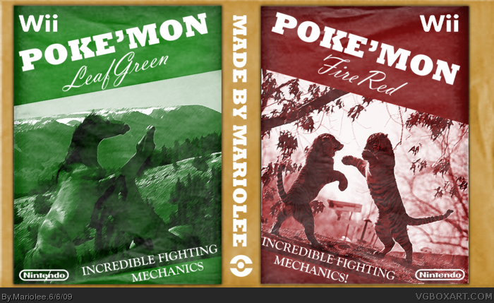
This was very much inspired by Koopadasher's Pikmin box. I wanted to do something different, yet not too drastic, and once that 5 colors competition opened, I zipped to this idea. Then I found that I couldn't use shadows and gradients. WTF?
But still, I like these boxes because they're reminiscent of the old boxes of the 80's.
#4 And Mugglesman111 who apparently inspired Koopa who inspired me.
Great, unique concept!! Even if the execution is sub-par, I don't care; this is way better than all of those plain, boring Pokemon boxes around.
Faved.
I see what you was trying to do but in my opinion, it just doesn't work for me. It doesn't have the same effect Koopa's box has! Im sure people will still fav it though purely because it's different.
#12, What the f@#$ was that about? I kind of agree with him. I see what he was trying to do, but it really has nothing at all to do with the game. It tells you nothing about what the game is about, other than fighting, which really isn't the main part of the game. It just kind of feels tacked on...rushed. Far from choosing an original, unique design that still shows the emphasis of the game, these covers show very little about the collection/trading/training/catching/community aspect of the game, and avoid delving into the world of Pokemon itself. Know what I mean?
#13 I'm not worthy! I'm not worthy! (Wayne's World Reference)
I know what you mean, I'd change the box up a little if I didn't delete it. But the next time I do a box, I'll keep that in mind: the whole getting all aspects of the game, not just one.
Yeah, this reminds me Nothing of Pokemon. Real boring text with random pictures of animals fighting. Is there even a tiger Pokemon? Really overrated art in my opinion. Also really not that hard to put together.
Edit: Also it annoys me when someone just writes Pokemon as the title, talk about rush.
#16 I didn't want to put off people by putting Pokemon FireRed and Leafgreen, so I simply put Pokemon not because it was rushed, but because it's less of a mouthfull and more appealing.
What I wanted to do is only get the core essence of Pokemon, as I was inspired by old noir film posters that had cursive writing and a simple painting or picture to describe its whole film.
#13 Sorry, I was REALLY pissed that day so please excuse me for such an outburst... but honestly I can see exactly what he was doing, but maybe it needs a back to explain it to others who don't get it.
 Pokemon Box Cover Comments
Kool.
[ Reply ]
This was very much inspired by Koopadasher's Pikmin box. I wanted to do something different, yet not too drastic, and once that 5 colors competition opened, I zipped to this idea. Then I found that I couldn't use shadows and gradients. WTF?
But still, I like these boxes because they're reminiscent of the old boxes of the 80's.
#4 And Mugglesman111 who apparently inspired Koopa who inspired me.
PLOX FAVE.
Edited at 1 decade ago
[ Reply ]
Great, unique concept!! Even if the execution is sub-par, I don't care; this is way better than all of those plain, boring Pokemon boxes around.
Faved.
[ Reply ]
idea stolen. :P. you got it from koopa who got inspiration from me. therefore, stolen from me. haha jaykay.
[ Reply ]
Retardedly cool.
[ Reply ]
Thank you everyone! Oh, and I edited my post for you Mugglesman111...:P
Edited at 1 decade ago
[ Reply ]
HaHa! Awesome! xD
[ Reply ]
I see what you was trying to do but in my opinion, it just doesn't work for me. It doesn't have the same effect Koopa's box has! Im sure people will still fav it though purely because it's different.
[ Reply ]
@8 How could I make it work? I don't want to get faves I don't deserve.
[ Reply ]
#9 I dont know! Theres nothing wrong with your boxes, Im just not feeling it! But hey, thats just me! :)
[ Reply ]
I don't get what the box has to do with pokemon...
[ Reply ]
#11 Oh JEBUS man! Just because an original idea comes up, you don't wish to open up your mind and at least TRY to understand it?!
...
*exhales*
[ Reply ]
#12, What the f@#$ was that about? I kind of agree with him. I see what he was trying to do, but it really has nothing at all to do with the game. It tells you nothing about what the game is about, other than fighting, which really isn't the main part of the game. It just kind of feels tacked on...rushed. Far from choosing an original, unique design that still shows the emphasis of the game, these covers show very little about the collection/trading/training/catching/community aspect of the game, and avoid delving into the world of Pokemon itself. Know what I mean?
Edited at 1 decade ago
[ Reply ]
#13 I'm not worthy! I'm not worthy! (Wayne's World Reference)
I know what you mean, I'd change the box up a little if I didn't delete it. But the next time I do a box, I'll keep that in mind: the whole getting all aspects of the game, not just one.
[ Reply ]
I wish I had thought of that.
+fav
[ Reply ]
Yeah, this reminds me Nothing of Pokemon. Real boring text with random pictures of animals fighting. Is there even a tiger Pokemon? Really overrated art in my opinion. Also really not that hard to put together.
Edit: Also it annoys me when someone just writes Pokemon as the title, talk about rush.
Edited at 1 decade ago
[ Reply ]
#16 I didn't want to put off people by putting Pokemon FireRed and Leafgreen, so I simply put Pokemon not because it was rushed, but because it's less of a mouthfull and more appealing.
What I wanted to do is only get the core essence of Pokemon, as I was inspired by old noir film posters that had cursive writing and a simple painting or picture to describe its whole film.
[ Reply ]
There is no tiger pokemon... or there wasn't in the first couple hundred. Should have made the horse have fire for hair like ponyta or something.
[ Reply ]
#13 Sorry, I was REALLY pissed that day so please excuse me for such an outburst... but honestly I can see exactly what he was doing, but maybe it needs a back to explain it to others who don't get it.
[ Reply ]