Hey,
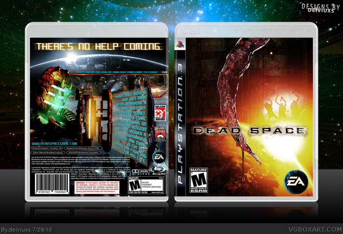
Here is my Dead Space box for PS3.
I absolutely loved this game and decided to create a box for it.
I tried to go fro something different (especially on the front) and I like the end result.
Comments & critiques are welcome..
..oh, favorites too! =)
--------
I would like to give credit the following people/websites:
- Techne
- Google Images
- Planet Renders
- deviantART
- and everyone in the forums!
I gotta say, for all this crap you were giving me in my boxes, I was waiting for this to come out so I could stick it to you, but you just blew me away man, good job.
#2 - your boxes might have some flaws, but your renders are beyond perfection!
#5 - which part can't you read? Have you tried viewing box in Full Size?
#7 - as I said in Forums, I created the box/came up with the concept before your box was added to the site
----------
As far as brightness goes, I was going for something different. I wanted warmer/stronger colors since most of Dead Space boxes are darker in colors.
Also, no one in the Forums said that the box was too bright.
I am happy with the end result and it is perfectly fine if you don't like it.
Not everyone likes "something different"
--------
Anyways, thank you everyone for favoriting this box as it really was a pain to make (enjoyable pain to make) and for leaving honest comments as well.
Much better, I really like the improvement that you have made to the back but I still think that the front is a little too bright. Try to make it so that the yellow brightness isn't so yellow if that makes sense because the contrast doesn't need to be up that much.
love the cover. my new trend to say it needs the updated ps3 logo and your good to go. you need a printable version so i can make this baby my own...lol
#15, I tried the new PS3 template, but it doesn't fit well because it has slightly different dimensions than the old template.
Would you still like a printable?
 Dead Space Box Cover Comments
Hey,
Here is my Dead Space box for PS3.
I absolutely loved this game and decided to create a box for it.
I tried to go fro something different (especially on the front) and I like the end result.
Comments & critiques are welcome..
..oh, favorites too! =)
--------
I would like to give credit the following people/websites:
- Techne
- Google Images
- Planet Renders
- deviantART
- and everyone in the forums!
Edited at 1 decade ago
[ Reply ]
I gotta say, for all this crap you were giving me in my boxes, I was waiting for this to come out so I could stick it to you, but you just blew me away man, good job.
[ Reply ]
The front has a fantastic concept, but the whole thing is a bit too bright IMO.
[ Reply ]
I agree with HalfSwiss
But i fav for effort
[ Reply ]
the concept is good but its WAY!!!!! to bright for a Deadspace box and you can't read the text on the back.
[ Reply ]
it's a bit too bright on the front but besides that it's really nice.
[ Reply ]
Hmm I seen that back somewhere....
link
Oh yes in my portfolio..
Looks good man but I still deserve a credit ;)
[ Reply ]
The front is looking real good, but the back is way to bright as others have said, and it clashes hard with the front.
I'd maybe redo the back with more emphasis on the firey orange colors on the front.
[ Reply ]
#2 - your boxes might have some flaws, but your renders are beyond perfection!
#5 - which part can't you read? Have you tried viewing box in Full Size?
#7 - as I said in Forums, I created the box/came up with the concept before your box was added to the site
----------
As far as brightness goes, I was going for something different. I wanted warmer/stronger colors since most of Dead Space boxes are darker in colors.
Also, no one in the Forums said that the box was too bright.
I am happy with the end result and it is perfectly fine if you don't like it.
Not everyone likes "something different"
--------
Anyways, thank you everyone for favoriting this box as it really was a pain to make (enjoyable pain to make) and for leaving honest comments as well.
Edited at 1 decade ago
[ Reply ]
UPDATE:
Darkened a box a bit.
[ Reply ]
Thanks for fav, HalfSwiss. =)
[ Reply ]
you too, Ticou93. =)
[ Reply ]
Much better, I really like the improvement that you have made to the back but I still think that the front is a little too bright. Try to make it so that the yellow brightness isn't so yellow if that makes sense because the contrast doesn't need to be up that much.
[ Reply ]
Decided to make a small update for my first Dead Space cover:
- changed presentation
- updated the template
- lowered the contrast and yellow color tone
[ Reply ]
love the cover. my new trend to say it needs the updated ps3 logo and your good to go. you need a printable version so i can make this baby my own...lol
[ Reply ]
#15, I tried the new PS3 template, but it doesn't fit well because it has slightly different dimensions than the old template.
Would you still like a printable?
[ Reply ]