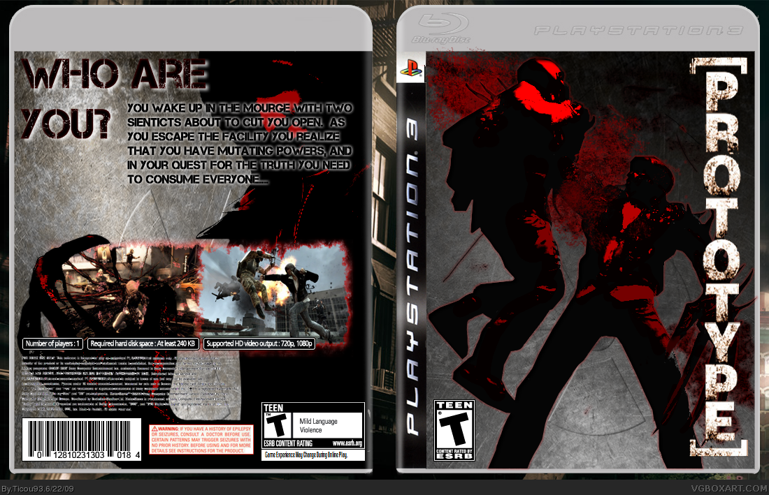
Anyways, the box itself is not bad. I can imagine it with the sort of design the MGS4 had.. but the box looks too... solid. You need more of a... well.. "glossy" feel to it.
I really like what you did with the front, but I think you should do something else with the text on the back. Maybe move it under the tagline, so it's not covering up his face. The rest looks great, I like the screenshots/borders a lot.
 Prototype Box Cover Comments
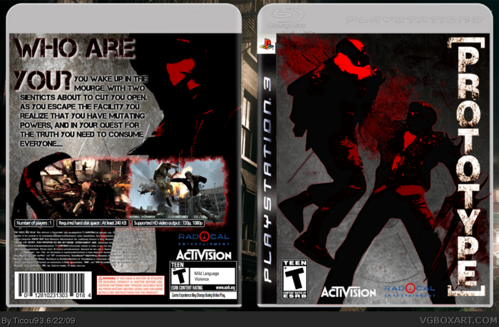
well here it is! my prototype box :)
credits to hellknight for template
and credits to all that helped me !
Edited at 1 decade ago
[ Reply ]
Is this a good game? I haven't played it yet..
Anyways, the box itself is not bad. I can imagine it with the sort of design the MGS4 had.. but the box looks too... solid. You need more of a... well.. "glossy" feel to it.
[ Reply ]
Front is not too bad, but you are missing a dev logo.
The back is too plain and could use more work.
[ Reply ]
looks great just add dev logo.
[ Reply ]
ok :)
[ Reply ]
#4, will do so
sry for dubble post
Edited at 1 decade ago
[ Reply ]
#2, "Glossy" feel?
[ Reply ]
I really like what you did with the front, but I think you should do something else with the text on the back. Maybe move it under the tagline, so it's not covering up his face. The rest looks great, I like the screenshots/borders a lot.
[ Reply ]
#8, better?
[ Reply ]