sorry, ignore my comment, my little brother came on while i was eating my dinner, anyway, teh box IS pretty nice, just add a glow or somthing to the text on teh back
good box i give it a 4/5
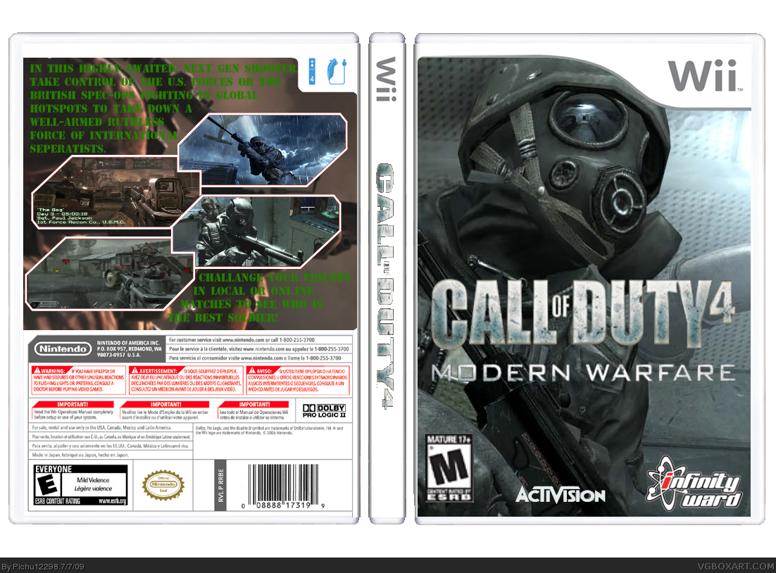
only thins wrong is that the esrb rating is bad and looks as if you cut and paste it out of another box and the logo of the game on the front is kind of blurry
 Call of Duty 4: Modern Warfare Box Cover Comments
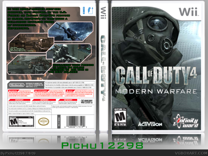
This box took me about an hour and a half. I put a lot of effort into it and I think this is my best box. Please give CONSTRUCTIVE criticism.
The Credits are:
Screen Borders: Silent_Oblivion
Template: Jevangod
Everything else: Google
Edited at 1 decade ago
[ Reply ]
Version 2 added with reflection.
[ Reply ]
Not bad. The text on the back kind of throws me off though. 4/5 though.
[ Reply ]
What do you mean? The font?
[ Reply ]
nice :) but next time try to find the font of the title.
[ Reply ]
I did, but I'm not gonna pay 20 bucks just for a font for one box. Do you have a suggested font I should use?
[ Reply ]
There are some websites that have it for free just search the font.
link
Edited at 1 decade ago
[ Reply ]
#7, Thank you for the link I used that font to update my box.
[ Reply ]
great job, except the back image and text... change it from green. hard to read. and the guy's of the back image is blocked by the screenshots.
[ Reply ]
#9, on the back you're not supposed to see the guy, and the text is fine like that.
[ Reply ]
sorry, ignore my comment, my little brother came on while i was eating my dinner, anyway, teh box IS pretty nice, just add a glow or somthing to the text on teh back
Edited at 1 decade ago
[ Reply ]
Not bad! I just dont like how the text blends in a bit with the background. Maybe try a black stroke around it? 3.5/5 ;)
[ Reply ]
#11, lol. #11 and 12, I put a black outline around the text. You think it's worthy of a fav?
[ Reply ]
still kinda hard to see, just fade the backing image maybe, so its a bit brighter
[ Reply ]
I'm gonna leave it, I can read the text fine.
[ Reply ]
Roza, I just faded it out, can you read it now?
[ Reply ]
gd box but u jus need to make it more clear like the side of the box n mabye the front
[ Reply ]
thanks i take it kiss from holland
[ Reply ]
good box i give it a 4/5
only thins wrong is that the esrb rating is bad and looks as if you cut and paste it out of another box and the logo of the game on the front is kind of blurry
[ Reply ]