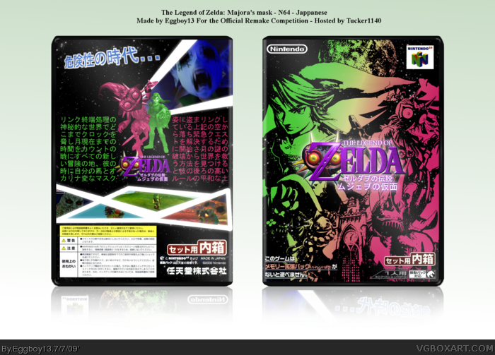
Hey, this is for Tucker's Remake comp, where we had to do basicly the same as the midas, but with an official. For mine I chose the Japanese version of Majora's mask. (Cause I had to do a Zelda based box)
If you don't know what it looks like, link take a look.
Oh yeah, I used adult link mostly cause there wasn't much good stuff for young Link, so yeah...
--Credit--
Anything that you can't find on google images, or PR, was made by me!
There's some great potential here, getting rid of adult Link would be a good start. This game is dark fairytale about a kid in a twisted world. It will look more geniune for you to make use of a proper image of the clock tower.
A good addition would be an image of the evil moon on the back, this would add to the apocalyptic feeling.
Very, very cool front cover. The back doesn't do much for me, not much going on in it compared to the front. Regardless of that, the front deserves a fav all on its own. Awesome.
I agree with General about this one. But still, the front cover is very cool, but the back...I don't know, it just wants to scream "japanese", but I'm not really feeling it. Good job anyway.
 The Legend of Zelda: Majora's Mask Box Cover Comments
Hey, this is for Tucker's Remake comp, where we had to do basicly the same as the midas, but with an official. For mine I chose the Japanese version of Majora's mask. (Cause I had to do a Zelda based box)
If you don't know what it looks like, link take a look.
Oh yeah, I used adult link mostly cause there wasn't much good stuff for young Link, so yeah...
--Credit--
Anything that you can't find on google images, or PR, was made by me!
[ Reply ]
i hate how its twilight princess style, you should have used different artwork
[ Reply ]
There's some great potential here, getting rid of adult Link would be a good start. This game is dark fairytale about a kid in a twisted world. It will look more geniune for you to make use of a proper image of the clock tower.
A good addition would be an image of the evil moon on the back, this would add to the apocalyptic feeling.
[ Reply ]
Very, very cool front cover. The back doesn't do much for me, not much going on in it compared to the front. Regardless of that, the front deserves a fav all on its own. Awesome.
[ Reply ]
I agree with General about this one. But still, the front cover is very cool, but the back...I don't know, it just wants to scream "japanese", but I'm not really feeling it. Good job anyway.
Edited at 1 decade ago
[ Reply ]
Wow very very cool!!!!+fav
[ Reply ]
I really like the front but the back seems lacking in the top left corner
[ Reply ]
Fav'ed!
[ Reply ]