My entry for the 1st Annual VGBA cup round one,which is "drained".
So that means no colour apart from black and white.
Cred to Stevencho, D@rk and IGN.
Edit:#1,Thanks! Remeber,the 24 peopple with most favs goes to round 2.Oh and no fav?
I see a cover thats been rushed to be made just so it can be the first one. Im not saying its that bad of a box, im saying that it shows no effort. Heres what you did: Snagged template, got a big a wallpaper and just slapped in on, no editing what so ever, got LK's logo, put a another wallpaper on the back, used the Triforce font (not so good when its used for everything), got the borders from resources and scaled screens to fit. Put it into 3D, and hit shif+ctrl+u, correct? I see no effort
#7, yes i said it looks good, but if you just used more effort, it could be so much better, upping your chances of winning? You wana win don't you? So why not just go the extra mile and go from ordinary to extraordinary? I suggest you work on a heavy update, dont submit it until you feel like you did every creative thing you could've possibly done.
It honestly doesn't look all that good. The back has a big wall of text, there's an empty space to the left of it that could've been filled with something, the front's already been demolished by Brettska99. This is a very rushed box.
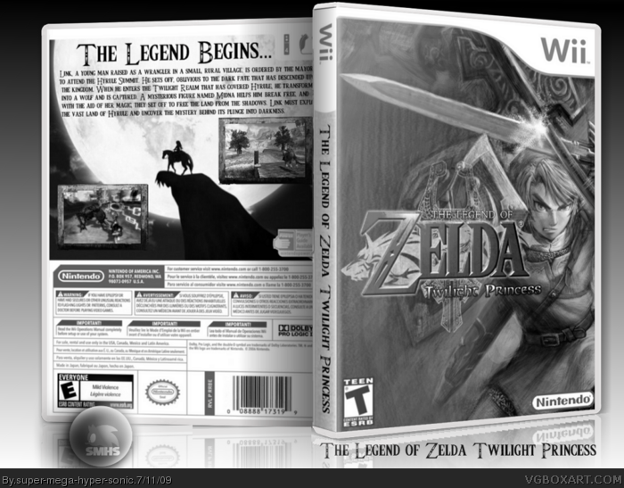
 The Legend of Zelda Twilight Princess Box Cover Comments
Awesome!
[ Reply ]
My entry for the 1st Annual VGBA cup round one,which is "drained".
So that means no colour apart from black and white.
Cred to Stevencho, D@rk and IGN.
Edit:#1,Thanks! Remeber,the 24 peopple with most favs goes to round 2.Oh and no fav?
Edited at 1 decade ago
[ Reply ]
#2, Well I'm competing to. But I guess it wouldn't hurt.
[ Reply ]
#3, Oh sorry I didn't know...
Good luck!
[ Reply ]
Instant Fav!
[ Reply ]
I see a cover thats been rushed to be made just so it can be the first one. Im not saying its that bad of a box, im saying that it shows no effort. Heres what you did: Snagged template, got a big a wallpaper and just slapped in on, no editing what so ever, got LK's logo, put a another wallpaper on the back, used the Triforce font (not so good when its used for everything), got the borders from resources and scaled screens to fit. Put it into 3D, and hit shif+ctrl+u, correct? I see no effort
[ Reply ]
#6, I'm sorry,I thought not about effort but about the looks.
You said yourself it looks good.PDN isn't the greatest for effects.
[ Reply ]
#7, yes i said it looks good, but if you just used more effort, it could be so much better, upping your chances of winning? You wana win don't you? So why not just go the extra mile and go from ordinary to extraordinary? I suggest you work on a heavy update, dont submit it until you feel like you did every creative thing you could've possibly done.
[ Reply ]
#6, I agree. It looks al to rushed. And I hate that damn triforce font.
[ Reply ]
that was quick lol! anyway, good luck man! mine is also nearly finnished lol, just gotta add a presentation of EPIC proportions hehe
[ Reply ]
The front is great, but don't use the same font for the description and the tagline.
[ Reply ]
#8, Unfourtunatley I totally agree.
[ Reply ]
How could I edit what I got to make it better?
There is not much I can do effects wise with the black and white and that.
[ Reply ]
#13 you can't ask people that! The whole point is for you to develop yourself as a box artist, so you have to express your own creativity.
Edited at 1 decade ago
[ Reply ]
It honestly doesn't look all that good. The back has a big wall of text, there's an empty space to the left of it that could've been filled with something, the front's already been demolished by Brettska99. This is a very rushed box.
[ Reply ]
I like this box. Nice!
But the back could be a little better...
[ Reply ]
The front cover is just a section of a wallpaper, which has been put into grayscale.
[ Reply ]
Wow, people on this site are hard to please.
[ Reply ]