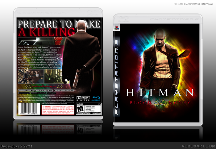
Started playing this game and decided to make a box for it.
Spend few nights on this. Was playing around with Photoshop and came up with this.
Hopefully, you'll like my approach to this, because I like the end result.
As always, comments and favorites are appreciated.
Thanks to:
Sens
PlanetRenders
Google Images
Photoshop CS3
#4, thank you.
#5, Believe me, it looks much that way than if the text was over his head. Also, you still can read the tagline and understand what it means.
Thanks for favs! Don't be afraid to leave a comment as well. =)
This box would be very good if 47 was Kirby. I know it's original but you just cannot mess with Agent 47 like this. Man... I can't freakin' belive this is HoF!!
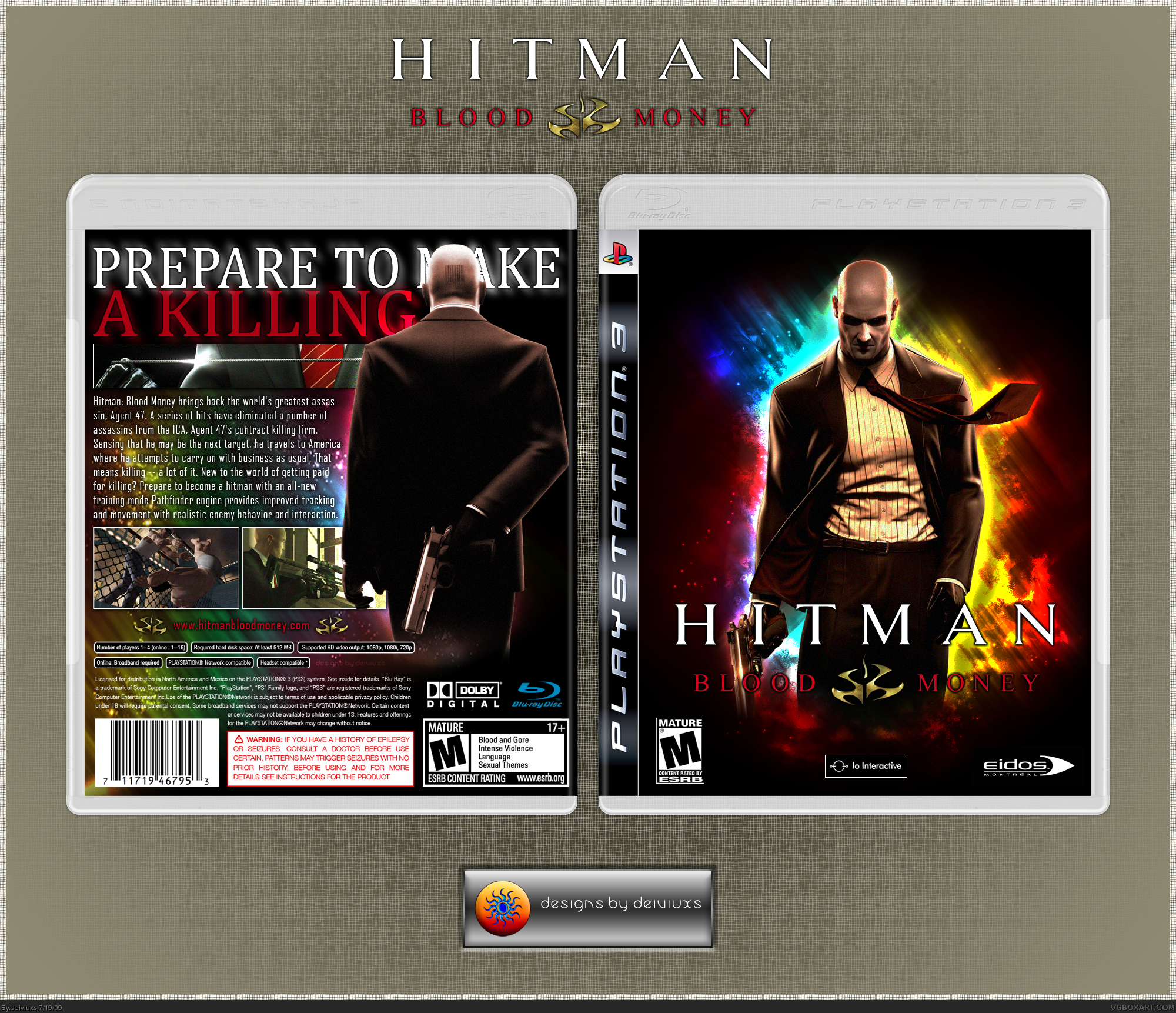
UPDATE:
I have decided to update this box since the front on Version 2 was slightly different than on Version 1 and it didn't look as good.
Updated, so the front is the same as in Version 1.
#35, No, not really. I wanted to change presentation for quite some time now, so I can put more emphasis on the box itself. Also, I think this box is far from Masterworks and one comment will not make it in.
 Hitman: Blood Money Box Cover Comments
Started playing this game and decided to make a box for it.
Spend few nights on this. Was playing around with Photoshop and came up with this.
Hopefully, you'll like my approach to this, because I like the end result.
As always, comments and favorites are appreciated.
Thanks to:
Sens
PlanetRenders
Google Images
Photoshop CS3
- dE -
[ Reply ]
This is nice. Well done.
[ Reply ]
Once again, I would appreciated if you favorited the box.
[ Reply ]
The quality and colour mixture of the box is brilliant!
[ Reply ]
Don't like how his head covers the tagline, the front is neat to look at though.
[ Reply ]
#4, thank you.
#5, Believe me, it looks much that way than if the text was over his head. Also, you still can read the tagline and understand what it means.
Thanks for favs! Don't be afraid to leave a comment as well. =)
[ Reply ]
Very nice composition and execution.
+fav
[ Reply ]
Ooh, I love that front.
[ Reply ]
Whaa Lovely
[ Reply ]
looks nice and colorful...lol
[ Reply ]
the colours contrast with the theme of the game in a spectacular way.
well done, fav.
[ Reply ]
I love the colors =)
[ Reply ]
Thanks for you feedback and favs!
You helped me reach Rank 4. =)
[ Reply ]
The Colours :D
[ Reply ]
Really sharp design, and I'm definitely loving those colors. Great design.
[ Reply ]
My most favorited box so far. Thanks guys! =)
[ Reply ]
Colorful!!!!!!
[ Reply ]
Glad you liked the colors. I worked a while with them.
Also, thanks for all the favs! Really appreciate.
[ Reply ]
I'm a sucker for different unique boxes :)
+fav
[ Reply ]
Awesome color scheme and design!
The tagline glow effect kinda puts me off though.
Faved.
[ Reply ]
Congrats! :D
[ Reply ]
Wow! This is awesome.
Thanks for all your support and favorites. =)
[ Reply ]
Congrats on your first HoF!
[ Reply ]
Thanks, Hawt_Es.
Also, a small update.. =)
[ Reply ]
congrats dude
[ Reply ]
Big, big congrats. Well deserved award.
[ Reply ]
Rayblade stole my line =P
Congrats.
Edited at 1 decade ago
[ Reply ]
#25-#27, Thanks guys! =)
[ Reply ]
I would have never suggested those colors for a Hitman box, this does work so surprisingly well.
[ Reply ]
This box would be very good if 47 was Kirby. I know it's original but you just cannot mess with Agent 47 like this. Man... I can't freakin' belive this is HoF!!
Edited at 1 decade ago
[ Reply ]
#30, do you understand the concept of originality?
[ Reply ]
I guess he doesn't..
[ Reply ]
UPDATE:
I have decided to update this box since the front on Version 2 was slightly different than on Version 1 and it didn't look as good.
Updated, so the front is the same as in Version 1.
[ Reply ]
Presentation update in order to put more focus on the box itself.
[ Reply ]
#34 Disguised *Masterworks* bump? :p
[ Reply ]
#35, No, not really. I wanted to change presentation for quite some time now, so I can put more emphasis on the box itself. Also, I think this box is far from Masterworks and one comment will not make it in.
[ Reply ]