[ Box updated on September 30th, 2009 ] [ original ]
 Between The Buried And Me: The Great Misdirect Cover Comments
Comment on xIAMHUNTERx's Between The Buried And Me: The Great Misdirect Cover.
inb4 boring
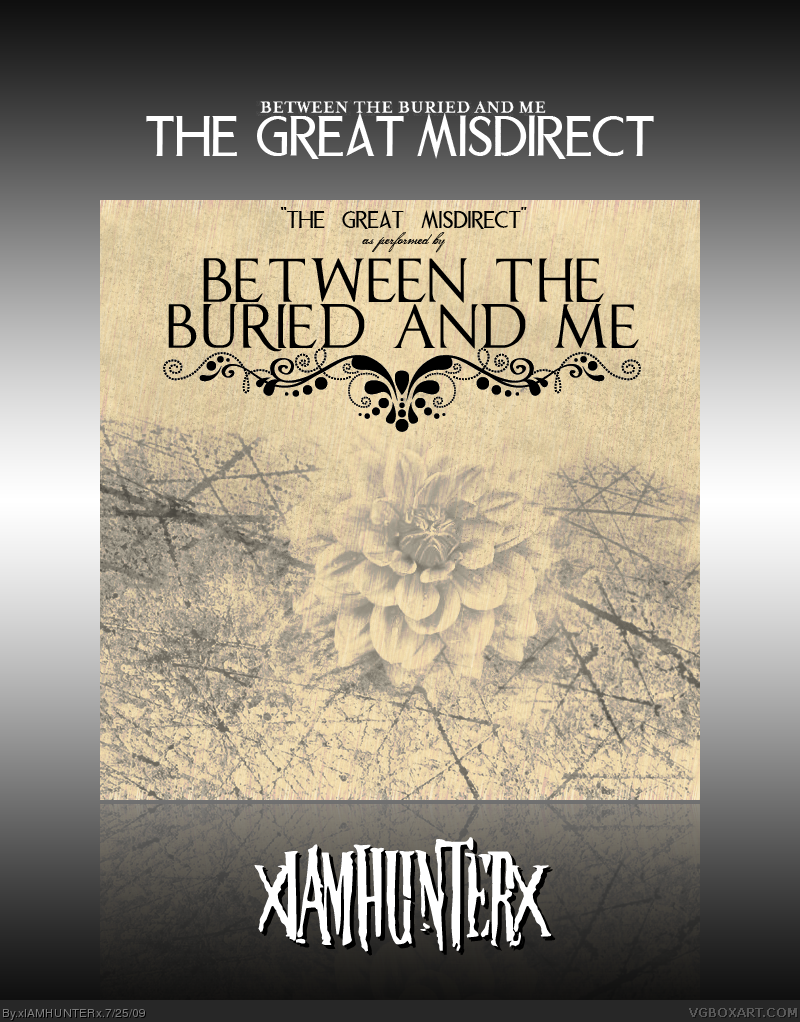
Part dos of my bitbam series. Next up are Silent Circus and Alaska.
Also, I don't care what you think the best CD of 2009 is, because you're wrong. It's this.
Edited at 1 decade ago
[ Reply ]
Would like to see a back. But the color is nice and the text is pretty cool.
[ Reply ]
your back =0
[ Reply ]
#3, I was banned, I didn't leave...
[ Reply ]
I really should check this band out I'm thinking.
[ Reply ]
#5, BTBAM are sick. Colors is probably my favourite album, although some of the older stuff is just as \m/, I'd start off with Colors though.
Anyways, nice box, although I'm not sure where you came up with the theme since little is known about the album, as far as I know - but awesome work, nonetheless.
+ Fav
[ Reply ]
#6, I don't know, I just had this idea that it would be really melodic and build on Colors, so... yeah.
[ Reply ]
#1, You already said Crack the Skye is album of 09, make up your mind.
[ Reply ]
Ugh, I just listened to one of this band's tracks. There terrible! I think I popped an ear listening to that.
Anyways, the box is cool.
[ Reply ]
#8, That was before I knew this was coming out this year haha.
Crack the Skye is still the best album so far of 09 though.
#9, You clearly have no taste in music so kindly gtfo.
Edited at 1 decade ago
[ Reply ]
LOLUPDATE
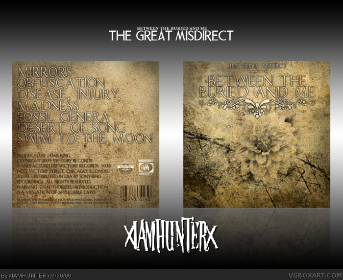
Looking back, I'm really not a big fan of the original. So I fixed it! Tweaked some stuff on the front and added a back and I think it's a lot more engaging than the first version.
Comments, critiques, etc. are welcome as always.
[ Reply ]
It's nice. I don't know if it was intentional, but some of the text is a bit difficult to read against the background. I think you should consider making it a little darker, or adding some kind of shadow or something like that to make it stand out a little better (mainly the title, but the rest could do with some too).
I have a feeling the copyright text is supposed to be like that, is it?
[ Reply ]
It has a shadow. >_>
[ Reply ]
I know that, but it could do with a thicker/darker one.
[ Reply ]
It looks stupid with a more prevalent one, I already tried. Aside from the copyright text which I just couldn't get right I'm happy with this and I'm not changing it. B|
*pout*
[ Reply ]
Ma get out of my room!
[ Reply ]
#16, HOLD ON MA I'M TRYING TO MAKE A PHONE CALL
[ Reply ]