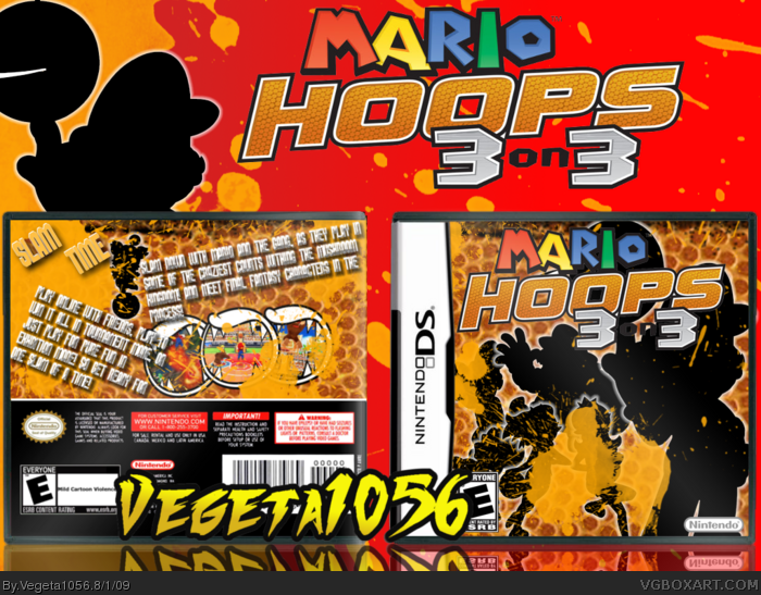
Well this one was fun to make! I give credit to LegoSlayer for the image borders, Gamefaqs for the images, artwork and logo the SuperMario Wiki (rendered everything and made the artwork black, and gave it a glow) Jevangod for the template, adfd for the back esrb and google for the rest! Hope you like it!
I think there's too much going on. You might've gone overboard with the effect. The Slam Time text is too small on the back, and the space is filled too much with text and splashes, while the screens are straight and barely seeable.
OH gosh, the back is well poorly made, I like the idea but it wasn't done greatly. Once again your front is quite good, but you over did it on the splatter, and I love the silhouettes. Now on to the back, Its, lets be honest, not good, The text is very hard to read, take the effect off of them, and the splatter over the screen shot is not good. But other than that good job. 6/10, until you fix some things.
Made me think about the Mario strikers box you made earlier.
Same style. However the back is very badly readable ...
For this one no fav but I'll watch your new box as you're one of my new fav authers
 Mario Hoops: 3 on 3 Box Cover Comments
Well this one was fun to make! I give credit to LegoSlayer for the image borders, Gamefaqs for the images, artwork and logo the SuperMario Wiki (rendered everything and made the artwork black, and gave it a glow) Jevangod for the template, adfd for the back esrb and google for the rest! Hope you like it!
[ Reply ]
Your best.
[ Reply ]
Thanks!
[ Reply ]
#2, agreed, but the username shouldnt cover the box
[ Reply ]
Yes, yes, YES! Definitely your best! *gives cookie*
#6, me too!
Edited at 1 decade ago
[ Reply ]
Yay! I like cookies!
[ Reply ]
I think there's too much going on. You might've gone overboard with the effect. The Slam Time text is too small on the back, and the space is filled too much with text and splashes, while the screens are straight and barely seeable.
[ Reply ]
I like how you used the basketball texture, very nice! I disagree with the choice to emboss the back text, but overall, nice job! :)
[ Reply ]
OH gosh, the back is well poorly made, I like the idea but it wasn't done greatly. Once again your front is quite good, but you over did it on the splatter, and I love the silhouettes. Now on to the back, Its, lets be honest, not good, The text is very hard to read, take the effect off of them, and the splatter over the screen shot is not good. But other than that good job. 6/10, until you fix some things.
[ Reply ]
#9, I agree. Love the front, hate the back. But, meh, I'll fave! lol
[ Reply ]
Made me think about the Mario strikers box you made earlier.
Same style. However the back is very badly readable ...
For this one no fav but I'll watch your new box as you're one of my new fav authers
[ Reply ]
wow this is wow truly wow awesome
[ Reply ]
That is just awesome :3
[ Reply ]
Looked at the front and thought it was good. But then I saw the back, which looks horrible.
The text needs to be drastically changed, and the background.
Great front though.
[ Reply ]