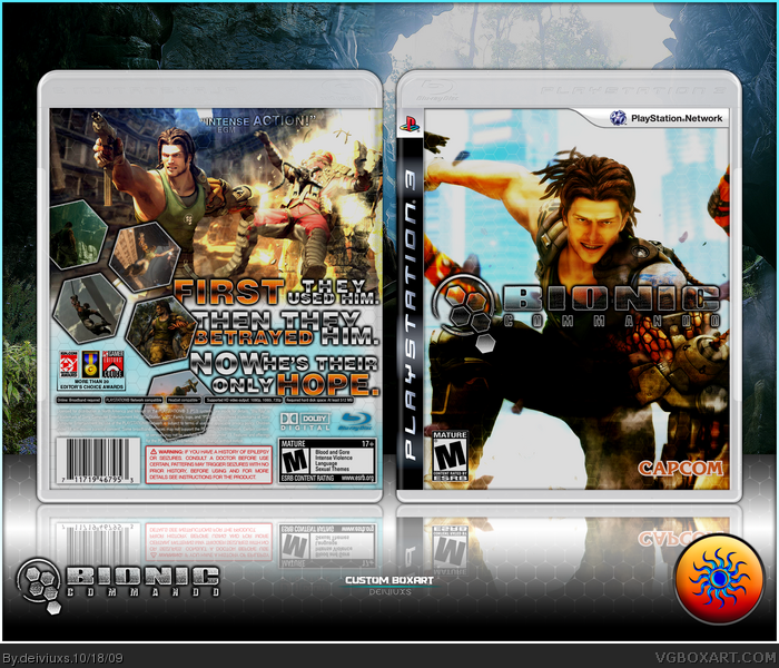
My box for "Bionic Commando" game.
Sounds like a fun game, I wished I had PS3 (or maybe PS3 Slim?).
Tried to go for a brighter design than most BC boxes on this site.
Also, I know there's not a lot of text on the back, but that's the way I wanted it to be.
View full size to see all the details!
Hope you enjoy... =)
#2, glad you liked the colors.
#3, sucks for you.
#4, agree, but I would like to hear your opinion on the box itself.
#5, there's not much info on official box too. What logo? My avatar?
I would like to hear more what the game is about instead of him just being betrayed. I mean that happens in alot of games. The box is too light. I dont like how you have the words so close to the information on the bottom.
I'm liking the bright and contrasted theme you've got going on here. The logo needs to be made more clear though. Also, yeah, there's no synopsis and the tagline is way to long.
Finally, the top half of the back is utterly empty, I'd suggest inputting the tagline there, and having the description of the game alongside the screenshots.
Overall, nice work. I like what you've got going on here.
I love the front but not the back so much, I know you said the shots were to match the logo but you should really get rid of the bottom one and it seems to be too crowded at the bottom and too empty at the top.
#13, that the actual tagline for the game, it's long but it's on official cover. I wanted top half empty because I like that screenshot.
#14, don't need to say "really" so many times, but thanks. =)
#15, I guess most of you don't like the back much..
 Bionic Commando Box Cover Comments
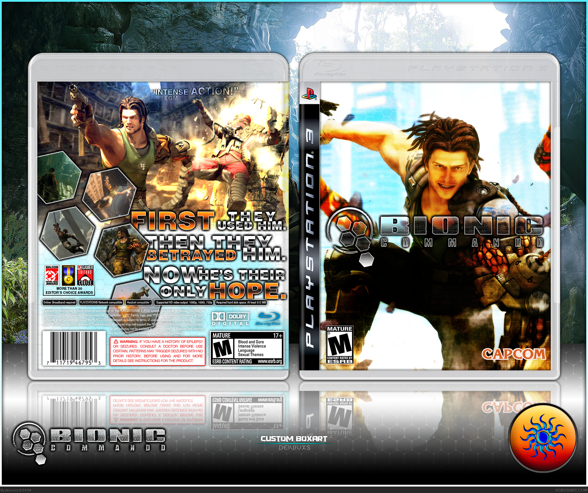
My box for "Bionic Commando" game.
Sounds like a fun game, I wished I had PS3 (or maybe PS3 Slim?).
Tried to go for a brighter design than most BC boxes on this site.
Also, I know there's not a lot of text on the back, but that's the way I wanted it to be.
View full size to see all the details!
Hope you enjoy... =)
Edited at 1 decade ago
[ Reply ]
Looking great, I really like the colors. +fav
[ Reply ]
IM BLIND!!!
[ Reply ]
#3, Please elaborate.
[ Reply ]
i would like a synopsis, but good otherwise +fav
p.s your logo looks like the firefox logo :p
[ Reply ]
#2, glad you liked the colors.
#3, sucks for you.
#4, agree, but I would like to hear your opinion on the box itself.
#5, there's not much info on official box too. What logo? My avatar?
Edited at 1 decade ago
[ Reply ]
I would like to hear more what the game is about instead of him just being betrayed. I mean that happens in alot of games. The box is too light. I dont like how you have the words so close to the information on the bottom.
[ Reply ]
The color scheme on the front reminds me of Mirror's Edge, and I love me some Mirror's Edge.
[ Reply ]
#7, I said I didn't put more info on purpose. I like it that way. It's different..
#8, Mirror's Edge? lol, this game does have some parkour action.
[ Reply ]
looks good... just one suggestion maybe make the four top screen shots a little bigger and remove the fifth one on bottom
[ Reply ]
its pretty good but the front is a little to bright.
[ Reply ]
#10, the screens have the same shape as the logo. I wanted them to be like that.
#11, I don't think it's that bright if you look at it in full size.
[ Reply ]
I'm liking the bright and contrasted theme you've got going on here. The logo needs to be made more clear though. Also, yeah, there's no synopsis and the tagline is way to long.
Finally, the top half of the back is utterly empty, I'd suggest inputting the tagline there, and having the description of the game alongside the screenshots.
Overall, nice work. I like what you've got going on here.
[ Reply ]
I like the front.
I really, really, really, really, really, really, really, really, really, really, really, really, really, really, really, really, really, really, really, really, really, really, really, really, really, really, really, really, really, really, really, really, really, really, really, really, really, really, really, really, really, really, really, really, really, really, really, really, really, really, really, really, really, really, really, really, really, really, really, really, really, really, really, really, really, really, really, really, really, really, really, really, really, really, really, really, really, really, really, really, really, really, really, really, really, really, really, really, really, really, really, really, really, really, really, really, really, really, really, really, really, really, really, really, really, really, really, really, really, really, really, really, really, really, really, really, really, really, really, really like the back. +fav!
[ Reply ]
I love the front but not the back so much, I know you said the shots were to match the logo but you should really get rid of the bottom one and it seems to be too crowded at the bottom and too empty at the top.
[ Reply ]
#13, that the actual tagline for the game, it's long but it's on official cover. I wanted top half empty because I like that screenshot.
#14, don't need to say "really" so many times, but thanks. =)
#15, I guess most of you don't like the back much..
[ Reply ]
oh yeah didnt notice that maybe move them up?...lol
[ Reply ]
I love the front, but I think that the text on the back should be less superimposed, and you should not to use a divided background...
[ Reply ]
I love this, the colors are great and I really like what you did with the screens and text on the back.
[ Reply ]
#18, what do you mean by "less superimposed"? and what's wrong with divided background?
#19, thanks, really appreciate your feedback! =)
[ Reply ]
I actually like what you did with the back. No need for a synopsis imo.
But the front's saturation and brightness is too high for me.
[ Reply ]
UPDATE:
- added "PlayStation Network" bar on the front
- lowered brightness
Also, added printable.
[ Reply ]