I agree with MoneY ;) I really like the front, Batman's head, the background, etc...
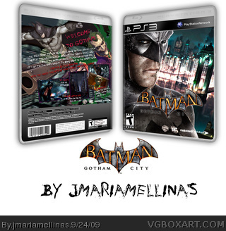
Umn the back isn't bad, but I don't really like the scheme. Maybe something more " orderly " would be better. Batman's leap of faith and The Joker, like that, I don't really like it.
Anyway, I just like how you used a Catwoman figurine for the screen.
It isn't a bad effort. I dislike how the bottom of the back is a basic gradient, that part does not flow with the other stuff. The description's text also looks a bit blurry in the full view.
 Batman: Gotham City Box Cover Comments
"Batman: Gotham City" is the sequel to "Arkham Asylum".
Hope you like the cover^^
[ Reply ]
I love it. It's just very blurry in full size.
[ Reply ]
The Front is incredible...but I don´t like the Back - Font and the Batman and Joker - Renders...but the other things are very n1ce :P
[ Reply ]
I agree with MoneY ;) I really like the front, Batman's head, the background, etc...
Umn the back isn't bad, but I don't really like the scheme. Maybe something more " orderly " would be better. Batman's leap of faith and The Joker, like that, I don't really like it.
Anyway, I just like how you used a Catwoman figurine for the screen.
Good job, fav'd ^^
[ Reply ]
It isn't a bad effort. I dislike how the bottom of the back is a basic gradient, that part does not flow with the other stuff. The description's text also looks a bit blurry in the full view.
[ Reply ]
Awesome. Fantastic job, I really like the front. Fav'd
[ Reply ]
He he he!!! This game is gonna be made!
[ Reply ]
And now this game exists... This was before Arkham City was made!
[ Reply ]