Sorry for the people who have to re-fav this. I messed up on the ESRB stuff so I changed it!
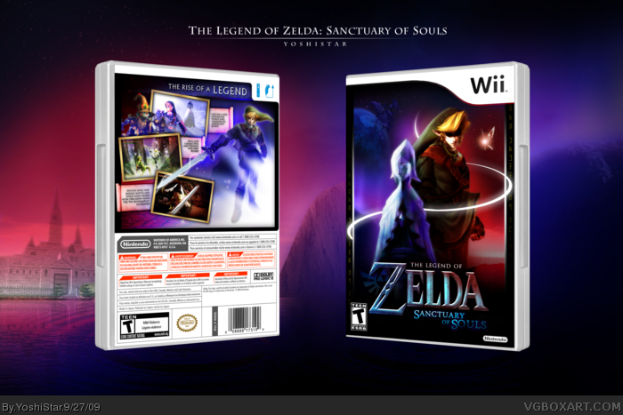
Anyway, this one was pretty fun to make. I really love making boxes of games with little material or no material. I decided to create Zelda Wii because ... well, I love Zelda games. It's also fun to create boxes for games that are not out yet because .. here it goes .. "The only limit is your imagination!" [/cliche]
I felt like turning away from the traditional 'ancient-styled' Zelda boxes, and create a more magical one. Magic is a big theme of the Zelda series after all.
I created the Link renders by mixing, merging, and rotating arms and legs to my desire. The Master Sword girl, of course, is from the Zelda Wii poster.
I also created the screenshots by doing various things.
I'm digging some things about this. The framing on the cover is very nicely done, for example. I'm not fond of the hard red and blue cover colors. They don't really fit the feel of the series. The fact that you created your own Frankenstein images of Link is pretty cool and admirable, but the one on the cover looks really weird (HUGE).
The feel people get from a series is usually determined by what they've become used to. Most people on this website, for example, have got really used to the ancient-styled theme from all the Twilight Princess boxes. Associating 'ancient', 'epic', 'medieval', etc. with Zelda is fine, but then we're very limited and can never go beyond, which is what I think WindWaker and even Majora's Mask did with their entire games and boxart (here's the link to MM's boxart. Doesn't look very what we'd call 'Zelda' in my opinion.) I understand straying completely from a series, like creating a Mario boxart with blood splatters and grungy textures, so I tried to not venture too far off and keep the theme something imaginable. Zelda is also associated with magic, so I thought I'd explore that bit of it a little more. It's also more FUN that way - creating things which are unique.
I'm not ranting cause I'm angry at you or anything. Nor am I defending myself. I just wanted to point out my thoughts.
Lol, as for Link, does he look that odd? His height should be correct ( link ). As for his body, I thought it'd be cool if he was slightly older (Apparently Eiji said he was going to be) and buffer. lol
Btw, I forgot to thank everyone in the Critiques forum for their help. :)
I agree with most of your points, Yoshistar. The thing is that we're used to ancient, medieval style boxes for Zelda because the LoZ embodies ancient legends in a medieval setting. I'm all for breaking the mold, but strong reds and blues just don't compliment the Zelda series. In fact, I feel they clash.
Even if you had used green and blue instead (Link and Sword-girl's colors) it would at least be complimentary to the series (Green, in this case, would support the entire concept.)
 The Legend of Zelda: Sanctuary of Souls Box Cover Comments
Awesome!
[ Reply ]
Read please! :)
Sorry for the people who have to re-fav this. I messed up on the ESRB stuff so I changed it!
Anyway, this one was pretty fun to make. I really love making boxes of games with little material or no material. I decided to create Zelda Wii because ... well, I love Zelda games. It's also fun to create boxes for games that are not out yet because .. here it goes .. "The only limit is your imagination!" [/cliche]
I felt like turning away from the traditional 'ancient-styled' Zelda boxes, and create a more magical one. Magic is a big theme of the Zelda series after all.
I created the Link renders by mixing, merging, and rotating arms and legs to my desire. The Master Sword girl, of course, is from the Zelda Wii poster.
I also created the screenshots by doing various things.
Hope you like!
VIEW IN FULL SIZE PLEASE! THX :D
Edited at 1 decade ago
[ Reply ]
Why didn't you use the update-tool?
[ Reply ]
Amazing.
[ Reply ]
I don't like putting up a bunch of versions. And since it had been only like a minute, I thought I might as well delete it and re-upload. Haha.
[ Reply ]
Stunning.
[ Reply ]
Amazing work Yoshi.
[ Reply ]
Truly Amazing! B)
[ Reply ]
Pure Bliss
[ Reply ]
Amazing work Yoshi... please go on witht Zelda :) I like your work.. its really uique :)
[ Reply ]
Simply amazing...
[ Reply ]
holy shit!!!! 0__o FUCKING AWESOME this is a real kickass boxart wow
[ Reply ]
Extremely imaginative.
[ Reply ]
Whoa, cool colors. People are making lots of great boxes lately.
[ Reply ]
Nengya shigglefrick zickyshahhhhhhhhhhhhhhhhhhhhhhhhhh.
I don't know what that means.
But I know this is awesome.
b(^_^)d
[ Reply ]
That's lovely.
[ Reply ]
Awesome work.
[ Reply ]
Hey, what do you know, even the second time around it's still awesome.
Edited at 1 decade ago
[ Reply ]
I just love this box. Lots and lots and lots. And I think "Sanctuary of Souls" is the best unofficial title I've ever heard for a Zelda game.
[ Reply ]
Agreed with #18.
[ Reply ]
not your best work, but still very nice +fav
[ Reply ]
I just want to point out that it would look better with a Wii Motion Plus icon on the back ;)
[ Reply ]
awesome work :)
[ Reply ]
I jizzed in my pants.
[ Reply ]
#21, I'm curious as to what you consider to be his "best" work?
[ Reply ]
W I N
[ Reply ]
F*ck the hall of fame, this belongs in the masterworks!
[ Reply ]
Sexy
[ Reply ]
shit, I missed this. :(
Very nice, like always Yoshistar! :)
[ Reply ]
I'm digging some things about this. The framing on the cover is very nicely done, for example. I'm not fond of the hard red and blue cover colors. They don't really fit the feel of the series. The fact that you created your own Frankenstein images of Link is pretty cool and admirable, but the one on the cover looks really weird (HUGE).
[ Reply ]
Absolutely incredible job Yoshistar!
[ Reply ]
2 Days. That's how many days it'll take to get into Masterworks. 4 days tops. :P
[ Reply ]
I hate to be a buzz kill but how is this of Masterworks statues? (._.)
It's still amazing never the less. You should be very proud. All your work is very consistent in quality and gets a lot of attention.
favin' this
[ Reply ]
#30 -
Thanks! :)
The feel people get from a series is usually determined by what they've become used to. Most people on this website, for example, have got really used to the ancient-styled theme from all the Twilight Princess boxes. Associating 'ancient', 'epic', 'medieval', etc. with Zelda is fine, but then we're very limited and can never go beyond, which is what I think WindWaker and even Majora's Mask did with their entire games and boxart (here's the link to MM's boxart. Doesn't look very what we'd call 'Zelda' in my opinion.) I understand straying completely from a series, like creating a Mario boxart with blood splatters and grungy textures, so I tried to not venture too far off and keep the theme something imaginable. Zelda is also associated with magic, so I thought I'd explore that bit of it a little more. It's also more FUN that way - creating things which are unique.
I'm not ranting cause I'm angry at you or anything. Nor am I defending myself. I just wanted to point out my thoughts.
Lol, as for Link, does he look that odd? His height should be correct ( link ). As for his body, I thought it'd be cool if he was slightly older (Apparently Eiji said he was going to be) and buffer. lol
Btw, I forgot to thank everyone in the Critiques forum for their help. :)
#33 -
Consistent. XD
|
V
link
Edited at 1 decade ago
[ Reply ]
#34, arguably your best work :3
[ Reply ]
I agree with most of your points, Yoshistar. The thing is that we're used to ancient, medieval style boxes for Zelda because the LoZ embodies ancient legends in a medieval setting. I'm all for breaking the mold, but strong reds and blues just don't compliment the Zelda series. In fact, I feel they clash.
Even if you had used green and blue instead (Link and Sword-girl's colors) it would at least be complimentary to the series (Green, in this case, would support the entire concept.)
[ Reply ]
OH-MY-GOD, that you could make something this amazing with so limited resources is... well, amazing :) fav' + author fav!
[ Reply ]
This reminds me again why I favorited YoshiStar. He has got to be my favorite box artist on this whole site!
[ Reply ]
the only thing i dont like is the black bar covering link's eyes.
[ Reply ]
That style, that art, is mind blowing, it's fresh and soft, colorful..
[ Reply ]
Ok this is what i call an EPIC game :D lol even though the boxart isnt real the new game is :D annnnnd what did u use to create it? PLEASE TELL :3
[ Reply ]
Sahhweeeeeet.
[ Reply ]
+fav ;)
[ Reply ]
Ehhh, don't think this deserved it :S
[ Reply ]
#44, Lol :P
You now have more MasterWorks than Marker.
Which is pretty damn massive :)
Congrats
[ Reply ]
#44, I really hate to say it. But I kind of agree...
(I really love the Link on the front though..)
[ Reply ]
lol don't worry about it. I don't even like the Link on the front hahah
[ Reply ]
...I have nothing to say lol
[ Reply ]
Woot bump to MW (:
[ Reply ]
Epic
[ Reply ]
cool dude!
[ Reply ]
where the hell did you get that template ,AWESOME!!!!!!!!!!
[ Reply ]