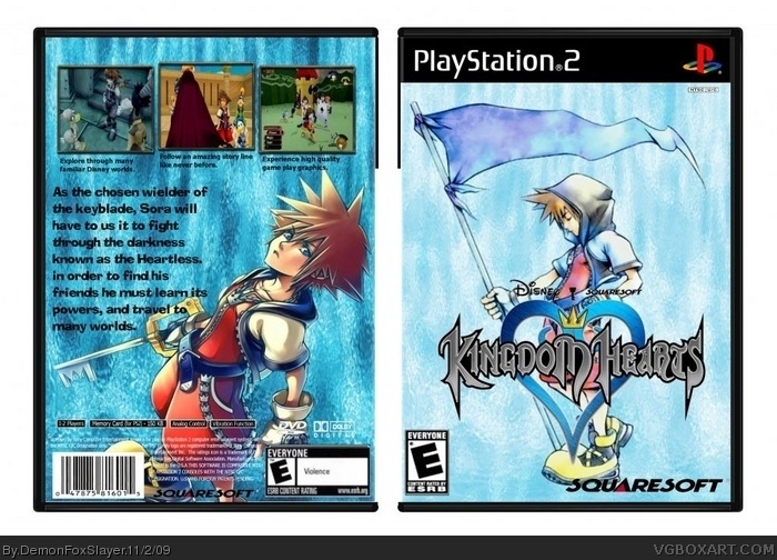
Okay, first off, you just bumped your box, that's a no-no. It's in the Comment Rules. Second off... it's not horrible, but it's nothing special either. Presentation is extremely plain, and the watery feel of the entire box doesn't work for me. The font style doesn't work too well with the subject matter and makes it feel even more plain. Keep working at it, not bad for a first on GIMP, but try even harder next time.
 Kingdom Hearts Box Cover Comments
Haha! My First box using(Believe it or Not) GIMP!!!!
*Clap*Clap*
So what do you think???
Credit goes to qwerty334 for the template!
Edited at 1 decade ago
[ Reply ]
Nobody Wants to Comment?
come on... I REALLY Need Feedback, not trying to be mean
[ Reply ]
Okay, first off, you just bumped your box, that's a no-no. It's in the Comment Rules. Second off... it's not horrible, but it's nothing special either. Presentation is extremely plain, and the watery feel of the entire box doesn't work for me. The font style doesn't work too well with the subject matter and makes it feel even more plain. Keep working at it, not bad for a first on GIMP, but try even harder next time.
Also, your screenshots are really stretched.
Edited at 1 decade ago
[ Reply ]
#3, Hmmm i thought the Front was the best... yeah, i can see where you got the too plain part...
Thanks for the Feedback...
Oh, and i have a better box for tomarrow, but it doesn't have a backside, so... Yeah...
I have a better one for tommarows upload, except it doesn't have a Back side, but whatever...
and i wasn't quiet thinking straight in the terms of bumping...
Edited at 1 decade ago
[ Reply ]