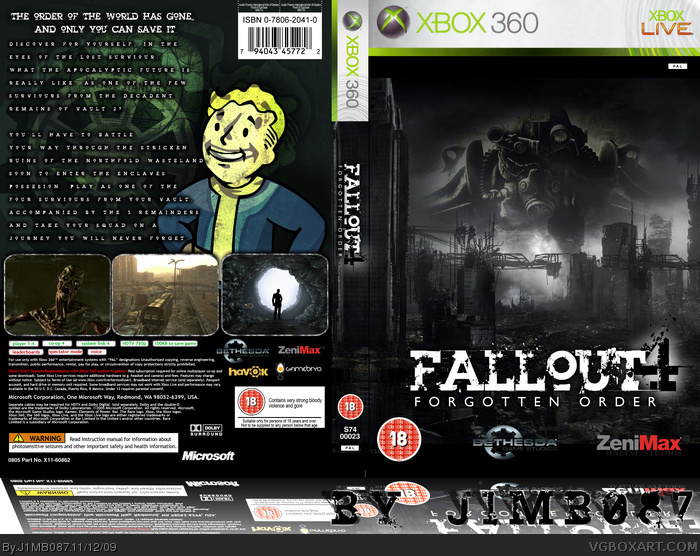
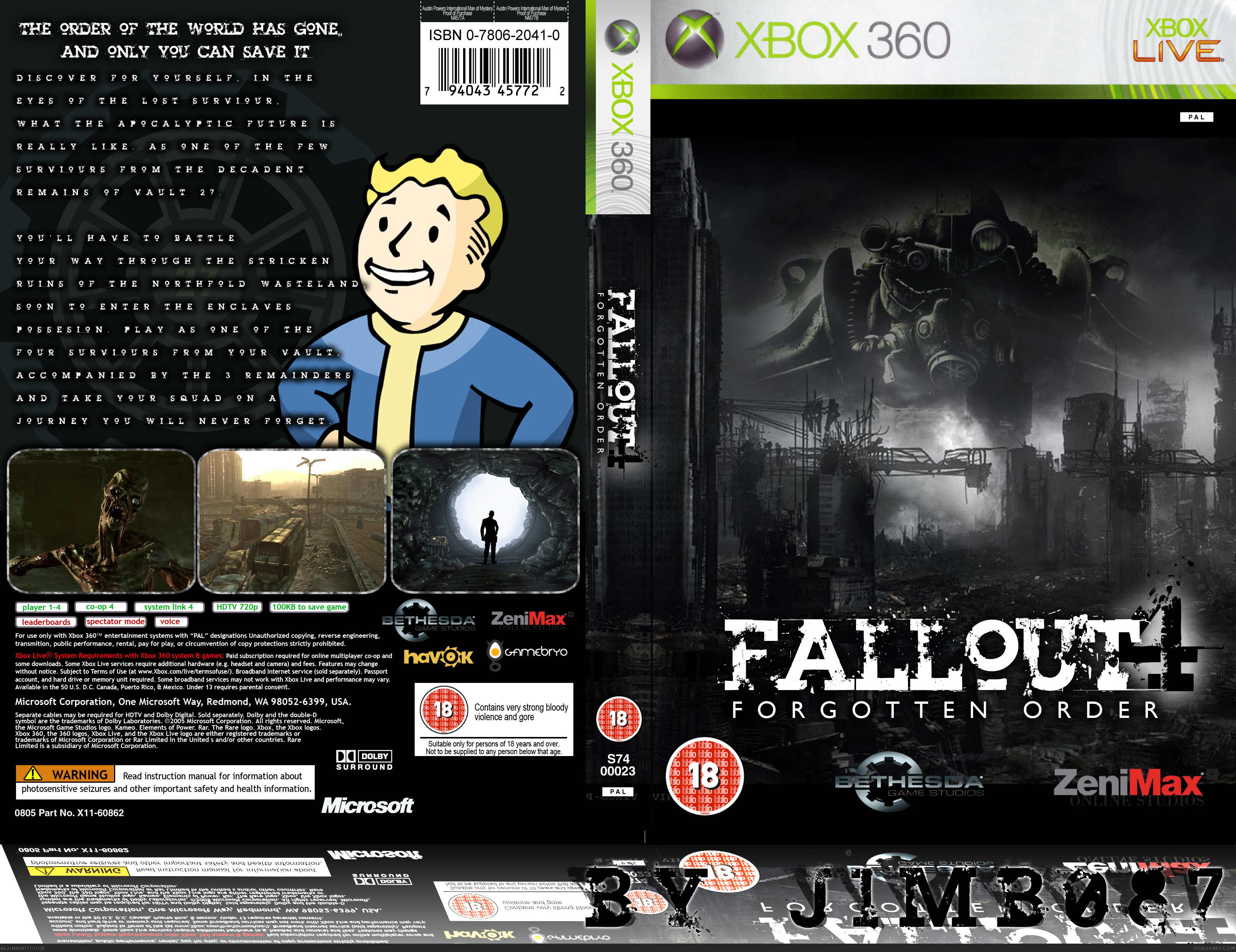
This is my first box-art entry and I must admit i'm very proud of it, credits go to Jimtendo64 for the blurb (description). If you have any constructive critisism please feel free to share it, but if your going to be an asshole then keep it to yourself please, thanks much love J1MB087
I do like the bleak epicness of the front, but the back seems a little by the numbers in comparison. The stark contrast of the Vault Boy render on the back is kind of throwing off the ominous vibe I get from the front, so maybe if that was changed out with something dark and brooding like what is on the front, the design will mesh together better.
 Fallout 4 Box Cover Comments
This is my first box-art entry and I must admit i'm very proud of it, credits go to Jimtendo64 for the blurb (description). If you have any constructive critisism please feel free to share it, but if your going to be an asshole then keep it to yourself please, thanks much love J1MB087
Edited at 1 decade ago
[ Reply ]
Very good for a first actually.
[ Reply ]
#2, Thank you very much Spiner
[ Reply ]
I really like the front :)
[ Reply ]
#4, Do you not like the back then
[ Reply ]
Take off that tag, your not part of BYTD, you must be part of it to take part in the party. But nice box man, Its looks good.
[ Reply ]
Really above average first. I don't really like what you did with the reflection though.
[ Reply ]
#7, well its not exactly part of the box itself, i just thought it would make the bottom look more interesting
[ Reply ]
#6, i was told if you put that in the tag you get entered into a competion, not need to get angry
[ Reply ]
Nice box.
Edited at 1 decade ago
[ Reply ]
#10, No, can't you have guessed that? Dear lord.
Anyway, its an invite only group, so I'm afraid you'll have to remove that tag, sorry =)
And like the others have said, great first, you have some great potential =)
Edited at 1 decade ago
[ Reply ]
Its great to see how it turned out, looks really good.
[ Reply ]
#12, <3
[ Reply ]
I do like the bleak epicness of the front, but the back seems a little by the numbers in comparison. The stark contrast of the Vault Boy render on the back is kind of throwing off the ominous vibe I get from the front, so maybe if that was changed out with something dark and brooding like what is on the front, the design will mesh together better.
Still, nice job for a first!
[ Reply ]
#14, Yeah, i agree.
Go into the contrast/color section, then make him blend in with everything else.
[ Reply ]
This is great, but you shoulda made it 3D, it would of Turned out Way Better...
[ Reply ]
yeah i realy like this , for a first its greatt
[ Reply ]
#14, Ive updated it with a darker image i hope you all like it.
[ Reply ]
#16, I dont think that would be a good idea, as firstly i dont know how and i would ruin it, its also a bit too distracting
[ Reply ]
The updated version looks really good too :D
[ Reply ]
#20, Cheers dude =]
[ Reply ]
#1, thats bad ass that would be perfect for a case
Edited at 1 decade ago
[ Reply ]